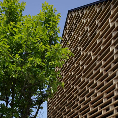
A grid of timber louvres screens the end facades of this Japanese house by architects AE5 Partners.
A fold in the middle of the two-storey House M divides it into two symmetrical halves.
Openings on both sides of the fold create entrances leading into an open-plan living room on one side of the house and bathrooms on the other.
A mezzanine library overlooks the living room from the floor above, while a bedroom is located opposite.
Another gridded timber screen inside the house creates a first-floor balustrade.
You can find more Japanese houses on Dezeen, including one with slides between floors, by clicking here.
Photography is by Nacasa & Partners.
The following information is from the architects:
House M, Kaga-shi Ishikawa-ken Japan
Context
Along a series of lushly green mountains narrow rice field terraces are divided by a mountain stream. Surrounded by this complicated yet beautiful, abundant nature, a settlement can be seen in Kashiwano-machi, a town in Kaga city, Ishikawa, Japan.
The project site was established in an gap between a national road and the edge of the city. How should the building be designed to fill the space in of a town that was slowly built up over a long period of time by people and nature? The foundational concept of the plan should proceed from the climate, the culture, and the historical context and, what is more, it should express modernity. It was thought that this approach may be necessary and most natural for the residents and town people. A “Kura” (Japanese warehouse) is a feature of the typology of the town. It is a secondary house that can be seen anywhere since every house in the town has a Kura.
With small, aesthetic proportions, it fills the space and distance between houses and it helps block the prying eyes of neighbours. It can be said that the planning site complies with the traditional construction style of the town: a house like a Kura with a few open doors is built between a busy national road and the head house in which the client family lives. Additionally, the volume of a Kura suits the current “a house for a woman living alone” theme.
While moving forward with the plan, the typological aspect of the Kura was used within the constraints of the building’s site and context to specialise the process. The process begin like this: a decision was made using a volume study that maintained the proportions of the dialogue between the building plan and the surrounding environment. Then, between the head house and the building plan, a chevron shaped courtyard was made way for, creating a complete assembly whose plan is known as Kunoji. Between the Kunoji and the main house the space became a welcoming courtyard and, at the same time, the north-western side of the Kunoji produced a small space that answered the client’s request of having a private garden. Via this process an architectural shape that acts as a part of the town was derived.
Geometry Embracement / Louvered Facade
Kuras stand with dignified and steady beauty. To acquire the shape, the building’s level surfaces and the exterior were designed with appropriate geometric proportions. The flat surfaces use two squares and isosceles triangles. The elevated surface toward the Tsumagawa (the side that contacts the ridge at a right angle) was constructed using Silver Ratios. The one of a Kura’s features is that it has only a few open doors. This relates to the house owner’s privacy. It is carefully designed to protect the dwellers privacy; The Tsumagawa facade was changed to wooden louvers so that it gets bright daylight; the wooden pieces are arranged to face in a constant direction at every other step.
The intent of the configuration of all of the louvers references the concept of “order and the unexpected”. There is an old persimmon tree in front of the louvers that was planted a long time ago. At first glance the randomness with which the branches and leaves grow seems to have a constant regularity which, when combined with the louvers opposite, abides by the concept of “order and the unexpected” to create a dialogue between nature and the architecture. Additionally, a polygonal shape was used to design the top lights placed on the 2nd floor terrace above and the open windows facing the road. Doing so, the contrast of the order (mathematically proportioned) in the flat and elevated surfaces against the free lines of the open windows attempts to bring into being a pleasantly designed harmony. The lights coming from the open windows or wooden louvers change seasonally and, according to the time of day, produce a rich tapestry of colour for an entire lifetime. On the other hand, the lights of the open windows add small flares of colour and warmth to evenings wrapped in silence or seasons covered in snow.
Surface 86 sqm

