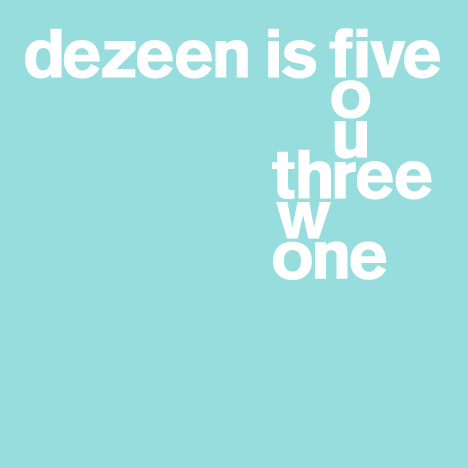
Dezeen is five years old this week! In the first of a series of stories celebrating our anniversary, Dezeen editor-in-chief Marcus Fairs selects his five most memorable stories of the past five years:
One: Design Museum drops Designer of Year show, 17 November 2006
This was the first ever story published on Dezeen: a bit of minor industry gossip about the Design Museum in London. A few days previously I'd been fired from my job as a magazine editor and I thought this might be a good time to launch a design blog. I went round to the home of a friend, Alex Wiltshire, and he showed me how to install WordPress and post stories.
The site looked a mess and my first effort hardly set the design world alight - and there weren't even any pictures! But it was a start.
Two: Sneak preview: Kanye West's apartment, 18 January 2007
This was our first story to go properly viral: the renderings of Kanye West's Claudio Silvestrin-designed apartment were a huge hit on Stumble Upon and got picked up by music blogs around the world, giving us a lot of link kudos.
It was also our first story to spark controversy due to the number (111 to date!) and nature of the comments posted by readers - something that was to happen with increasing regularity until we started to moderate comments more vigorously to counter trolling.
And it was our first genuine scoop: I met Kanye West at a party during Design Miami and he told me about his passion for design (he collects the Campana Brothers and Maarten Baas among others) and mentioned that he'd commissioned Claudio Silvestrin to design his New York apartment. I asked if I could publish it and a few weeks later his publicist emailed me the renderings.
Looking back it appears that I milked the story by publishing more images in a second post but the truth is I was laboriously extracting each image from a PDF by taking screenshots, which took hours. I had to stop halfway through and go to bed.
Three: Eiffel DNA by Serero Architects, 25 March 2008
We got had on this one, good and proper. I saw on the Guardian website that French architects Serero had won an international competition to fix a temporary Kevlar platform to the top of the Eiffel Tower to mark its 120th birthday.
It seemed odd that the Eiffel Tower's own website made no mention of this but, trusting the Guardian, I published the story. A couple of days later the New York Times exposed the story as a fake: there was no competition, and no winner; Serero produced the design speculatively.
The story is a reminder of how rumour and untruth can spread unchecked on the internet. We've been much more careful since. But I also admire the architects for their enterprise: it was a good design, a great story, and a fantastic publicity stunt.
Four: Food and Design: a report by Dezeen for Scholtès, 22 November 2010
This was a labour of love; the biggest, hardest, longest story we've ever published. We were commissioned by luxury kitchen appliance brand Scholtès to write a major report on the increasing overlap between the worlds of food and design to coincide with the brand's relaunch in the UK market. We spent around six months working on the report, which also included around a dozen video interviews filmed in Milan.
The response to the report was astonishing - Treehugger.com kindly wrote that it had "redefined blogging" - and it reinforced our belief that Dezeen can be a place for serious, in-depth analysis as well as high-speed cut-and-paste reportage.
A project like this is labour intensive and expensive to produce but as we grow we definitely have ambitions to raise our game journalistically. There's no reason why the web should be the poor cousin of TV and print when it comes to editorial quality. We hope we can grow to fill the void left by the demise of so many architecture and design print titles.
Five: Interview: Rem Koolhaas on OMA/Progress, 7 October 2011
Rem Koolhaas gave us a private tour of the OMA/Progress show at the Barbican press preview and we filmed it on the little Sony A1 camera we had with us - we weren't expecting to get time with Rem as we'd already had our official interview request turned down. But the tour was exhilarating and despite the dodgy picture quality I love the sense of Rem's intensity and intelligence that comes across in the video. He spoke to the camera for over 20 minutes non-stop while dashing around the exhibition and he never missed a beat.
It's also great for a site like Dezeen to scoop the TV channels and national newspapers with a better Rem interview than any of them got! Video is going to be a really important part of Dezeen's future as a media company: video allows you to capture a moment in history in a more compelling way that still images and text allow, I think.

