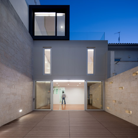
The architect of this Portuguese residence describes it as a grey house with a black backpack (photos by Fernando Guerra).
Located in a coastal town outside Porto, the Frei Sebastião House by António Fernandez comprises two separate buildings, divided by a private courtyard.
Grey panels clad the lower two floors of the three-storey entrance building, while the ‘black backpack’ is an overhanging rectangular top floor.
The black panel-clad facade of the smaller rear building is decorated with a pattern of fork-shaped indentations, which are intended to resemble a tree.
Kitchens, living rooms and bathrooms are contained within both sides of the house, although the front building also provides a garage, a dining room and two bedrooms.
Portuguese photographer Fernando Guerra has shot a number of beautiful houses - see our earlier stories about one with gaping chasms in the roof and another with four courtyards cut into its asymmetrical volume.
Here's some more text from the architect:
Frei Sebastião House in Póvoa de Varzim
The challenge asserted itself. A teacher couple acquired two tiny plots of land in the centre of town where they intended to build a home. Their intentions were bold.
A little place where they could have everything and be close to everything and everyone. The first option was to join the two plots, but bureaucracy nipped it in the bud.
In such cases, urban regulations at the time imposed such low construction indices that only one floor could be built. Somewhat ridiculous considering the plots are surrounded by buildings of seven storeys or more on the adjacent main avenue of the city.
Therefore, the project’s premise was to maintain the two autonomous plots to permit the building of two dwellings that complement each other, each with two floors and a transitional third that confronts the neighbouring buildings and which stands in conformity with current regulations.
Thus, the larger plot would comprise the actual dwelling while the other, much smaller, building would provide complementary areas to the main dwelling, including a workroom for tutoring small groups of students, mindful that all applicable requirements should be guaranteed as for any independent dwelling.
Thus, the idea came about for two buildings joined by an open interior space that, without any physical barrier, contains a tranquil courtyard with a grill.
The large glazed facades in the rear reflect light, creating moving reflections among the facades that animate the space and minimize the impact of the adjacent building’s volume that faces south towards both plots and seems to want to stifle them.
It was necessary to make the spaces liveable and breathable. Light would have to invade the rooms naturally. In the main house, the entryway patio that forms the garage was the key to solving all the imposed constraints and requirements.
In this way, it is camouflaged, not visible from the street, and serves various functions: as a parking space, an access point to the plot’s interiorized house, maintaining a distance between people and the street, and even as a patio that permits the extension of the kitchen to the outside.
The porch, created by the body of the first floor, with an elevation equal to two floors, creates a more secluded area in the courtyard, allowing it to be used even on rainy days.
And thus, we have the multifaceted and internalized experience of the patio/garage/access area, separated from the street only by the garage door whose surface is concealed within the facade.
Inside, each room is reduced to the allowable minimum, but remains functional.
In terms of volume, the dwelling evolves into the equivalent of two floors, upon which rests the volume making up the third floor, which establishes itself as a container/TV that also stands out due to its black exterior.
The second dwelling presented a major challenge. It started from the assump- tion that this building, as a separate and complementary entity to the first, should only open up to the back courtyard and communicate with the main dwelling and the courtyard, turning its back to the street and apartment tower that almost devours its surroundings.
But turning its back was intended to be a friendly gesture, covered in black, and for a bit of irony, reproduce, through the interplay of ceramic and stainless steel sheets, the existing tree in the still empty adjacent plot.
For the street on this side, only a necessary link, an entry door, was created, camouflaged in the geometry of the facade.
In turn, the rear elevation is entirely enclosed in glass, and all rooms enjoy the west-facing orientation, the only possible point of entry for light. Inside, the configuration of the dwelling arose from resolving the location and layout of the staircase.
The house, resulting from the combination of the two buildings, makes the most of the courtyards and their functional capabilities. It assigns various uses to the outdoor spaces. They are spaces upon spaces to be used according to the occasion of the moment, so that something very small is converted into something very big.
And suddenly, we have everything, and the answer is simple, everything works, everything is there. The minimum reduced to a minimum can, after all, be huge! To unite all this diversity we have the language of architecture, the grey house with a black backpack complemented by the black glazed house with a sculpted tree on its back.

