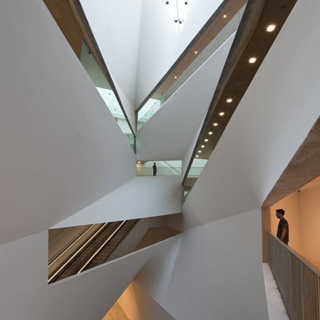
Herta and Paul Amir Building at the Tel Aviv Museum of Art by Preston Scott Cohen
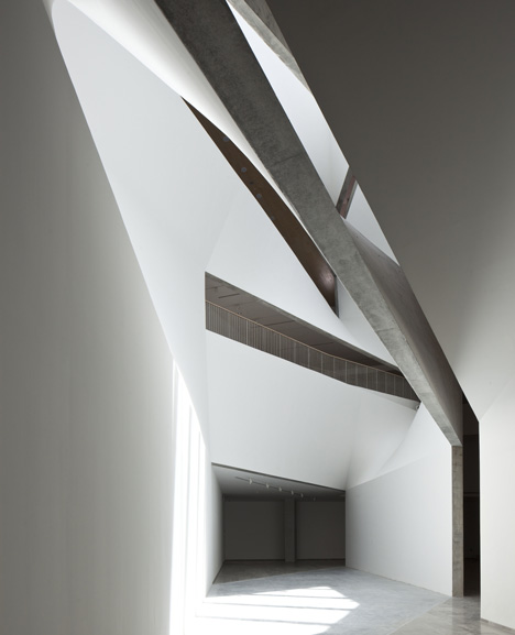
Dezeen in Israel: here are some images of the recently opened new wing at the Tel Aviv Museum of Art, which has a dramatically faceted atrium piercing its centre.
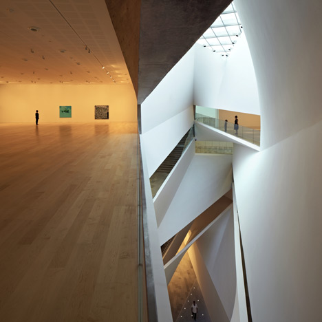
Designed by American architect Preston Scott Cohen, the Herta and Paul Amir Building has a spiralling plan with two storeys above ground and three underground floors.
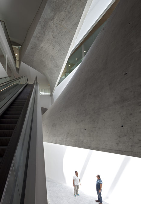
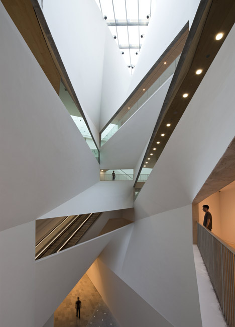
Galleries overlook the 26-metre-high atrium through long windows that slice through its angled walls.
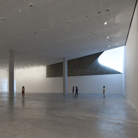
Although the building has a triangular plan, these exhibition galleries are rectangular and display art, design, architecture and photography.
Walls fold around the entrances to these rooms and appear on approach to be wafer-thin.
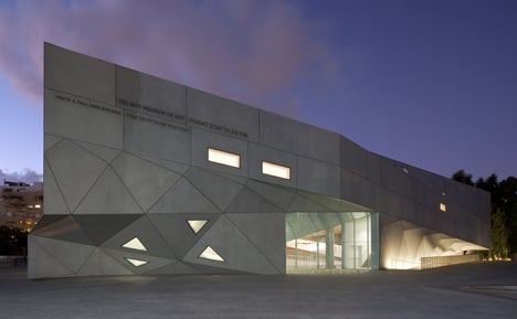
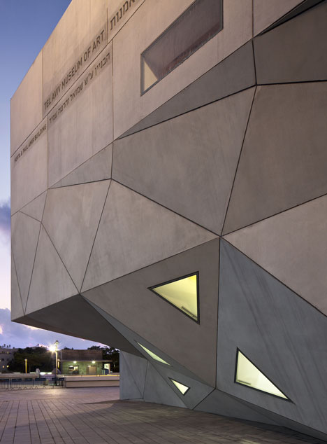
The museum has a tessellated concrete exterior where windows match the shapes of the triangular and rectangular panels.
You can see more stories about Israeli architecture and interiors here, or if you're interested in furniture and product design from Israel you can check out our special feature here.
Photography is by Amit Geron.
Here's some more information from the museum:
Herta and Paul Amir Building
Tel Aviv Museum of Art
The design for the Amir Building arises directly from the challenge of providing several floors of large, neutral, rectangular galleries within a tight, idiosyncratic, triangular site. The solution is to “square the triangle” by constructing the levels on different axes, which deviate significantly from floor to floor. In essence, the building’s levels—two above grade and three below—are structurally independent plans stacked one on top of the other.
These levels are unified by the “Lightfall”: an 87-foot-high, spiraling, top-lit atrium, whose form is defined by subtly twisting surfaces that curve and veer up and down through the building. The complex geometry of the Lightfall’s surfaces (hyperbolic parabolas) connect the disparate angles of the galleries; the stairs and ramped promenades along them serve as the surprising, continually unfolding vertical circulation system; while the natural light from above is refracted into the deepest recesses of the half-buried building. Cantilevers accommodate the discrepancies between plans and provide overhangs at the perimeter.
In this way, the Amir Building combines two seemingly irreconcilable paradigms of the contemporary art museum: the museum of neutral white boxes, which provides optimal, flexible space for the exhibition of art, and the museum of spectacle, which moves visitors and offers a remarkable social experience. The Amir Building’s synthesis of radical and conventional geometries produces a new type of museum experience, one that is as rooted in the baroque as it is in the Modern.
Conceptually, the Amir Building is related to the Museum’s Brutalist main building (completed 1971; Dan Eytan and Yitzchak Yashar, architects). At the same time, it also relates to the larger tradition of Modern architecture in Tel Aviv, as seen in the multiple vocabularies of Mendelsohn, the Bauhaus and the White City. The gleaming white parabolas of the façade are composed of 465 differently shaped flat panels made of pre-cast reinforced concrete. Achieving a combination of form and material that is unprecedented in the city, the façade translates Tel Aviv’s existing Modernism into a contemporary and progressive architectural language.
Architect: Preston Scott Cohen, Inc., Cambridge, Massachusetts
Project Team: Preston Scott Cohen, principal in charge of design, Amit Nemlich, project architect; Tobias Nolte, Bohsung Kong, project assistants
Consultants:
Project Managers: CPM Construction Managment Ltd.
Structural Engineers: YSS Consulting Engineers Ltd., Dani Shacham
HVAC: M. Doron - I. Shahar & Co., Consulting Eng. Ltd.
Electrical: U. Brener - A. Fattal Electrical & Systems Engineering Ltd.
Lighting: Suzan Tillotson, New York
Safety: S. Netanel Engineers Ltd
Security: H.M.T
Elevators: ESL- Eng. S. Lustig - Consulting Engineers Ltd.
Acoustics: M.G. Acistical Consultants Ltd.
Traffic: Dagesh Engineering, Traffic & Road Design Ltd.
Sanitation: Gruber Art System Engineering Ltd.
Soil: David David
Survey: B. Gattenyu
Public Shelter: K.A.M.N
Waterproofing: Bittelman
Kitchen Design: Zonnenstein
Key Dates:
Architectural competition: 2003
Design development and construction documents: 2005-06
Groundbreaking: 2007
Opening: November 2, 2011
Size: 195,000 square feet (18,500 square meters), built on a triangular footprint of approximately 48,500 square feet (4,500 square meters)
Cost: $55 million (estimated)
Principal Spaces:
Israeli Art galleries: 18,500 square feet
Architecture and Design galleries: 7,200 square feet
Prints and Drawings galleries: 2,500 square feet
Temporary exhibitions gallery: 9,000 square feet
Photography study center and gallery: 3,700 square feet
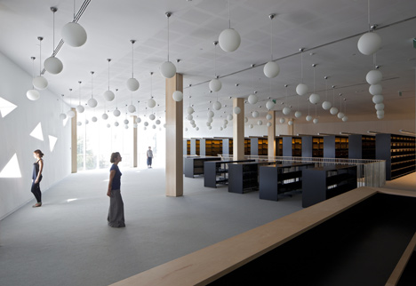
Art library: 10,000 square feet
Auditorium: 7,000 square feet
Restaurant: 3,200 square feet
Offices: 2,700 square feet
Principal Materials: Pre-cast reinforced concrete (facades), cast-in-place concrete (Lightfall), glass, acoustical grooved maple (ceilings in lobby and library and auditorium walls) and steel (structural frame)