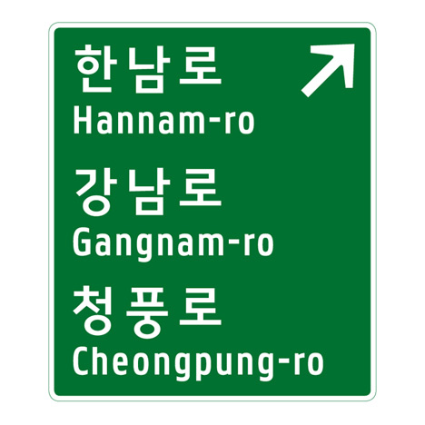
South Korean road signs by Studio Dumbar
The Seoul office of Dutch designers Studio Dumbar has redesigned the national road signage system for South Korea.
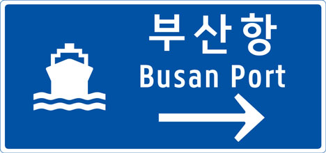
Working with typographer Pieter van Rosmalen, they created a new font for the English lettering that features narrow characters to accommodate the long translations plus wide spacing so the words can be read clearly when travelling at speed.
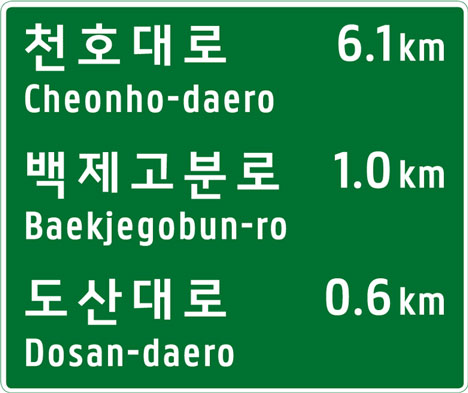
They also developed guidelines for the layout, colours, arrows, road numbers and pictograms of all signs.
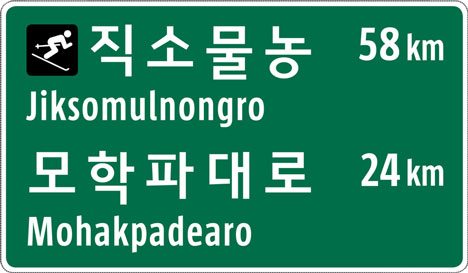
The system is now being rolled out across the country.
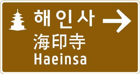
Here are some more details from the designers:
In 2008, Studio Dumbar started the development of the Korean national road signage system in co-operation with the Hong-Ik university. The previous road signage system had many disadvantages which led to confusion at best, and accidents at its worst. Challenges were the lack of logic in the system, regulatory problems, overcrowding, the fixed size of the panels and a disproportion in letter size, letter space and leading. With signs in both Korean and roman script, and in some areas even Chinese, it is no wonder the old signs were over crowded. The phonetically spelled, romanized translations of Korean words are often very long, making it a challenge to fit all the letters on one row. To add to the confusion, third parties were also placing signs with advertising around the traffic signs, making the roads even harder to navigate.

Above: comparing readability
To answer these challenges, Studio Dumbar developed the guidelines for the layout, typography, color system and the graphical elements such as arrows, road numbers and pictograms. Together with type designer Pieter van Rosmalen, we developed a custom made fonts for the english translations.
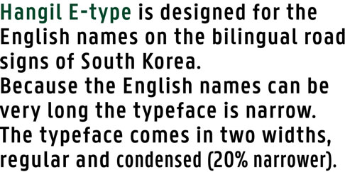
The new roman font, called ‘Hangil’, improves readability considerably. The font features a regular and condensed version and seven weights and italics. Both word- and letter-spacing are wide for optimal readability while moving at high speeds.
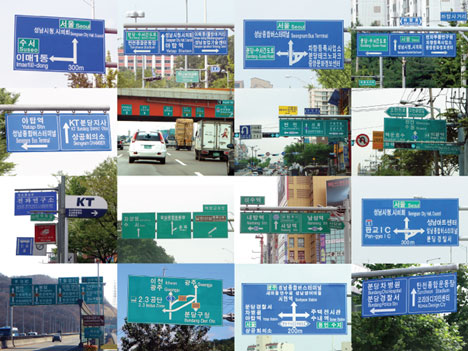
Above: existing system
A special version for both dia-positive and dia-negative application were made, so the optical effect of the font on both dark and light backgrounds is the same. The background color of the panels was darkened for better contrast, and the arrows and pictograms were redesigned for better and quicker scanning while on the road. From 2011 onwards, the new signs will be implemented steadily throughout the country.