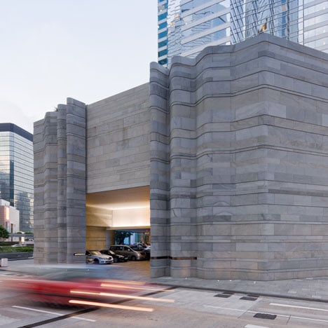
Pacific Place by Thomas Heatherwick
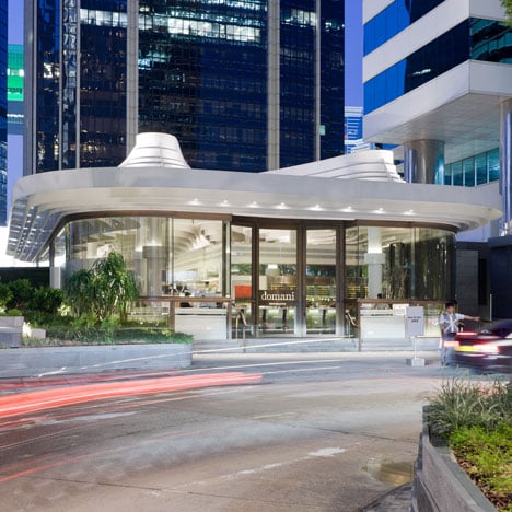
Waves of stone ripple around the corners of a Hong Kong shopping centre that was recently renovated by British designer Thomas Heatherwick.
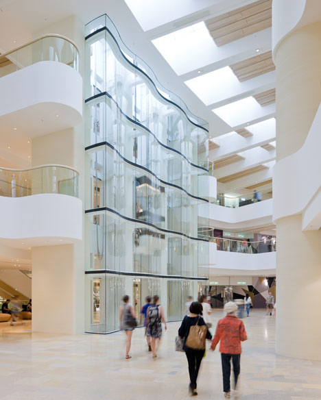
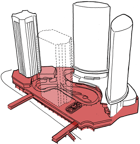
Pacific Place was originally constructed in the 1980s and is located at the base of four towers, which house offices, hotels and luxury apartments.
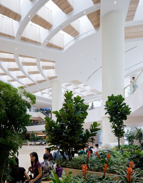
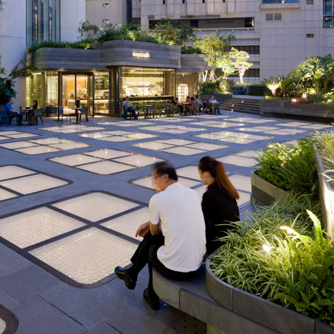
Flat skylights replace the previous pyramid-shaped ones to maintain natural daylight inside the building whilst allowing the roof to be converted into a public terrace.
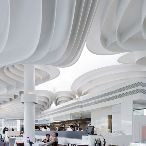
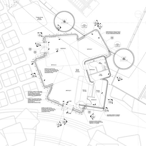
A new restaurant has been constructed on this level, featuring a swirling ceiling of folded steel.
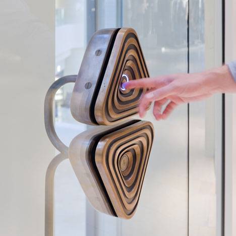
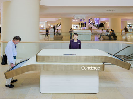
Heatherwick has also installed a new signage system around the building, helping visitors find their way around.
Thomas Heatherwick also recently completed furniture for an English abbey - see our earlier story here.
Photography is by Iwan Bann.
Here's a little more text from the client, developer Swire Pacific:
About Pacific Place
Pacific Place is a large scale, high quality, mixed-use development encompassing floor space of approximately 5.19 million sq ft by gross floor area in the central business district of Hong Kong. It is linked to Admiralty MTR station, with connections to other modes of transport.
Since its inception in 1988, Pacific Place now houses nearly 130 shops and boutiques and two major department stores, collectively offering an array of contemporary fashion and international luxury brands.
The mastermind behind the Pacific Place contemporisation project, Thomas Heatherwick, took an organic approach to the new design, using natural forms and materials to bring a sense of fluidity to Pacific Place.
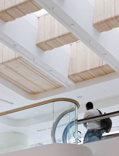
Materials such as natural stone and textured Tektura wallpaper were used to add a sense of depth to otherwise flat surfaces, whilst wood was manipulated to eliminate angular edges and create a more natural flowing sensation within the complex.
Over 1.6 million man-hours have been spent on the contemporisation project since it was initiated in 2007.
Materials used in the renovation include over 3,600 sqm of Limestone and Bedonia stone were also featured in the new design, with 72 variations of plant species employed for the landscaping of the level 4 area.
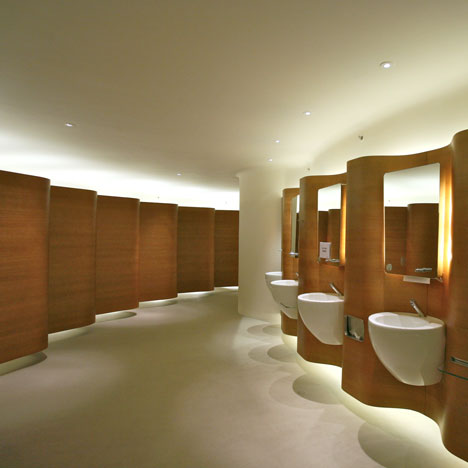
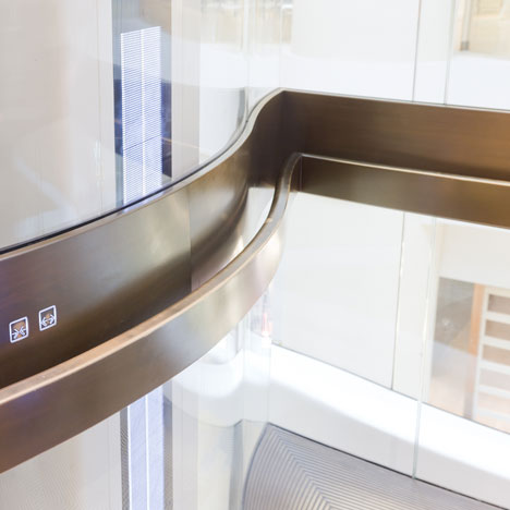
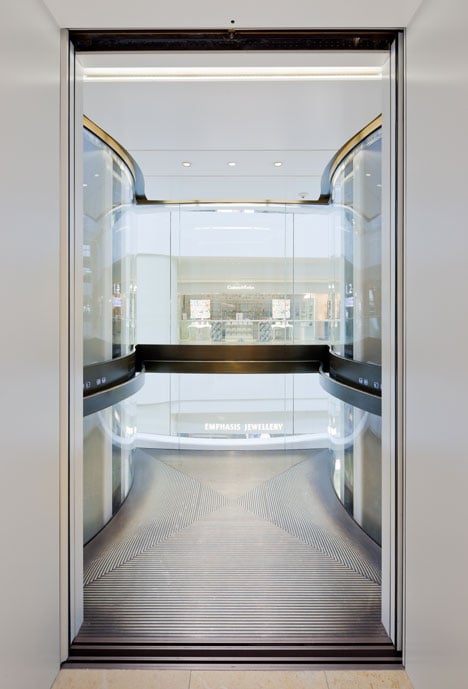
Besides the warmer ambience and softer design of the mall, visitors can also enjoy a new selection of high-end brands and stores at Pacific Place, including luxury department store, Harvey Nichols, British fragrance brand, Jo Malone, and travel accessory company, Tumi. Journeys through the mall are more enjoyable with a new music system continuously playing music tracks interwoven with natural sounds, whilst new escalators to the carpark levels and redesigned bubble lifts make access easier. The washroom facilities have also experienced an upgrade, with a new design which affords visitors the luxury of space in a modern setting. In total, the interior, exterior, and architectural refinements to Pacific Place have cost approximately HK$2 billion.
Click above for larger image
The substantial completion of the Pacific Place contemporisation project marks a new era for Pacific Place, reinforcing its reputation as a premier shopping destination in Hong Kong.