Joyce by Case-Real
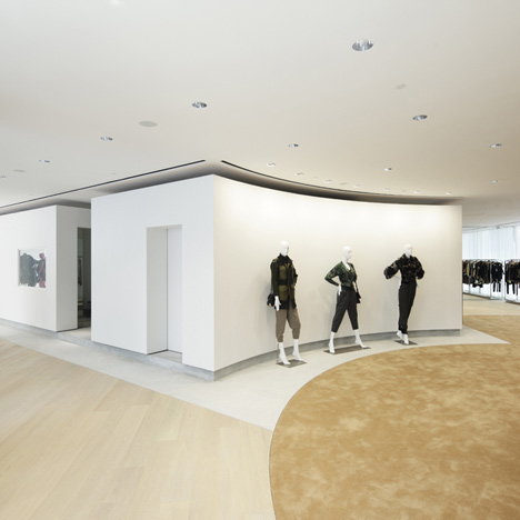
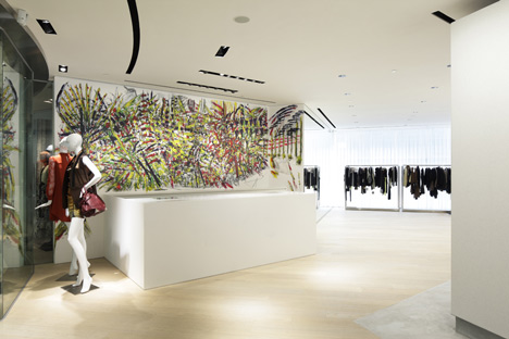
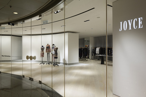
Concave walls at the centre of this Hong Kong boutique hide a stockroom and fitting rooms.
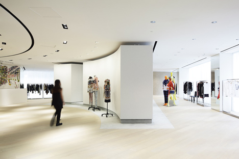
This free-standing core was designed so as not to block the two long glazed walls, which admit an unusual amount of natural light for a shopping centre unit.
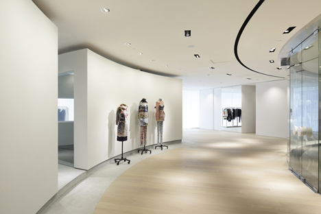
Japanese designer Koichi Futatsumata of Case-Real designed the interior for clothing brand Joyce.
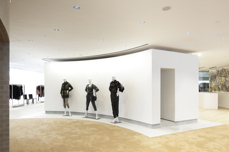
Photographs are by Daisuke Shimokawa of Nacasa & Partners.
Here are some more details from the architects:
A shop design for Joyce, an established Hong Kong boutique with a 40-year history. The site, a corner plot located within The Lee Gardens, a luxury shopping mall in the central area Causeway Bay, is V-ish in shape, with walls of windows on two sides and an area measuring roughly 100 square meters. Even in Japan, it would be rare to get such natural light in adjoining boutique, and we sought to create a bright, open space in this location. To do so, it was imperative that the windows not be obscured by the placement of the boutique's commercial facilities, such as fitting rooms, stock and staff rooms, and the like. We devised a method of assembling those facilities and forming a core in the center of the space.
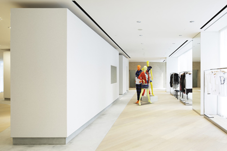
At the same time, Hong Kong gives one the impression of being is a place where all sorts of things from all over the world are brought together, forming a complex mix of urbanity. It is a space naturally crafted as aggregate of the natural environment, man-made elements such as buildings and roads, and the thinking of many different types of people. We felt an attraction to that which is as diverse as Hong Kong's unintentionally formed urban space. Thus, the unintentional contour of the space was kept with a simple reduction in building volume. Just as Hong Kong is as a city, the inevitable volume produced by the location given here was a core, a 'microcosm'.
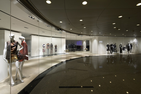 From this, three major advantages are born: 1) an unbroken flow of movement is secured; 2) it becomes a brighter space with no lighting interference, and 3) the multiplicity of expression within the lines of the walls bring out movement in the space. The form of this 'microcosm' holds a sculptural interest as well.
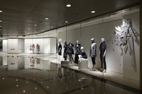
It could be said that, in a way, this unique space was borne of the unintentionality of Hong Kong as a city, rather than something that we produced.
Project Name : JOYCE - THE LEE GARDENS
Design: Koichi Futatsumata/CASE-REAL
Lighting Plan: USHIOSPAX FUKUOKA
Cooperation of construction: SOGO DESIGN HONG KONG
Construction: blueprint design engineering Ltd
Location: Causeway Bay, Hong Kong
Type of Project: Interior Design
Period: May 2011 - Oct 2011
Floor area: 353.9㎡
Art Works: Ryo Matsuoka
Client: JOYCE BOUTIQUE HOLDINGS LIMITED