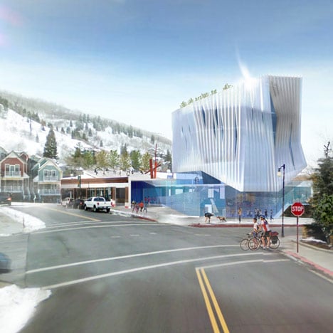
The Kimball Art Centre by Brooks + Scarpa
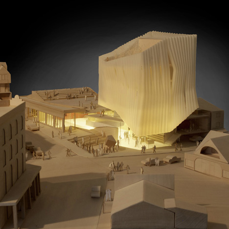
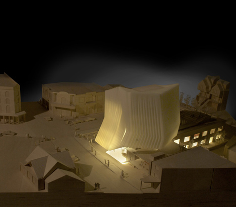
A ridged cloak of glazing would surround the extension to an art centre in Utah proposed by Californian architects Brooks + Scarpa.
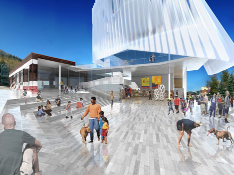
The concept for the new wing of the Kimball Art Centre is one of five designs for the site by different architects.
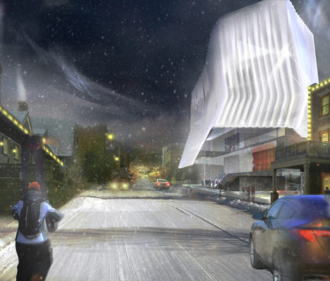
The extension would almost triple the size of the existing building, adding new studios and exhibition areas.
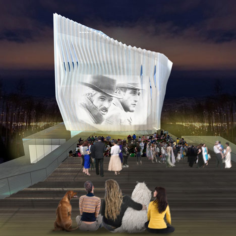
A glazed ground floor lobby would wrap around the buildings at ground floor level, connecting the historic block with the extension.
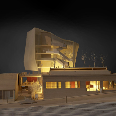
This lobby would open out to a large plaza that will also be used as a workspace for artists in the adjacent metalwork, welding and glass studios.
You can read more stories about studios for artists here.
Here's a more detailed description from the architects:
Brooks + Scarpa Unveils Proposal for The Kimball Art Center – “The Kimball Cloud”
Brooks + Scarpa has released their proposal for the roughly 22,000 square foot addition to the existing 12,000 square foot 1929 historic structure located in the heart of downtown Park City at the corner of Main Street and Heber Ave.
The design concept for the new Kimball Art Center is to perceptually bring the mesmerizing and seemingly endless deep blue Park City sky directly into the space of the city. Despite the time of year or weather conditions, the sky always seems to quickly return to its infinite and hypnotic clarity, with rarely a cloud in the sky. It provokes a kind of indelible wonder; a dreamlike state of mind that engages the viewer, heightens their sense of awareness, and brings a sense of vitality to the place. The Kimball “Cloud” delivers a new experience and expands art into the broader Park City community, creating a new social space for the 21st century.
The building’s façade creates a visual icon, a glowing beacon that can be seen and experienced from a distance and immediately adjacent. The upper floors are composed of a conventional glazing system that is covered by a rain screen made from a translucent honeycomb material. This translucent, faceted skin is not only aesthetic, but also plays a role in the building’s thermal performance. Below this envelope, the new ground level façade is constructed of very transparent glass and opens directly to the street, while delicately connecting and weaving into the heavy mass of the existing historic Kimball building. Spatially, the lower floor is absorbed into the adjacent existing building and the city, while the upper floors overhang the more transparent level below. The new ‘cloud’ building appears to levitate above the site, while the historic structure feels solid and grounded to the earth. This illusion enhances the buildings, giving them a collective strength that neither building could possess individually.
Interior spaces delicately knit together passive and active uses, allowing the community to view and/or participate in the artistic experience. Rather than simply displaying art for view, the new design reveals to the community the very process by which art is created. Every feature of the building is multivalent and rich with meaning—performing several roles for functional, formal and experiential effect.
At the corner of Main Street and Heber Ave, the creation of a large exterior court links directly to the 20-foot high metal-smithing, welding and glass studios that would use this court daily as their outdoor workspace. The façade between the exterior court and studio is visually clear, opening the Art Center to public view. Large sliding panel doors open and connect the exterior and interior together, so artist and students can use the court seamlessly from inside to out. This court, located midway between the existing Kimball ground floor and basement levels, is connected directly to the street, and allows most of the working studio spaces to be visually linked to the street corner. These spaces flow from the court deep into the building linking the new structure with the existing building. In this configuration, the existing basement is opened up and connected to Main Street along with the existing Kimball ground floor and the new structure. Creating this split-level design at the street level on Main Street and Heber Avenue, serves several other important purposes: it allows for great flexibility, affording the Art Center the ability to easily divide and use the ground level for a variety of purposes and functions, both large and small, while still remaining visually open and not feeling like separated smaller rooms.
The heart of the Art Center, the process by which art is made, is connected to the street corner. Passerby can see deep into the building, viewing people working throughout several studio spaces, the main exhibition space and the many other spaces that are visually linked together. Rather than simply displaying art to the community, the process itself is on display.