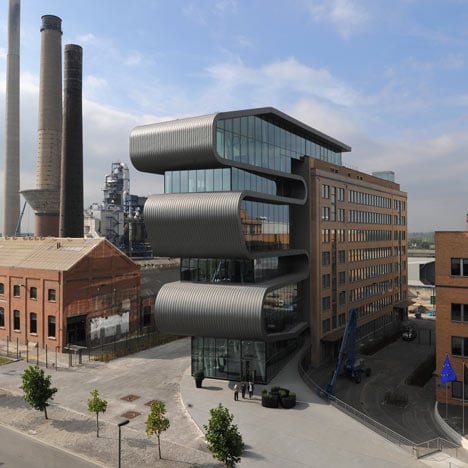
A giant zinc-plated ribbon folds in and out between the floors of this Antwerp office extension for metal refiner Umicore.
Belgian firm Conix Architects completed the extension in 2009, which provides an entrance to the company’s nine-storey-high industrial plant.
The facade of the building is glazed between the strips of curved metal.
The lowest folds of the ribbon shelter the ground floor lobby and create the sloped floor of a lecture room above.
See more projects from Belgium here, including a see-through church and a renovated farmhouse.
Photography is by Serge Brison.
Here's some text from Conix Architects:
Master plan of an industrial site and office building, Hoboken (near Antwerp)
The company plant of Umicore, south of the Antwerp agglomerate, is part of a larger industrial park. The site is a city in itself but lacks structural cohesion and coherence. Conix Architects had to structure this complex site to promote a new corporate identity. In order to integrate the plant better into its surroundings and generate an improved feeling on the whole, reconversion was considered.
Conix Architects developed a strategy which creates a new and more accessible identity for the company. The strengths and weaknesses of the terrain were determined. Based on this, Conix Architects drew up a master plan, including the problem areas and particular issues. The master plan points out the complexity and diversity of the necessary actions. Consequently, the perception and emotions of future visitors and employees are also considered. The functionality and flow of logistical activities are revised and modified, where needed.
Multiple spatial changes are made: adding a compact tower building with offices, screens, green areas, billboards, signage and route descriptions and the renovation of a number of important industrial buildings.
The new office building is the eye-catcher, encapsulating and generating the company’s new corporate identity. It offers a place to stop on the main axis which runs through the entire site. By narrowing and shaping the street profile, the idea of an entry area is created, an element that was lacking. The office building is unrestrained in design in contrast to the monotonous and randomly selected surroundings. The design draws one’s attention, in an emotional response, counter to the existing rational background. By positioning the building at a slight angle, the axis of the central entry road is broken.
The powerful look and feel creates an innovative image, thus modernizing the company. Umicore is ready to face the 21st century as a dynamic and innovating company.
Project name: Umicore Hoboken
Project description: Master plan of an industrial site + extension and new interior design for office building
Client: Umicore Precious Metals Refining Hoboken nv
Site: A. Greinerstraat, 2660 Hoboken
Design submission date: December 2005
Start of construction: September 2007
Delivery date: June 2009
Surface area: 110 ha masterplanning, 2.300 m² new construction, 6.900 m² renovation
Structural Engineer: Ney & Partners nv
Services Engineer: Technobel NV
Safety coordinator: Jean Michaux
Landscape architect: Studiebureel Stockmans nv
Main contractor: Strabag
EPB coordinator: Gebotec
Control officer: Seco

