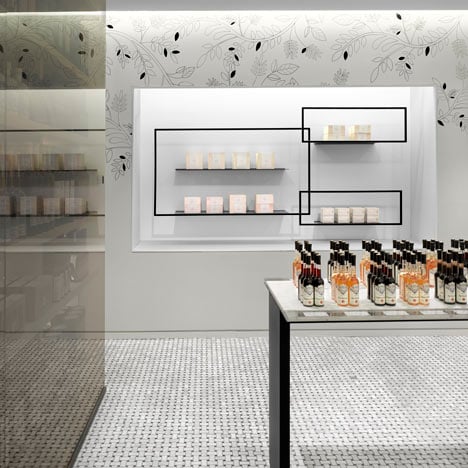
TA-ZE by Burdifilek
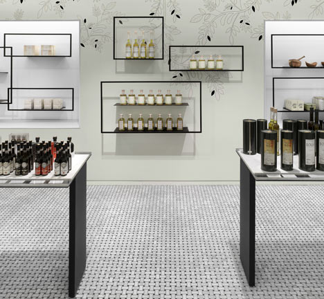
Black frames outline rows of olive oil bottles at this culinary shop in Toronto, while images of olive branches decorate the walls behind.
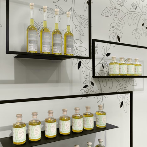
Completed by interior designers Burdifilek for oil specialists Ta-Ze, the shop features marble tasting-counters and a stone mosaic floor.
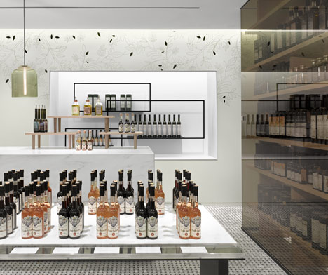
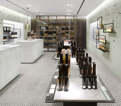
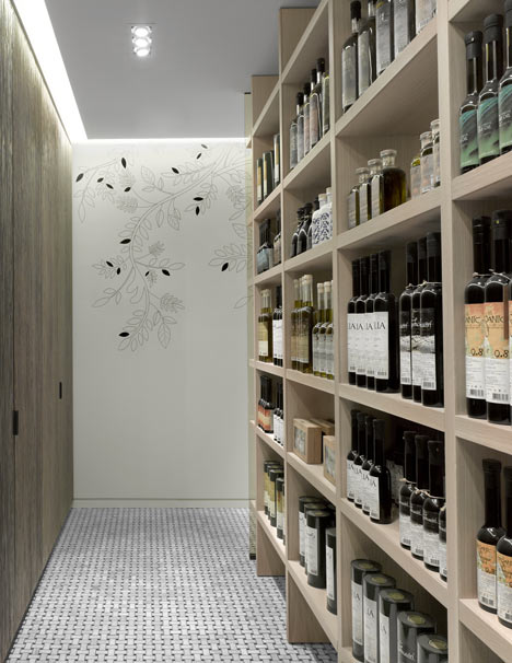
Additional bottles are displayed on marble tabletops, while more valuable oil varieties are stored on shelves behind floor-to-ceiling glass doors.
See also: a wine store built from packing crates and an all-white macaroon shop.
Photography is by Ben Rahn of A Frame, c/o v2com.
Here's some more text from the architects:
TA-ZE by Burdifilek
Canada
Ta-Ze is a unique retail experience for the gourmet chef and food enthusiast alike. It is a modest 800 square foot space, showcasing a variety of premium olive oils and complementary products. The environment is a clean, modern and tranquil space which evokes at once the history of the brand and the purity of the product.
Established in 1915 by the Union of Taris Olive and Olive Oil Cooperatives, the brand represents over 28,000 olive producers and is the first of its kind to carry fair-trade products exclusively. The design emphasizes purity of form and material and complements the product offering beautifully.
The impressive floor to ceiling glass facade showcases products on a simple hanging display system. A welcoming arch of sand-blasted dark solid pine lifts the viewer’s eye toward the illuminated signage, and draws them into the store. The customer steps out of the busy concourse corridor and into an elegant clean space where they are surrounded by beautiful and gracefully merchandised products. Light green walls are subtly layered with an olive branch vinyl deco. On the foreground, matte black powder-coated frames effortlessly float, showcasing the olive-oil, olives and vinegars.
Clear glass cabinets double as storage space and feature wall. The cabinets hold premium olive oil and are located at the back of the store, inviting the customer to explore the entire depth of the space. Two marble countertops serve as a display and a tasting bar, allowing the customer to experience the brand while a sales consultant details the product’s quality and unique characteristics.
The careful design of the store ensures that the product is constantly on display, no matter what feature it is showcased on The customer is free to wander the store while being educated on the uniqueness and pricing of each piece. Product cards displayed in front of each item help navigate the customer as they browse. The use of natural materials such as stone mosaic flooring, wood detailing and solid marble countertops reflect the freshness and authenticity of the products being sold.
Project Name: Ta-Ze
Date Of Occupancy: Oct. 27, 2011
Square Footage: 748 Sf
Project Location/Address: 120 Adelaide Street West, Unit R3, Toronto, Ontario M5h 1t1
Function Of Space: Retail
Design Team Members:
Burdifilek:
Diego Burdi, Creative Partner
Paul Filek, Managing Partner
Ovunc Unal, Project Manager
Tom Yip, Senior Designer
Ovunc Unal, Cadd/Production
Daisuke Matsuura, Concept Designer