Das Haus – Interiors on Stage by Doshi Levien at imm cologne
Cologne 2012: London designers Doshi Levien installed a vision of their dream home at trade fair imm cologne in Germany last week.
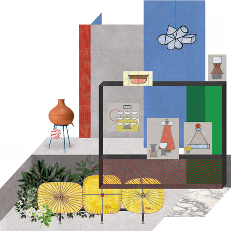
Top: bathing concept visual
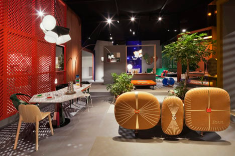
Above: courtyard
The Anglo-Indian husband and wife team were given a platform of 180 square metres to present their ideas about the home using their own designs for brands including Moroso, BD Barcelona Design and Richard Lampert, plus other products on show at the fair.
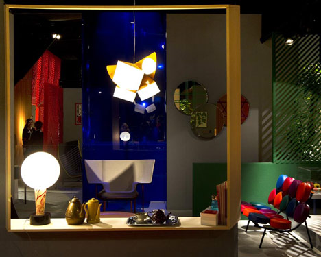
Above: salon. Photograph is by Alessandro Paderni.
Envisaged as part of a dense urban neighbourhood, the model home centres on a courtyard. It includes a workshop/shop where residents can trade with neighbours and an exercise room for activities like yoga.
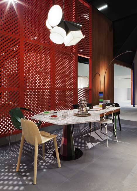
Above: dining table for Stilwerk Gallery
Rooms are connected so that the bedroom can be used alongside the living room for entertaining guests, and the kitchen and bathroom share a cabinet.
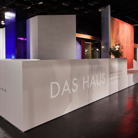
Above: exterior
See all our stories about Cologne 2012 here and all our stories about Doshi Levien here.
Photographs are by Constantin Meyer unless stated otherwise.
Here are some more details from Doshi Levien:
Concept/Das Haus
“It started with a conversation about how you define the home and the vision came together, drawing on a fragmented collage of memories, real and imagined. This is our dream of the perfect home, uniting very plural points of view. This is not a singular, purist approach; we wanted to keep very open to different ideas,” says Jonathan Levien.
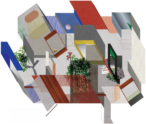
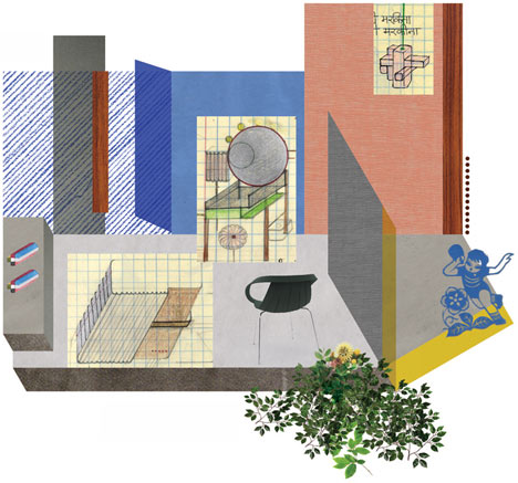
Above: concept drawing, plan
Das Haus is all about domestic activity and redefining traditional spaces, structuring the house into functional zones, eating, sleeping, bathing, dressing, socialising and working. The relationship between these spaces is also crucial; making the transitions and connections from each zone was an essential aspect of Doshi Levien’s design. “Its important for us to challenge clichéd notions of what is a bedroom, kitchen or bathroom. Every part of the house connects and redefines,” says Levien.

Above: concept drawing, side view
This is very much an urban space, inspired by cities that team with life like Tokyo or Mumbai and houses that develop over time, absorbing different identities and influences. “This is a very evocative space that will get people thinking. I like the idea that our house is sensual and layered, rooted in reality but closer to the notion of a perfect house, one that is never complete,” says Nipa Doshi. Ultimately Das Haus is an optimistic and positive vision for the future.
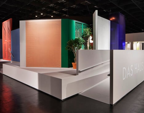
Above: exterior, entrance
Exterior
Doshi Levien’s vision of a perfect house is rooted and enmeshed in the socio-economic fabric of its urban neighbourhood. This is not a stand-alone house to be admired as a monument from the outside, but a space that is sandwiched between other buildings and reveals different aspects of itself depending on where you arrive from. In this sense it is inspired from mixed use neighbourhoods of Shanghai, Mumbai, Tokyo or Rome.
“We worked with intersecting volumes of the kind you might find in industrial buildings to create fragmented spaces. We’re thinking of walls of different degrees of transparency and frames with mesh-like coverings, rather like Indian jaalis.”
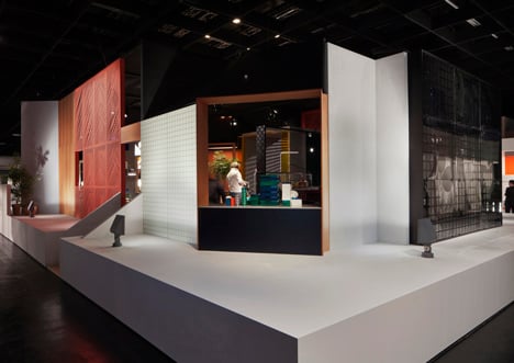
Above: exterior, shop
Exercise/wellbeing
This more or less empty space is simple; the architecture becomes the props that you need to exercise so a wall is for aiding balance, a floor for stretches. An uninterrupted view out onto the courtyard with its lush greenery adds to the tranquility and space.
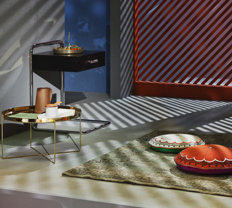
Above: exercise/wellbeing
This house is all about a sensual, refined appreciation of our material environment. “The light cast by the jaali (latticed screen) casts shadows with a visual sensuality.” Pieces featured in this space designed by Doshi Levien include: Rangoli cushions for Moroso
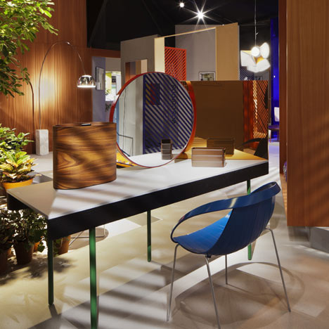
Above: dressing
Dressing
This is not just a room for dressing, it is also a space to curate and celebrate clothing and other personal treasures, displayed in a large transparent display box. Central to the space is Doshi Levien’s new dressing table for BD Barcelona, which, like the house escapes the restrictive notion of what should go where. “This is a room for enjoying the ritual of dressing.”
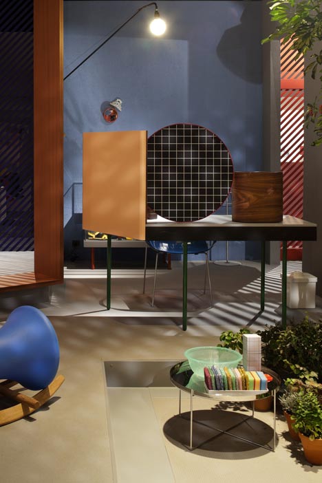
Above: dressing
Pieces featured in this space designed by Doshi Levien include: Dressing table for BD Barcelona Design. Impossible wood chair for Moroso.
Above: dressing
Salon
The Salon is a social room reserved for receiving family and friends in a slightly more formal capacity, the idea here is to play with notions of hospitality and the generosity of sharing. It is equally a room to relax and read or do nothing at all.
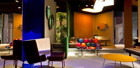
Above: salon. Photograph is by Alessandro Paderni.
With this in mind there will be lots of small side tables for food and drink, generous reading chairs and daybeds for lounging.
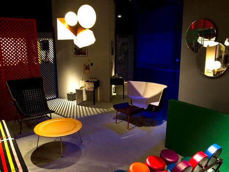
Above: salon. Photograph is by Alessandro Paderni.
“We love the French ceremony Le goûter, when the afternoon lull sets in and you mark a moment of rest with tea, coffee and cakes.” Pieces featured in this space designed by Doshi Levien include: Paper Planes for Moroso, Capo chair for Cappellini, Camper lamp prototype.
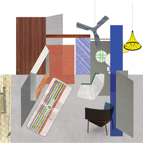
Above: salon
Sleeping
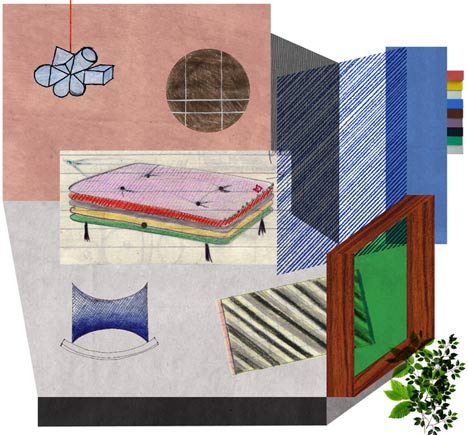
The bedroom is not just for rest, it is also a space for socialising with close friends, of exchanging ideas in a more intimate environment. Inspired by this the bed becomes a combination of sleeping and socialising platform, where you can sit and hold court. The bed is layered with many different fabrics, again celebrating the ritual of preparing a bed, sensual and layered, like the house.
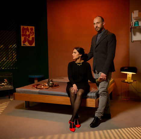
Above: sleeping. Photograph is by Lutz Sternstein.
“We like the idea that the entire bedroom could be a bed, which turns the bed into a kind of platform. And why shouldn’t the bedroom be used during the day as well? Maybe as a place for intimate socialising or laying out your clothes.” Pieces featured in this space designed by Doshi Levien include: Bed for Das Haus
Above: sleeping
Bathing
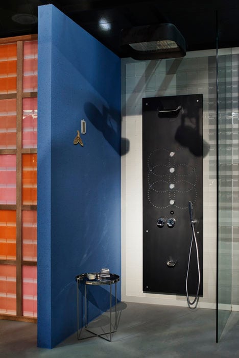
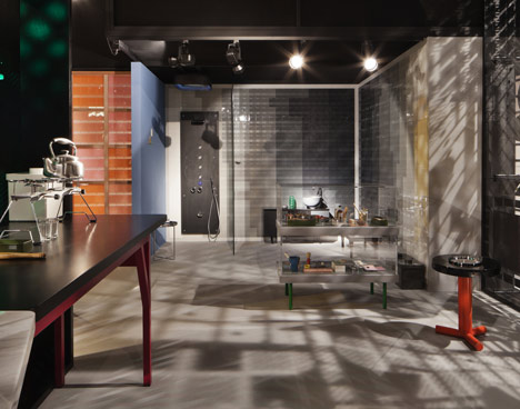
The bathing space is a personal spa using Ananda designed by Doshi Levien for Glass Idromassagio. It takes inspiration from traditional Moroccan hamams. A cabinet between the bathing area and kitchen celebrates the idea of taking different elements of each room and blending them, grinding salt into scrubs or using yoghurt to cleanse faces.
Above: bathing
“For us wellness is a means to physical wellbeing so that it has to do with bathing and the kitchen as well, and that’s why there is a direct link between these spaces and a shared cabinet.” Pieces featured in this space designed by Doshi Levien include: Ananda for Glass Idromassaggio, Display cabinets for Das Haus.
Above: bathing
Kitchen/Pony wall
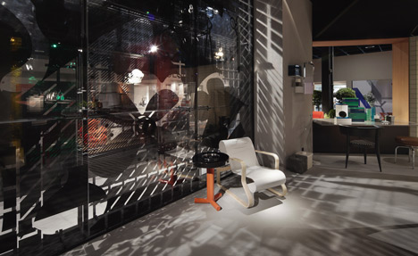
The space itself is more like a market kitchen, full of equipment, a bustle of activity and plentiful food. Art is an essential component for Das Haus: a large multi media mural by Pony explores the whole ethos of the house, revealing all the different areas, and illustrating how they come together.
Above: kitchen/pony wall
This visionary screen wall is an exploding hologram of activity and space. It brings together the connected ideas and cultures of Bathroom, Kitchen and Workshop as vital organs of Das Haus. Like day-dreaming through the kitchen window, your gaze is filled with familial memory fragments — from the past and the future — of ancestral knowledge, technological tools and tacit skills. Noisy and comforting, you find yourself in a place full of love and learning, joy and hard work, surrounded by the fecund instruments of wellbeing.Design by Pony

Above: kitchen
Workshop/Shop
Part utility room, part workspace, part shop; this draws on the fluid proximity of all these elements on the streets of Tokyo and Mumbai. So there is room here for home maintenance, to make useful things and encouraging creative engagement. This space is also for selling and buying from passing traders, an opportunity for commercial interaction between the home and neibourhood. This is also a space for children. Unlike other houses, there are no defined spaces for children here, acknowledging that children rarely observe boundaries, instead follow their curiosity.
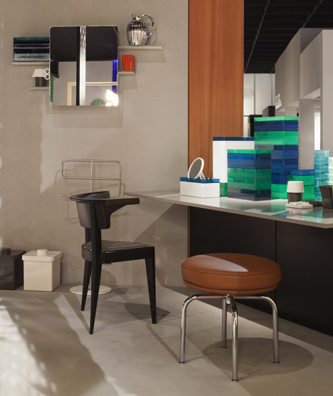
Above: workshop/shop
“The workshop isn’t necessarily a space for making things, it’s also a place where kids can play and the family can get together to do activities." Pieces featured in this space designed by Doshi Levien include: Kali wall cabinet and bathroom range for Authentics.
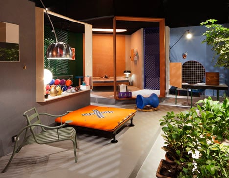
Above: courtyard
Courtyard
Escaping the traditional notion of the dining room, Doshi Levien asked themselves, where do we like to eat? The most important aspect was a good view, so the central courtyard, private and protected from the elements, was the ideal place for eating. Doshi Levien designed a table for Stilwerk Gallery in Germany that appears to be in two parts, responding to the way parallel activities are often carried out in the same location. In the courtyard, plants and herbs provide a link with the kitchen. There is also a pipe for showering outdoors, washing feet and watering plants.
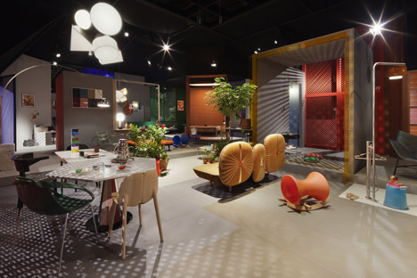
Above: courtyard
“This is an inner world. In this house, you really do face inside from wherever you happen to be, towards the courtyard where the dining table is and all the activities of the house converge.” Pieces featured in this space designed by Doshi Levien include: My Beautiful Backside for Moroso, Charpoy for Moroso, Impossible wood chair for Moroso, Manzai table for Stilwerk Gallery, Children’s Rocker for Richard Lampert, Camper hanging Lamp prototype.
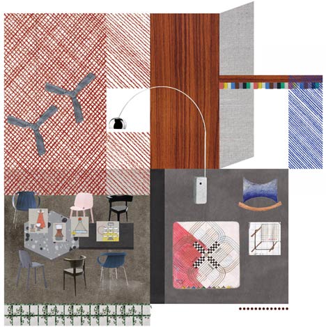
Above: courtyard