Maison boutique by Sybarite
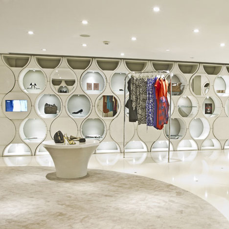
London designers Sybarite have fitted out this boutique in Bengaluru, India, with a modular system of hourglass-shaped shelves
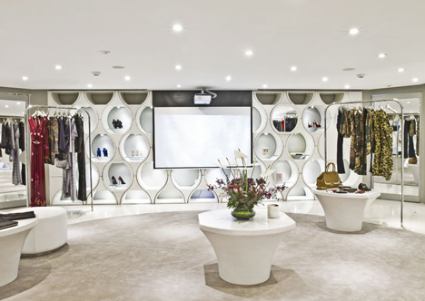
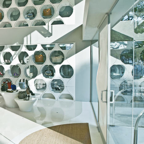
The walls and display units of multi-brand store Maison comprise clusters of the translucent fiberglass modules, which were inspired by the traditional geometric patterns of Indo-Islamic art and architecture.
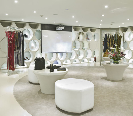
The units are fixed into hidden sockets on the floor and can be reconfigured to include shelves, hooks and inset video screens.
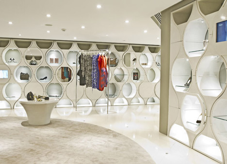
Each one can be lit internally with different levels of light used to create subtle zones in the store.

The double-height glazed side wall of the shop is partially shaded by the modules like filigree screen.
Photographs are by Sam Mohan.
Here are some more details from Sybarite:
Inspiration for the design of this multi-brand boutique came from the way Indo-Islamic art and architecture use repetition of geometric forms to achieve intricate decorative patterns. Echoing the famous dome of the Taj Mahal and other landmarks of the Mughal period, a stylised hourglass form is repeated, building a texture and rhythm reminiscent of traditional patterns but made modern in its application, simplicity and materiality. A module based on this simple geometry is the building block from which all of the interior walls emerge, both an architectural feature in their own right as well as the primary means of display.
The modules can be configured in multiple ways: mirrored; inset with video screens; fitted with shelves or hooks; hinged with doors for storage; glazed as vitrines for jewellery and other more precious items. Moulded of translucent natural fibreglass, each unit is internally lit with dimmable, adjustable LED's, allowing VM teams to adjust the intensity of light and easily create zones and themes within the store.
The hourglass shape is repeated in the clusters of freestanding display units, also in natural fibreglass. Fixed into hidden sockets at the intersection of large quartz floor tiles, discreet stainless steel garment rails are placed within a grid angled at 45 degrees from the perimeter walls. This arrangement permits complete flexibility in the positioning of the rails, allowing the customer's journey through the space to be directed.
Like filigree screens, walls of translucent hourglass blocks flank the glazed, double-height area at the front of the store. Large Barrilux ceiling clouds cast diffuse light, creating a bright, airy space by day and putting the front signage in strong silhouette in the evening. In contrast with the minimalist glazed facade, the front door of curved fibreglass panels repeats the material and translucent finish of the display modules. Subtly applying the Maison identity to the building's existing exterior, the hourglass motif is hinted at once again in the huge Amazonian lily pads floating in the pond at front and in the shape of the aluminium bridge which spans it. The front elevation is clad in wire mesh on which bougainvillea creepers will climb, softening the angles and creating a carpet of greenery to frame the interior.
Shop Area: 300 m2
Shop address: Vittall Mallaya Road, Bengaluru, India
Client: 23 Carat / Prestige Group, India (Sana Rezwan, Rezwan Razack, AM Shameem)
Architect: Sybarite, London, UK (Simon Mitchell, Torquil McIntosh)
Local Architect: RC Architecture, Bengaluru (Nandan Damle, Suraj Anchan)
Completed: October 2011