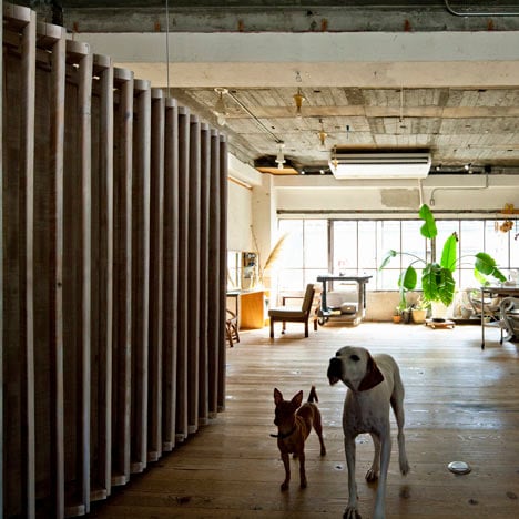
A neat row of wooden louvers conceals a small sleeping chamber inside the attic staffroom of a hair salon in Hamamatsu, Japan.
Japanese firm 403architecture started the renovation by stripping the walls, ceiling and floor of the loft bare, before laying the roof rafters as floorboards.
The former floorboards were recycled to create the walls and ceiling of the louvered bedroom, which is propped up on one side where the floor level changes.
The ceiling overhead is left unfinished, with exposed lighting fixtures and ventilation ducts.
This is the third unusually titled interior we've published recently from 403architecture - see the first two here.
Photography is by Kenta Hasegawa.
Here's a description from 403architecture:
The Grid of Santen
This project is the staffroom of the hair salon in Hamamatsu, Japan.
The client needed a space to take a nap and meal. Fortunately, there is a timber deserted loft at the rooftop of the same building.
So we aimed at solving this contradictional demands by using materials from this rooftop loft.
At first we wrecked this loft, then calculated all of materials. Then, we begun to study on the CAD, which means that we constructed the actual measure and materials in the virtual space.
Also in the construction term, we used the huge parking to spread lots of materials as if in the virtual space of the CAD. We choose the "site prefabrication".
We converted "ex beam" to the new floor, and "ex floor board" to the new columns, and "ex joist" to the new beam for the structural system of layering miner grids.
Ex floor board which become columns works as double louver controlling eye view, keeping air flow.
And this louver solve that contradictional demands "nap" and "meal". With each louver, one side was painted white, the other side was not painted.
So we can see this volume as white, light one from the entrance, in the other hand, we can see as massive wooden volume from the cutting space. We wanted to propose an alternative distance.
Inside is white space but actually it looks soft yellow because the light from outside moves around and reflects with the non-painting louver.
The surface of each material painted white has a marbled pattern because we wanna use existing pattern of the each materials which consist of the loft.
And this volume hanged out from the ceiling to simplify each connection by canceled the weight of itself.
Though out this project, we reconstructed every topic of the architecture such as structure, program, study, construction, window, volume, surface by converting the structure which had already constructed to the new system.

