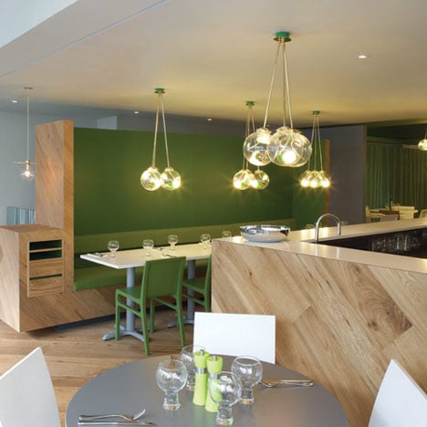
ASK Hertford by Gundry & Ducker
London studio Gundry & Ducker have added oak booths and stencilled tree-like graphics to the interior of an Italian chain restaurant in Hertfordshire, England.
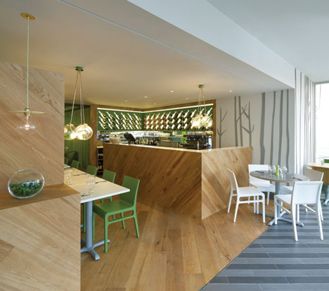
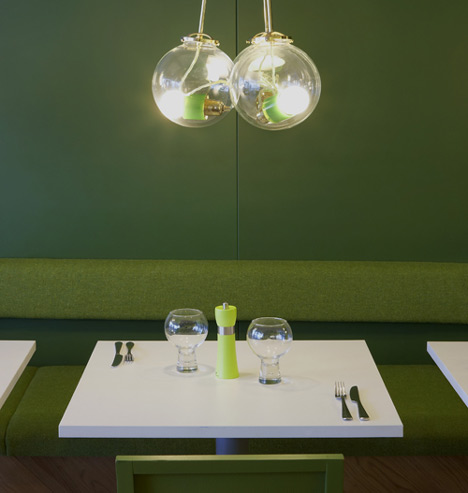
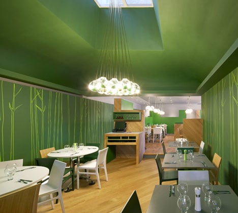
Bauble-shaped pendant lights are clustered in each of the three dining rooms of ASK Hertford, two of which feature deep green walls.
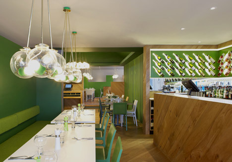
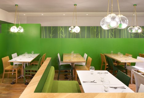
Oak tables and chairs are either laminated or painted in green and white, arranged randomly around the restaurant.
Wine bottles displayed on the walls behind the wooden bar appear to have bright white shadows.
The restaurant is one of a few ASK outlets that the architects are upgrading.
You can see a couple more projects by Gundry & Ducker here, including a pub inside a cardboard box.
Photography is by Hufton + Crow.
Here's some more text from Gundry & Ducker:
Ask Italian Hertford
As part of a major refurbishment program Gundry & Ducker were asked to re-design Ask Italian in Hertford.
The design is intended to create a warm and relaxed dining environment for both the evening and daytime, whilst maintaining a sense of the simple white restaurant interiors that typified Ask's early restaurants.
The restaurant is sited within a sequence of interconnecting spaces, Victorian shop, covered courtyard & Edwardian showroom, which with their differing volumes together provide the framework for the design.
The first space is light and addresses the street, The floor is striped in contrasting grey tiles, bespoke pendent lights hang low over a mix of white and timber tables, projecting a silhouette onto the ceiling at night that are echoed on the walls. The openness of the space is contrasted with a sense of enclosure created by high backed benches, with rich green interiors and a new bar and back display.
The second space is a vertical volume with a vaulted ceiling and central lantern light. This dark green volume is dominated by the a chandelier, a version of the brass and glass bespoke lighting that runs throughout the restaurant, The walls are decorated with murals in light green inspired by the out line of trees, in turn influenced by the history of the town.
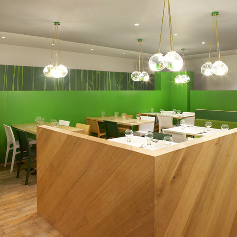
The third space, previously a draper’s showroom, is the largest and lowest of the three. Here the space is sub divided into "a space within a space", where walls are cut away to form castellated screens and booths green on the insides, clad in oak on the outside.
Throughout the scheme the oak flooring is manipulated to form the furniture, turning the boards through 45° and up the face of key elements within the space. Interior reveals and lit elements are picked out in greens from a pallet that runs throughout the restaurant. The tabletops are a mix of sharp white and laminated timber the laminated chairs are finished in Oak and greens from the recurring pallet.