Pombal Castle Hill by Comoco Architects
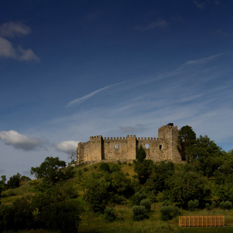
Portuguese architects Comoco have added a weathered steel cafe and a wooden gazebo on the hill of a castle in the town of Pombal.
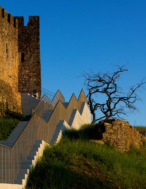
The two new structures accompany a set of repaved pathways, as well as a new castle entrance and reconfigured parking area.
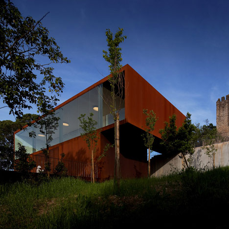
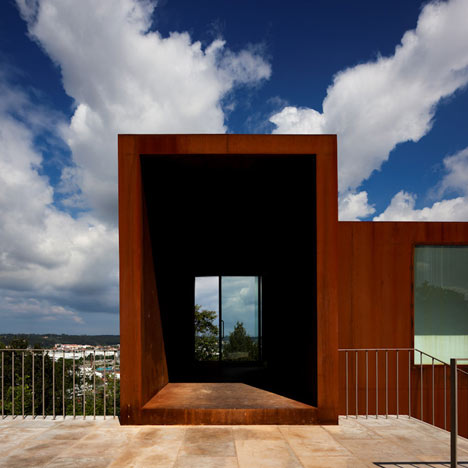
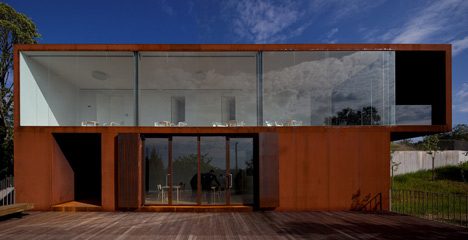
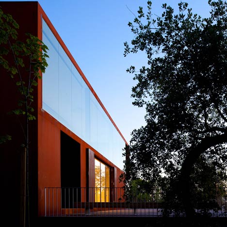
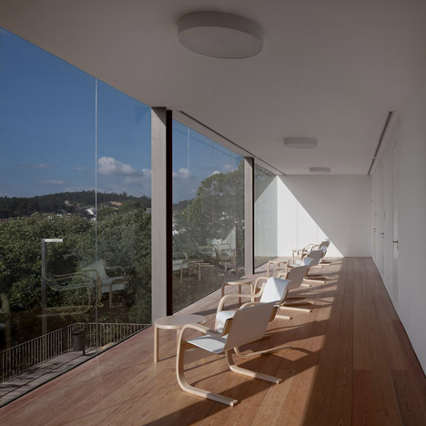
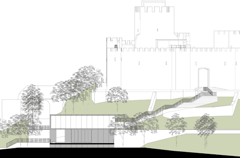
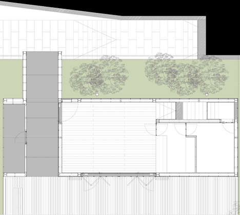
The two-storey cafe is clad in Corten steel and features large windows that overlook the surrounding town.
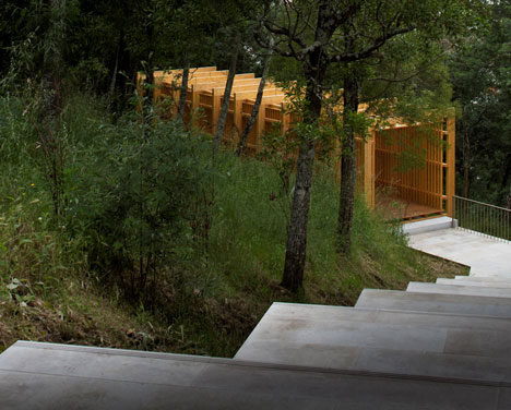
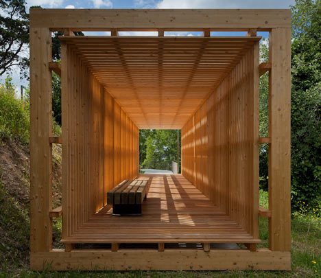
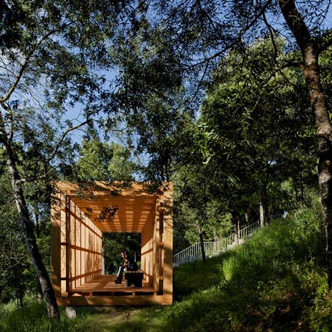
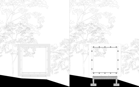
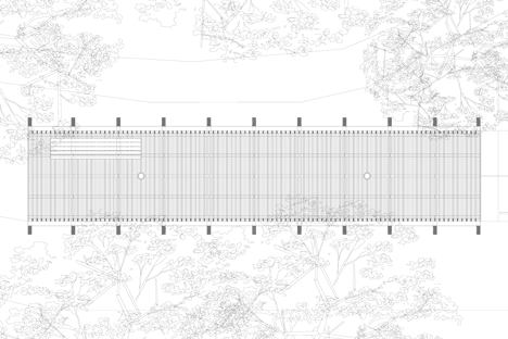
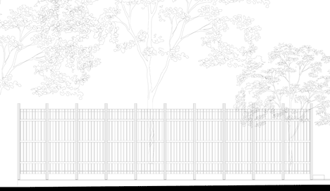
Located near the bottom of the hill, the rectangular timber pavilion is constructed from evenly spaced wooden slats.
This isn't the first castle project we've featured by Comoco Architects - read about a visitors centre with walkways built through and around a castle here.
Photography is by Fernando Guerra.
Here's a more detailed description from Comoco Architects:
Reorganization of Pombal Castle’s Hill. Pathways and Facilities
Comoco Arquitectos Luís Miguel Correia, Nelson Mota, Susana Constantino
Previous State
Throughout the last decades, Pombal Castle and its surrounding area have been doomed to seclusion from the core of the city at its feet.
For the ordinary city user, the Castle was only a background for the everyday, a mere identity reference that resonated with the history of the city more than with an actual experience of it. “Rua do Castelo”, a street defining the South and West perimeter where the hill meets the city, embodied the boundary that defined those two realms.
From that street, some connections with the walled precinct were possible. They were, however, just a vague memory of previous uses, and their conservation decayed progressively, hampering public use.
The area’s vegetation - nowadays uncritically cherished by the population - is, paradoxically, the result of the abandon to witch this area was devoted throughout most of the 20th century.
Aim of the Intervention
The project for the reorganization of Pombal Castle’s hill was launched by the city’s municipality with the goal of promoting the re-centralization of that area. The basic brief of the commission encouraged a design that would help fostering the use of that historic area by both residents and tourists.
A more elaborated programme was developed collaboratively by municipality’s politicians and technicians, together with the design team and enriched by the feedback delivered by the population at the proposal’s preliminary stage.
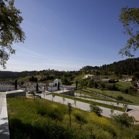
The basic premise was that the project should improve the connections between the urban areas at the bottom of the hill, the hill itself and the walled precinct.
The articulation with the Castle, the hallmark of the city, should be tackled in order to preserve its importance for the population’s shared identity.
To increase the area’s attractiveness some facilities should be created to answer needs such as car parking, comfortable and safe pathways, resting and contemplation areas and a cafeteria. Archaeological and preservation works should also be central to bring about and highlight the area’s history.
Description of the Intervention
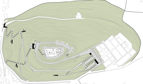
The basic character of the intervention is an attempt to deliver an approach were the new designed elements should be clearly defined against the background of both the natural and the built pre-existing elements, without challenging the latters’ character, tough. The project defined three areas, each of which with a different approach.
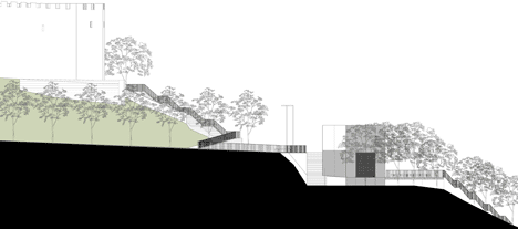
In the first area, the south and west slopes of the hill, the approach was focused in the idea of flow. This idea was thus developed creating and highlighting connections between the urban areas at the bottom of the Castle’s hill, pathways along the slopes and gazebos to provide shelter and foster diverse experiences in the contact with the landscape. The materials used were prominently plastered walls, stone and grit pavements, and wooden structures.
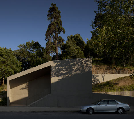
In the second area, in the surroundings of the cemetery, the approach was concerned with the idea of a topographical design of the infrastructure. Both the parking area and the adjacent facilities were designed as topographical elements, concrete walls supporting the transition between sharp differences of levels.
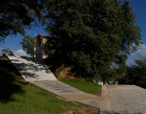
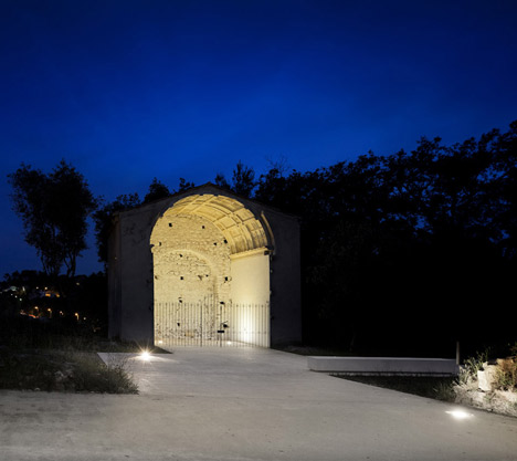
Finally, the third area, surrounding the walled precinct, aims to enhance the Castle as the main built element of the area. The west access to the Castle was redesigned, including the platform at its bottom.
The surrounding area of Santa Maria’s Church was also redesigned to provide a public space that could foster its appropriation as a privileged stage for performances and other cultural activities. The material that is thoroughly used in this area is limestone, the same used in the main landmarks, the Castle and the Church’s ruins.
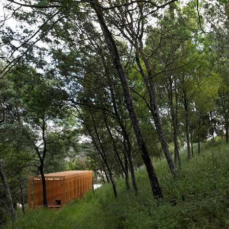
To work as a connector between these areas, a cafeteria was designed, proving thus an additional element to attract visitors to the area. To highlight its singular role in the overall intervention, the cafeteria was built using a metallic structure and finished with corten steel panels both on its façades and roofs.
It embodies, thus, the design’s strategy of affirming the new against the pre-existing preserving, however, the identity of the place. With this project we aimed at creating a delicate balance between nature and artefact.