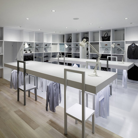
Japanese designers Nendo have a furnished a suit store in Okayama like an office, with conference tables, bookshelves and desk lamps.
Suits at the Halsuit concept store for menswear retailer Haruyama hang beneath the wooden tables, while accessories are arranged on the wall-mounted shelves.
Circular mannequin stands conceal a set of fitting rooms in the centre of the store.
Elsewhere, the floor and ceiling surfaces change in colour and material to highlight an area where shirts are displayed.
Other boutiques designed by Nendo include one filled with fake doors and another where shoes are showcased on timber staircases - see all our stories about Nendo here.
Photography is by Masaya Yoshimura.
Here's some more text from Nendo:
“HALSUIT” design concept
A concept shop for high-volume mens suit retailer Haruyama.
Haruyama offers its customers a dizzying number of options for suits, shirts and ties. Variety of choice is one of Haruyama's strengths, but customers can also be overwhelmed by the number of options, and find it difficult to choose the best matches for their suit.
Families can get bored, and the overall atmosphere isn't always as conducive to relaxed, pleasant shopping as Haruyama would like. Our first decision was to move the fitting rooms from the edge of the shop floor to its centre. We used the front exterior walls of the fitting rooms as showcases for different ways of coordinating the suits, and installed a counter with magazines and television for friends and families. Matchable accessories are arrayed around the area, making it into a focal point where shoppers can develop an image of the suit they'd like to have.
Most suits are worn to the office, so we used lighting reminiscent of desk lamps, and shelving in the style of office storage units to create the right scene. We replaced posters with LCD screens, and transformed the sales area for shirts into a server room.
Shoppers make their purchases at a 'reception desk', and lounge and conference room-type spaces help shoppers to imagine their own work styles as they select their suit. The space reflects Haruyama's brand concept, that men should define and enjoy their personal working style.
We used louvers that change colour depending on the angle from which they're viewed for the shop exterior, so that the image of the shop varies, depending on the direction from which drivers approach.

