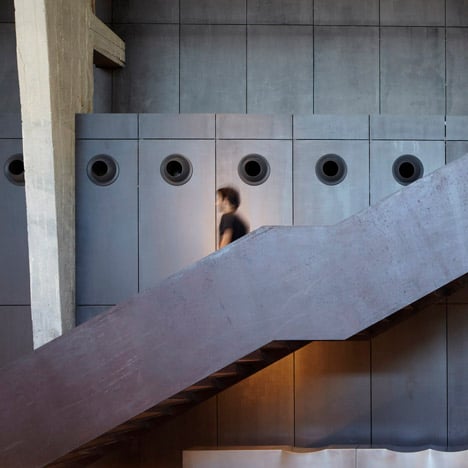
Israeli architect Pitsou Kedem has completed a showroom for furniture brand B&B Italia inside an industrial warehouse by the harbour in Tel Aviv.
Silicate panels line the western wall of the 11-metre-high hall, while other interior walls are clad in concrete panels.
A deep-framed entrance leads visitors inside, where a rusted metal staircase climbs up to a narrow mezzanine that bridges the full width of the showroom.
A wall of metal-framed window panels divides the space into two and some of them pivot open as doors.
Furniture on show inside the warehouse currently includes a sofa by designer Patricia Urquiola - find out more about it here and see more stories about B&B Italia here.
The text below is from Pisou Kedem:
The Shell and its Contents – Italia B&B Showroom
The designer breathed new life into an abandoned and dilapidated building in the Tel Aviv harbor area, and created, around one of the finest furniture collections in the world of design, a space that is both powerful and yet restrained at one and the same time.
The 11 meter high structure with a unique façade consisting of a line of pillars that creates a clear and well defined construction grid, was used by the designer as the base for the entire outer shell.
The architect chose to leave in place only the pillars and beams and to remove everything else leaving just a hint of the structures history with the rectangular, silicate western wall, being specially treated to preserve its original look.
In the design for the interior of the building, the architect expresses his own, local interpretation for the display space where there is a continuous space, achieved through light, sight and movement along with the use of industrial materials that correspond with the industrial look of the outer shell.
The aim was to create a display space that was both impressive and powerful but without detracting from the importance of the furniture on display.
The central idea was to create a shell that would stand as an architectural element in its own right whilst still respecting the contents of the structure.
The use of unprocessed materials in their natural and original form (such as concrete panels and rusted iron) succeeded in empowering the industrialized look but also not to overpower of the furniture display.
The outside of the structure was sheathed in industrial, concrete looking panels and, despite the buildings great height; the architect designed a low, metal entrance that emphasizes to all those entering the structure the human relationship and the contrasts that strengthen the power of the space's height once inside the building itself.
From outside, the façade is almost anonymous and, for the most part, sealed.
Due to the decision not to adorn it with huge signs as is usually the case with other showrooms, but rather to preserve the minimalistic and restrained look from the outside, the company's logo was positioned on the walls of the entrance "tunnel" thus strengthening the effect of the contents – furniture display.
There is an awareness of the importance of the furniture collection on display and of its designers and of a sincere attempt to follow the so fragile and delicate dividing line, to design both a showroom that is impressive and eternal whilst not imposing the architecture on the contents.
Design: Pitsou Kedem Architects
Design Team: Pitsou Kedem, Irene Goldberg, Raz Melamed

