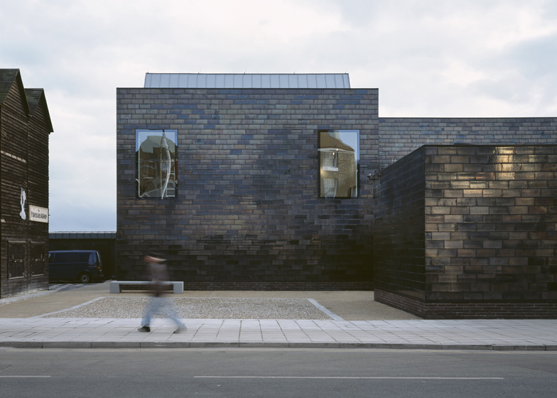
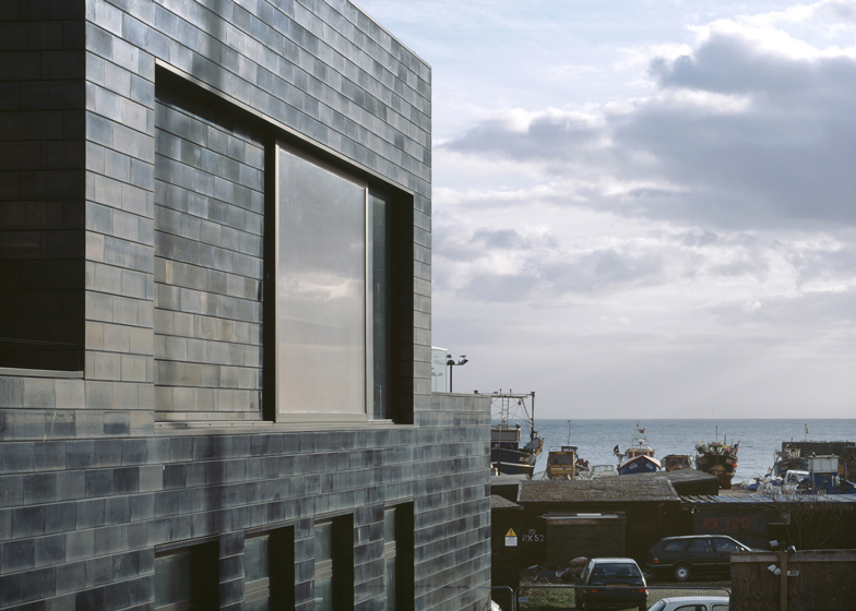
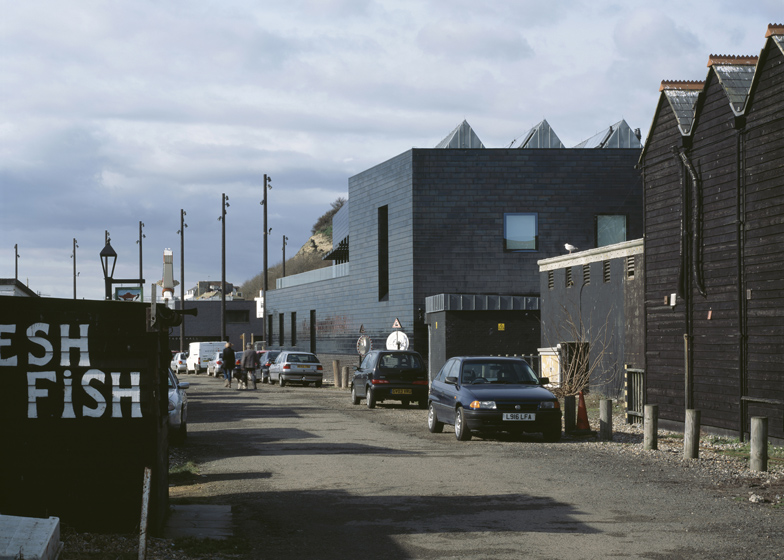
Slideshow: British architects HAT Projects have completed a seaside gallery in Hastings, England, with a shimmering exterior of black glazed tiles.
Positioned between a fairground and a fish market, the two-storey Jerwood Gallery has a U-shaped plan that folds around a private rear courtyard.
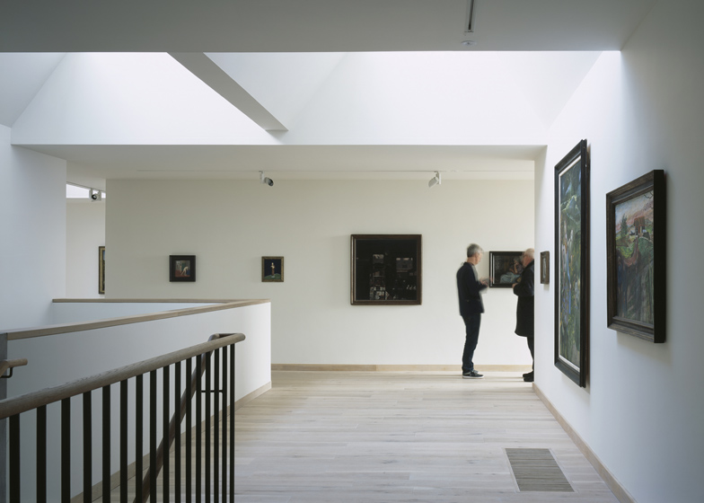
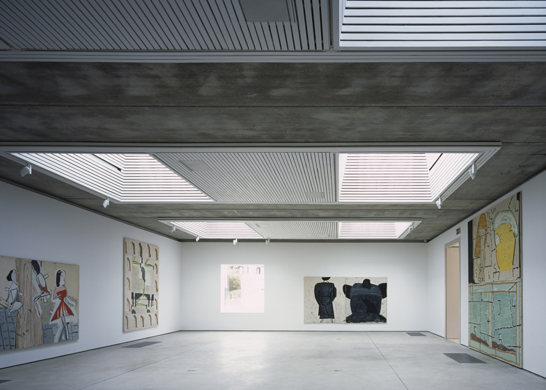
One large hall on the ground floor will host temporary exhibitions, while a permanent collection is housed within a series of domestic-scale galleries upstairs.
Pointed roof lights let natural light into rooms on both floors, which also include an education room, storage areas, a shop and a first-floor cafe.
Another seaside gallery that has opened in the UK in the last year is Turner Contemporary in Margate - see it here or see more stories about galleries here.
Photography is by Ioana Marinescu.
Here's some more information from HAT Projects:
The Jerwood Gallery is a £3.3m new-build art gallery on the Stade in Hastings, part of a wider masterplan to develop a new public space and community uses on a former coach and lorry park occupying a pivotal seafront site.
Click above for larger image
Hastings has a growing artistic community but is also one of the most deprived towns in the UK and the wider Stade project aims to assist in economic regeneration, through more year-round tourism and higher-income visitors, as well as culturally and socially through creating a facility that will bring national-quality arts experiences to all the community. It also aims to raise internal and external perceptions of the town through creating a new focus for civic pride and identity.
The site sits at the foot of the medieval Old Town, between the East and West Cliffs which dominate the townscape. The Stade - a Saxon word meaning ‘landing place’ - is an interstitial zone between the town and the working fishing beach, and the site is between the ‘Amusement Stade’ of fairground rides and penny arcades, and the Fishermens Stade of the Fishmarket and tall black net shops that are unique to Hastings.
In this extraordinary location, the gallery is conceived as a strong and civic building in a sensitive dialogue with its surroundings.
Click above for larger image
Urban analysis
The masterplanning of the site (also undertaken by HAT Projects) involved detailed analysis of the townscape and urban grain of the area. In particular, the unique listed net shops - not found anywhere outside Hastings - give the eastern end of the Stade a very particular character and urban pattern, with small courtyards between the rows of huts. We felt that it would be important to continue this rhythm along the street, and also to consider views of the net shops very carefully in terms of the new building’s massing.
Lessons were also learnt from how some much larger buildings - in particular, the Fishermens’ Chapel - nestle among the net shops and use more permanent, solid masonry in contrast to the more provisional timber cladding of the huts. East Cliff House - a Georgian structure which was the first ‘gentleman’s residence’ to be built with a deliberate sea view - also gave clues in its massing and hierarcy of a semi-rusticated ground storey projecting to the street, and more elegant ‘piano nobile’ upper storeys set back.
The use of black glazed mathematical tiles on Lavender House, next to East Cliff House, was one of the leads behind the development of the glazed cladding for the Gallery. Robus Ceramics, the Kent- based workshop that produced the replacement mathematical tiles for its restoration, worked with us to develop the bespoke hand glaze for the cladding.
Masterplan and consultation
The brief for the wider site was developed to reflect the needs of the Old Town community in particular, and the traditions in Hastings of holding festivals and celebrations such as Jack-in-the- Green and Bonfire, which previously had no public space in which to focus. The medieval Old Town lacks any fully accessible community buildings and there is very little public open space due to the tight urban grain of the area.
The masterplan was developed with the participation of an extensive network of local groups and representatives. This included residents’ groups, heritage groups, local business, fishermen, arts and education providers, and other local community organisations. This ‘advisory group’ met monthly with HAT Projects and Hastings Borough Council to feed into emerging options and design approaches.
The emerging proposals were tested through several rounds of full public consultation in addition to the ‘advisory group’. The feedback was overwhelmingly positive and laid the base for a strong local engagement with the project.
HAT Projects worked with Hastings Borough Council to procure the architects for the detailed design of the other masterplan elements. Tim Ronalds Architects were appointed and the project was completed on site in Spring 2011.
Design
The Jerwood Gallery is designed as a contemporary civic building in a sensitive dialogue with its surroundings.
Clad in hand-glazed black ceramic tiles which refract and reflect the changing seaside light, the gallery’s form is simple but carefully calibrated. It is broadly structured with a relatively inward-looking ground floor around a small internal courtyard, and a more outward facing first floor recalling the ‘piano nobile’ arrangement of a palazzo or villa.
On an urban scale, the building continues the rhythm of the net shops, creating pockets of public realm off the street. The two-storey mass is set to the south of the site, allowing the net shops to be glimpsed over the single-storey entrance and temporary gallery wing which is pushed to the street edge. Facing the public space, the glazing to the first floor cafe window slides back fully to form a covered balcony from which to spectate the festivals and events for which the Old Town is renowned.
Reflecting the character and scale of the Modern British art they will house, the internal spaces are more domestic in scale than industrial art-warehouse, although the space for temporary exhibitions tends towards the latter. The collection galleries generally have views north or east to the Old Town, or into the courtyard, and the arrangement is intended to encourage exploration through the building, discovering unexpected spaces and views, rather than a simple axial plan.
Sustainability
Sustainability has been embedded in the design from first principles, including the orientation and plan diagram of the building, as well as the approach to materials and servicing. All the galleries are naturally lit (with optional blackout in selected spaces) and the building is almost all naturally ventilated, with the exception of the collection galleries where the air-conditioning is driven entirely through ground source cooling. Eleven 120m-deep ground source probes provide all the cooling and 60% of the heating for the building. Solar thermal panels provide most of the hot water for the building, and rainwater is collected and recycled for use in the WCs.
The Foreshore Gallery is naturally ventilated with fresh air drawn through underground ducts from the courtyard through grilles in the floor, and extracted through automatically operating mechanical louvres in the rooflight lanterns. A mechanical supply and extract system is also provided for situations of high occupancy or when exhibitions require a closer acoustic control to the environment. The exposed concrete soffit and concrete floor provide thermal mass, and air can also circulate behind the wall lining, using the thermal mass of the blockwork behind.
Key facts
Gross external floor area: 1380m2 (excluding 80m2 courtyard and 56m2 terrace) Gross internal floor area: 1260m2
Construction budget: £3.3m
Project budget: £4m (not including art collection)
Anticipated CO2 emissions: 27kgCO2/m2/yr - 40% of the CIBSE benchmark for museums and galleries
Design team
Architect: HAT Projects
Structural engineer: Momentum
Services engineer: Skelly & Couch Quantity surveyor: Pierce Hill
Access consultant: People Friendly Design
Main contractor
Coniston Ltd

