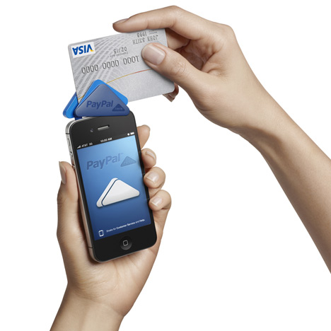
PayPal Here by Fuseproject
Online payment system PayPal have launched PayPal Here, a device designed by San Francisco studio Fuseproject that allows users to make face-to-face transactions by plugging it into the top of a smartphone.
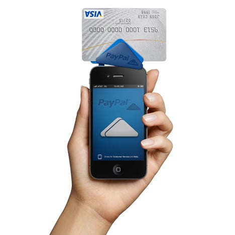
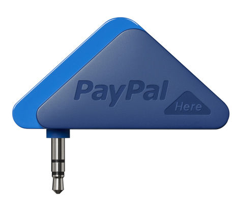
The arrow-shaped device contains a strip-reader between its two layers, while the front section twists to overlap the front of the phone and prevent it pivoting on the jack.

It's controlled via an app and a completed transaction is signified by sound.
The device and app are free but Paypal takes a 2.7% cut from every transaction.

Fuseproject and PayPal collaborated to develop the branding, packaging and online experience for the system, which is to be rolled out in the USA, Hong Kong, Canada, and Australia first.
See more projects by Fuseproject on Dezeen here.
The details below are from Fuseproject:
Mobile payment is changing commerce and creating new and easy social interactions around commerce. When PayPal approached fuseproject with an idea to facilitate real world payments, the prospect of creating a physical product and new brand for the e-commerce pioneer was a tantalising design challenge. PayPal and fuseproject’s brand and design team partnered on the expression of this new experience through all interaction points, from naming to packaging, sound and device, web and communication.
The leader in online payment, PayPal, is moving to face-to-face transactions and will bring the ease and comfort of their online platform to the real world. We named it PayPal “Here” to highlight its physical presence and anywhere-anytime possibilities.
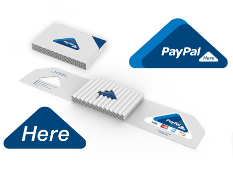
Most payment transactions are disconnected and confusing, with Paypal Here we sought to create an ecosystem where all elements are clear, simple, consistent and a pleasure to use. The Here logo, iconography, packaging and device follow an arrow-like form that references the physical world where payments happen one-on-one, and also the virtual cloud world that enables these new forms of payments.
The arrow is an ancient symbol that shows something being done in the here and now, and became the inspiration for the shape of the of the product, logo, web, graphics, naming and application sound design. In the PayPal Here experience the arrow also represents easy payment. It expresses how each swipe sends your transaction onward to the cloud.
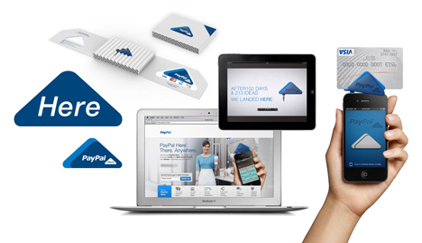
Functionally a large card stripe reader dictated the wide base of the arrow, while the offset surface layer on the card reader easily identifies the credit card swiping track for the user. The front triangle is also an innovative drop down lock that prevents swivel or pivot when one swipes a card. The width of the device track fits perfectly on a smartphone while ensuring enough of the card is read for a successful transaction every time. The product and application experience is further enhanced by sound design when the swiper is inserted in a phone, or when a transaction is complete.
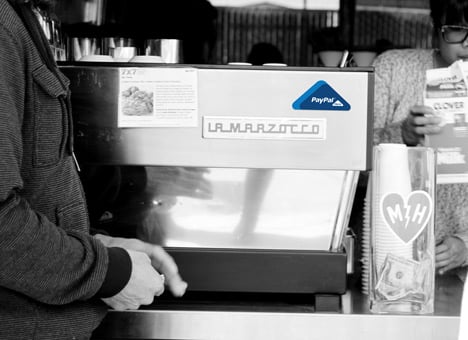
The Here shipper is a smart corrugated triangular box, made of a recycled corrugated material that insures robustness and flexibility when sent through the mail to customers. It includes an iconic Here sticker that becomes a recognisable icon for the Here service.
PayPal Here does more than accept payments - through its distinct design and brand ecosystem, it serves as a brand flag for PayPal in the everyday real world.