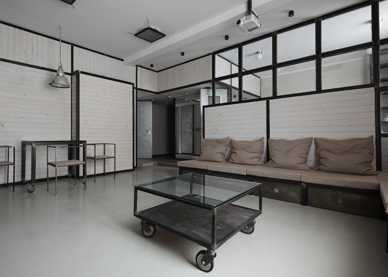
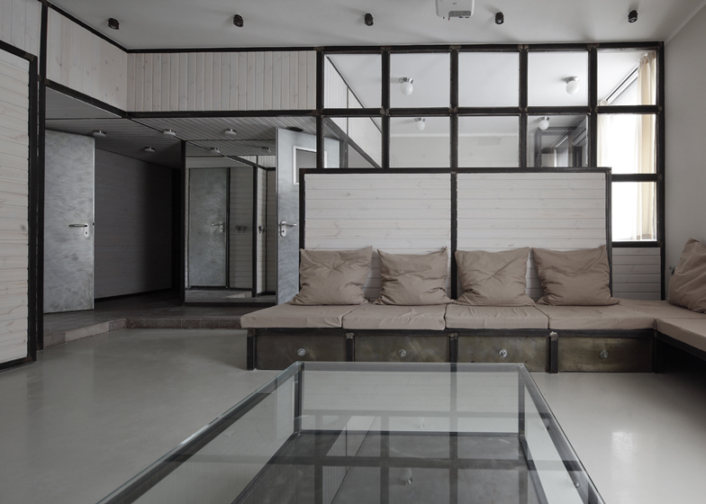
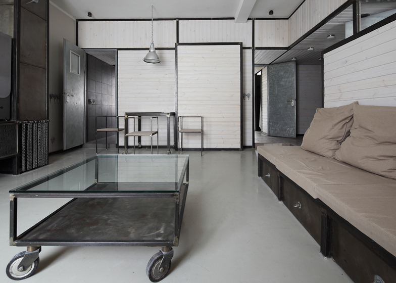
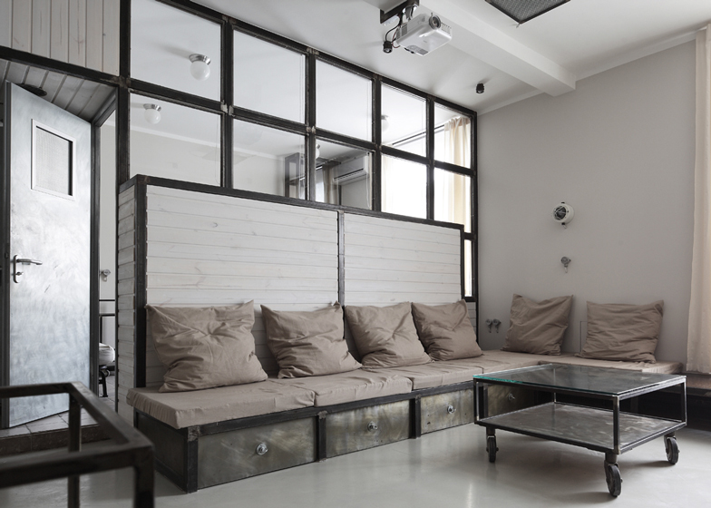
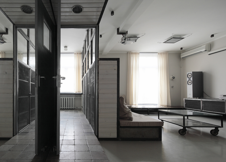
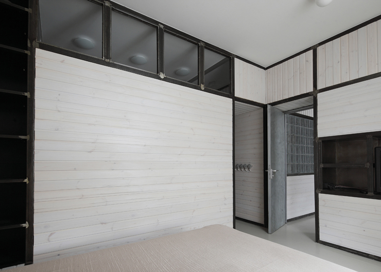
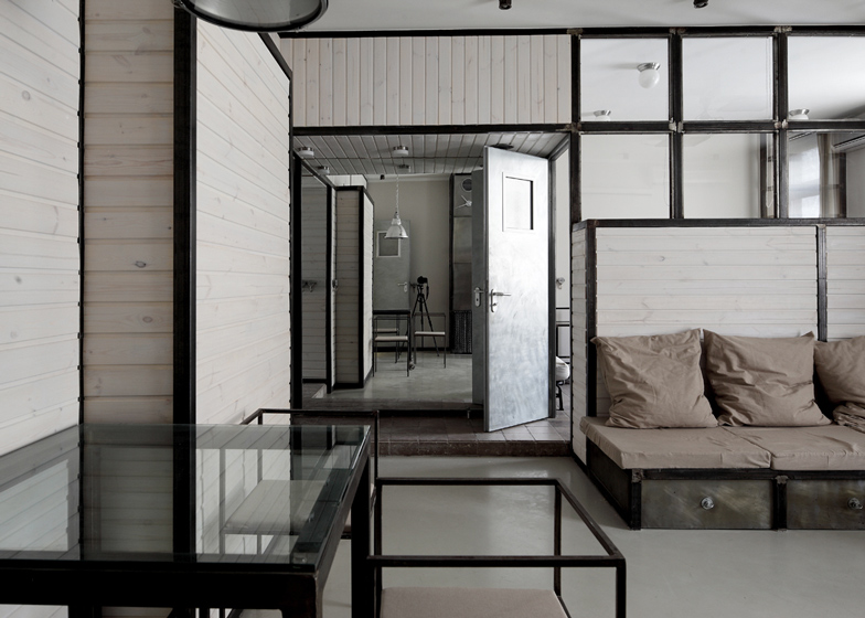
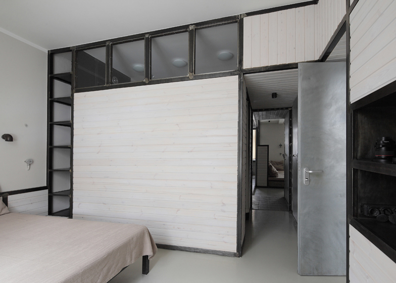
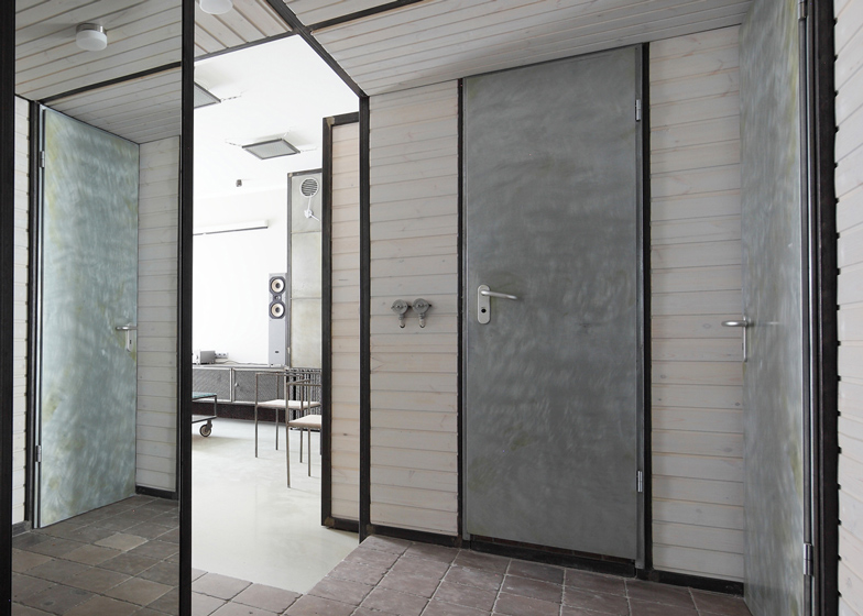
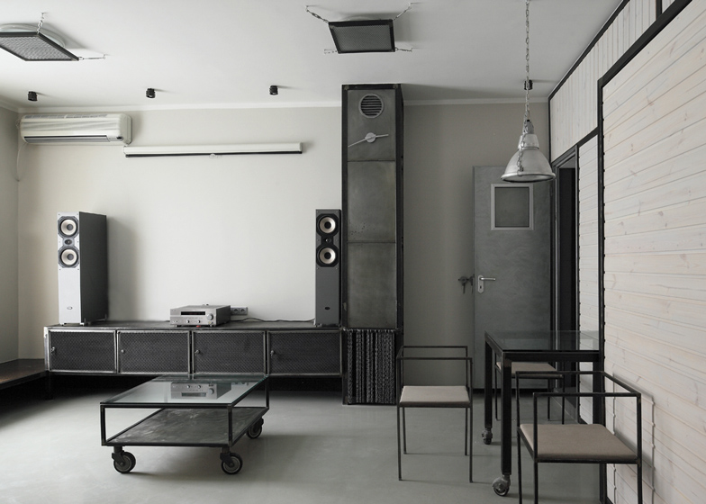
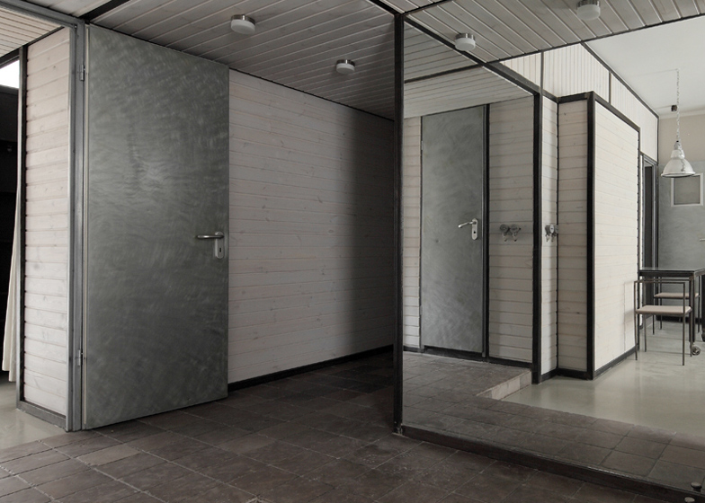
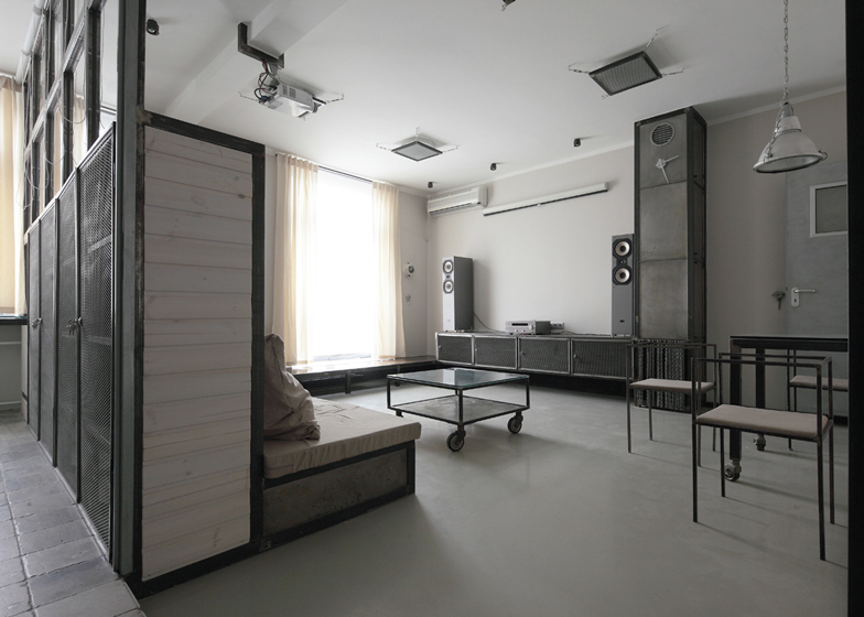
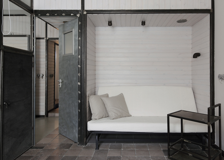
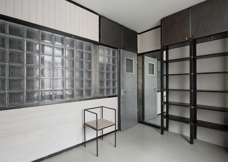
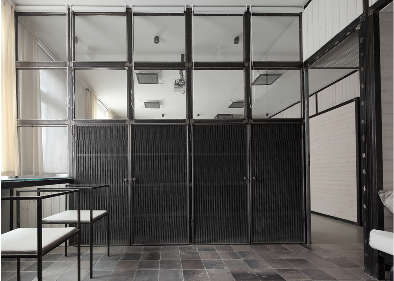
Slideshow: Russian architect Peter Kostelov has removed the welded metal walls of an apartment he first completed seven years ago and replaced them with light timber partitions.
These panelled screens sit within the retained metal framework that lines each room and are complemented by beige-coloured soft furnishings.
The layout of the residence remains as it was, but the architect has renamed it Wood Warm Wight Apartment to reflect its new bright and less industrial appearance.
When we first published the interior Dezeen readers called it "stark" and "like a jail cell" - see the original design here and let us know how you think the two compare.
You can also see all our stories about the architect here.
Photography is by Zinon Razutdinov.
Here's a longer description from Peter Kostelov:
WWW.AP (Wood Warm Wight Apartment)
The previous project of this apartment was called as” Moscow Metal Apartment”.
It was finished in the end of 2005. After it served for 7 years it was decided to bring in some changes.
The apartment plan stayed the same, as well as carcass of all metal frames, which form walls, partitions and items of furniture.
As for filling between frames which initially was metal plates now replaced by white toned wood.
While the look of the previous design is associated with words “Industrial”, “Extreme”, “Cold”, “Gloomy”, “Hard”, “Dark” the new one is a complete opposite.
Here come the words: ”Warm”, “Wood’, “White”, which explains the name of the new project: WWW.AP
In fact these probable changes of the artistic image of the apartment were assumed initially.
Steel carcass ran through the apartment performing such functions as planning, dividing the space, creating the elements of furniture and items of interior. While shape-generating are still metal frames filling is just an accessory.
Theoretically filling inside frames could be of any material: stone, wood, cork, even textile.
Yet working with metal was extremely interesting at that moment as it seemed almost impossible to apply this material for interior of a living space.
Nevertheless it appeared to be captivating and surprising.
Just mere change of frame filling resulted into stunning effect as the apartment looks totally different.
In fact it was primary task: keeping all basic characteristics: design, walls and partitions lay-out on the assumption of minimum efforts and expenses to make possible changes from brutal and industrial look to warm and cozy living space.
Surely warm grayish-beige colors of walls and other elements of décor-cushions, curtains, and bedspread also supported this change for WWW apartment.
As a result utterly new space with new characteristics came out.
Before filming this new project it seemed it would be correct to replicate pictures of old apartment made 7 years ago so that to compare two object as “before” and “after”.
But after a few pictures were filmed it became clear that even focusing on the old point of camera and keeping the same size of pictures still we get totally changed space.
“Dark” and Light” graphics created new design and concept, while metal and wood combination point to contrast of materials and texture. Definitely now we see absolutely new image which lives in its own laws.
Built Area: 86m2
Architect: Kostelov Peter

