City Hall Harelbeke by Dehullu & Partners
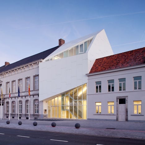
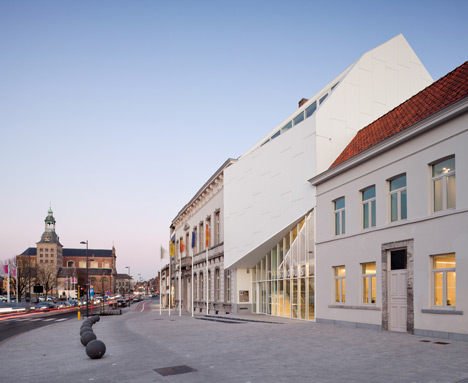
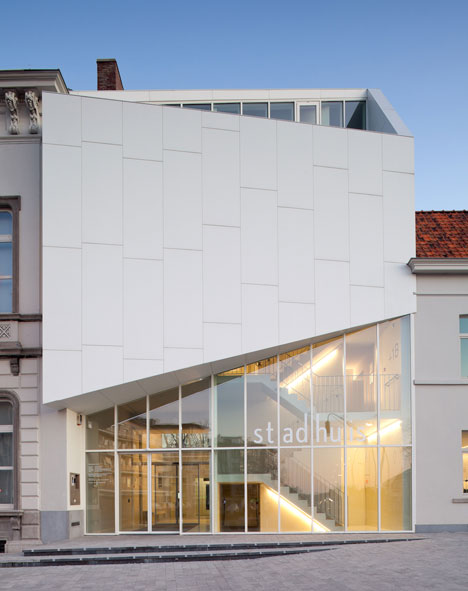
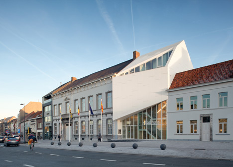
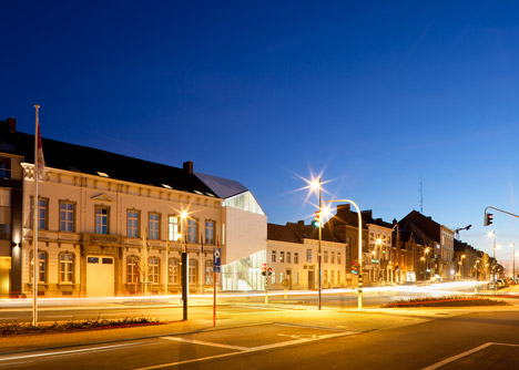
This asymmetric white building bridges the two existing halves of a town hall in the Belgian municipality of Harelbeke.
Local architects Dehullu & Partners designed the structure to provide an entrance reception for the hall, as well as new meeting rooms and a tourist information centre.
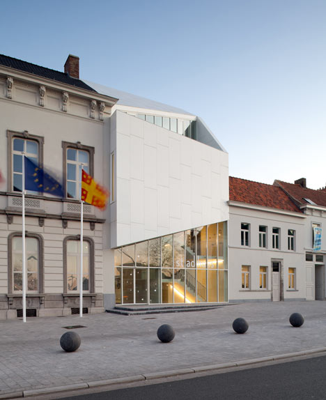
The white panels that clad the facade are made from Corian and they skew upwards to partially screen a balcony on the second floor.
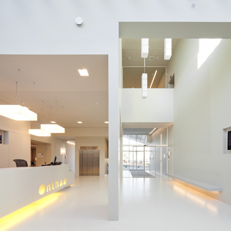
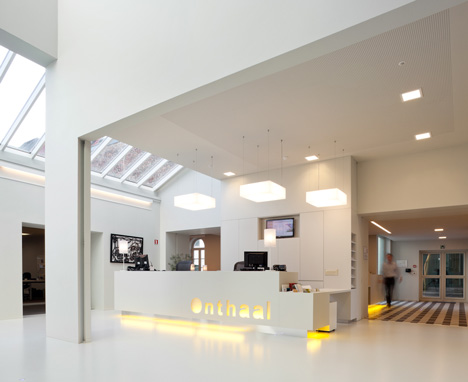
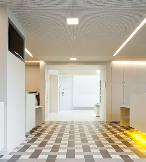
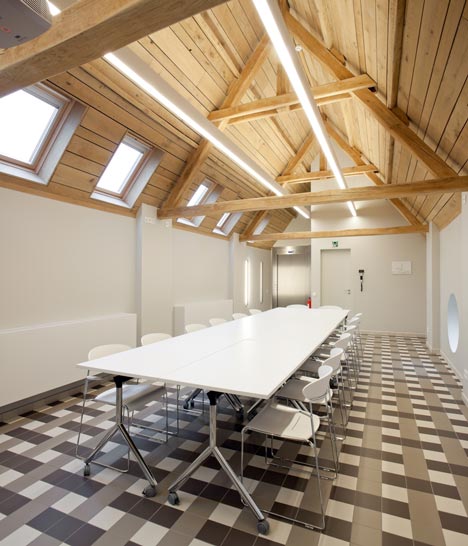
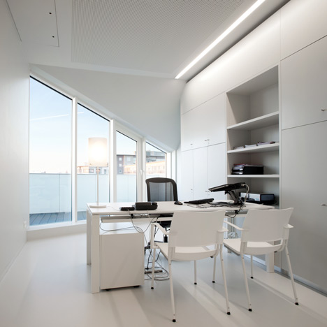
Grey and white tiles create chequered floors inside meeting rooms and offices, while suspended rectangular lights illuminate a desk in the reception area.
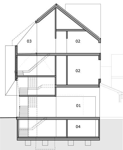
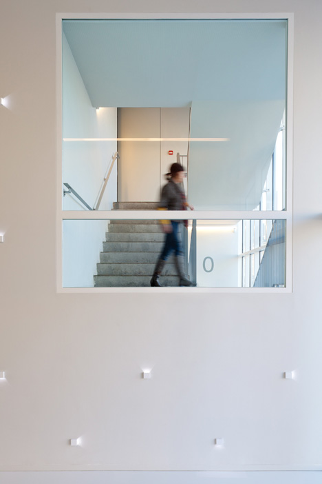
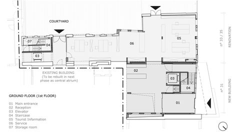
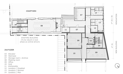
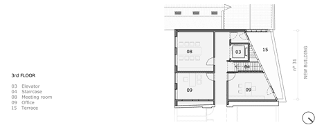
Staircases and lifts are strategically located to overcome the issue that floor heights in the two existing buildings do not correspond.
Another unusual town hall from the Dezeen archive is composed of overlapping cylinders - see it here.
Photography is by Tim Van de Velde.
Here's some more information from Bert Dehullu:
The Town Hall of Harelbeke, Belgium by Dehullu-Architects (text 21/03/2012).
The works that have been conducted are part of a masterplan that was developped in 2007. Due to the growing needs of the city services, the Town Hall was looking for an extension of their site.
In order to anticipate these growing needs a masterplan was developped. In this plan the historic site of a 19th century flax-factory was incorporated in the new site of the Town Hall.
Redevelopping the new site, a new entrance building was designed, centrally located between two existing historically valuable buildings.
The new entrance building links it’s adjacent buildings. None of the floors of these neighbouring buildings were corresponding.
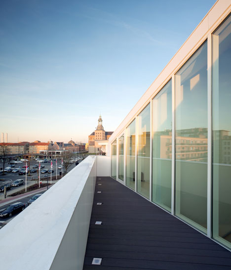
The challenge was to make all of the floors accessible for wheelchair users. Therefore the location of elevators and staircases was very carefully thought of.
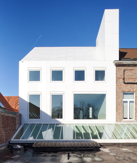
Since it’s central location in the city, the new entrance building was designed to be a contemporary ‘landmark’ on the main road of Harelbeke. Therefore the cladding of the facade and the roof was executed in a dirt repelling white material.
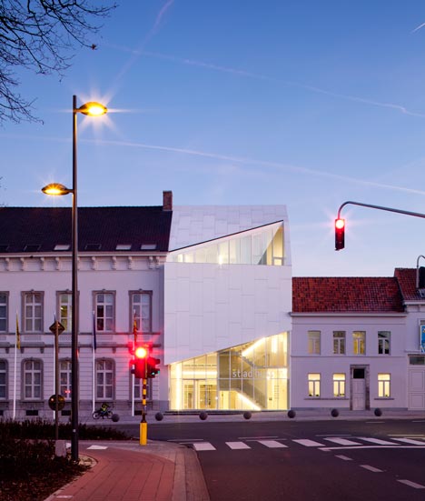
The material is a mineral substance of the brand Corian. It is the first time in Belgium that this material is used as exterior cladding.
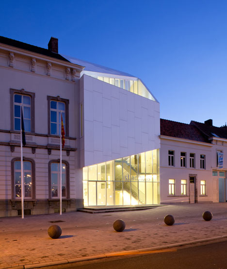
Furthermore, part of the historical flax-factory was renovated. The walls and roof of this part were carefully preserved and restored according to the recommendations of the institute of cultural heritage.
On the inside of this historical part, the pattern of the tiled floors refer to a weaving technique, to make the link with the history of this building.
Click above for larger image
Sustainability was an important aspect in the building process.
Click above for larger image
No cooling was installed in this office building. Due to the high degree of isolation, the use of windowblinds and the white colour of the cladding, overheating of the building can be avoided for the Belgian mild summer climate.
Click above for larger image
In a next phase the central spot in the site will be transformed into an atrium, in order to centralise all of the city services so the current and future needs of the civilians can easily be satisfied.
