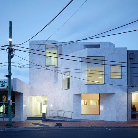
Australian architects Demaine Partnership have completed a marble-fronted dental surgery in Victoria.
Large frameless windows wrap around the corners of the polished facade, which folds back towards a glazed entrance.
Grooved recesses in the white-rendered rear walls divide the three-storey building into a row of blocks, pierced by a set of openings.
An apartment is located above the clinic on the top floor.
Other dental clinics from the Dezeen archive include one in Prague with illustrated walls and another in Austria with an interior coloured like toothpaste.
Photography is by Peter Clarke.
The text below is from the architects:
Beaumaris Dental
This project began when two dentists, who are also father and son, decided that they needed a new building for their growing dental practice - a building that would reflect the quality of their dentistry and modern equipment and a building that would serve their business well into the future.
Our first task was to assist the clients realise the potential of the site and to understand the projected local urban development. This exploration led to the brief being for a three storey mixed use building that provides the ground level for their dental business, a second level for a commercial tenant and a third level as an apartment for the son to occupy.
For the design of the building, we began by reflecting upon the aesthetic ideals of dentistry and the role of the dentist to sculpt and shape teeth. We took this as our starting point for the architecture.
We developed the design to achieve a considered interplay of the qualities of translucency, reflection, depth, solidity, surface and composition with the aim of giving proper expression to the craft of dentistry. This attempt to evoke allusions to dentistry harks back to the tradition of buildings communicating the service or trade that occurs within.
The street facade of this building is a smooth veneer of polished marble and glass. The pattern of the stone and the configuration of openings convey a homogenous surface.
As the light changes those glazed surfaces that previously offered solidity via their reflections become deep punctures in the monolithic quality of the stone and, like an x-ray, it is the (uppermost) edges that appear most translucent.
This facade folds in from the adjacent buildings to offer a forecourt and a modest expression of civic presence. The angled surfaces articulate the building as a cluster of elements and provide a sense of depth and movement via the manipulation of perspective sightlines.
The rear facades employ sharp incisions to white rendered surfaces to dissolve transform an otherwise box-like form into a cluster of crisp, white elements. Deep window reveals provide requisite shading and an expression of mass.
The interior spaces offer a picturesque circuit via the staircase and moments of vista. At the first floor large windows provide the strong visual connection with the street sought by tenants and the windows to the north are screened to respect the sensitivity of the residential interface.
Throughout the apartment baroque-like concealed light sources suggest spatial extension; surfaces toy with reflection and the incised motif is again used to suggest mass.

