Dezeen Wire: here's a round up of design critics' reactions to the retrospective of British design that opens at the Victoria & Albert museum in London tomorrow.
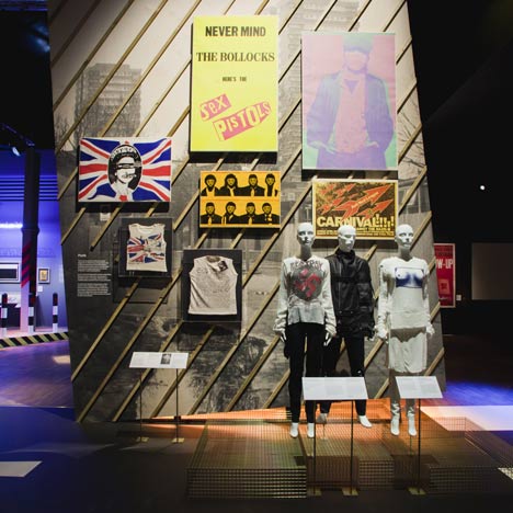
The exhibition is the first major presentation of post-war British design and includes over 300 significant objects representing the evolution of design in the country from the 1948 Olympics up to the present day.
Writing in The Guardian, Fiona MacCarthy, who was the newspaper's design writer during the 1960s, describes the curators' choice of start date for the review of British design as "an embarrassingly opportunistic link back to the 1948 London Olympics," claiming that it should have begun two years earlier with the Britain Can Make It exhibition, which was also held at the V&A.
Also in The Guardian, current design critic Justin McGuirk suggests that interesting parallels can be drawn between the products on show and the evolution of UK politics over the same period but feels that the curation doesn't represent recent British design favourably, "partly because it is drawn mainly from the V&A's own collection, and museum collections are weakest when it comes to contemporary artefacts."
Jay Merrick, design writer for The Independent, describes the exhibition as "timely and ambitious," but says the choice of familiar buildings such as Norman Foster's Gherkin and the Falkirk Wheel is "disappointing" and "rather safe," when more ambitious architecture projects have been left out.
Design Week's Emily Gosling also finds the architecture section disappointing, claiming: "even the Gherkin model in all its ridiculous phallic splendour doesn’t make for a particularly engaging finale."
Meanwhile, The Observer has invited six British designers – James Dyson, David Bailey, Zandra Rhodes, Richard Rogers, Barbara Hulanicki and Ron Arad – to talk about their favourite designs, the most unusual of which is Bailey's choice of gaffer tape.
See all of our stories about the V&A here.

