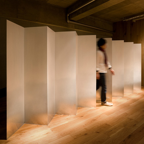
A steel screen zigzags in front of a shampoo area at this dimly lit beauty salon in Gifu, Japan, by architect Hiroyuki Miyake.
Paint applied to the surface of this two-millimetre-thick screen gives it a graduated surface that becomes more and more reflective nearer to the Japanese oak floor.
A missing fold at the centre of the zigzag provides an entrance.
Three chairs are positioned opposite in front of square mirrors, while a square window provides a view into a storage closet at the back.
See more stories about salons and spas in our dedicated category.
Photography is by Rikoh Adachi.
Here's some more explanation from Hiroyuki Miyake:
Beauty salon TROOVE by Hiroyuki Miyake

This beauty salon is located in Gifu, Japan, and is designed by Japanese designer Hiroyuki Miyake.

This salon is run by the one stylist. In order that the stylist face each client thoroughly and create beauty. A sacred and pure atmosphere was emphasised by concise composition and light and darkness.
Stand lights [AKARI] were designed by ISAMU NOGUCHI in the 80s. They are also manufactured in Gifu, Japan.

The space constituted by concrete and the Japanese oak exists as a background with depth.

The partition divides a shampoo booth is inspired by japanese traditional folding screen. It is made from 2mm thick galvanised iron, and the lower part is reflecting the wooden floor by processed gradation paint. It stands like it floats.
Although the screen seems to be one apparently, in fact, there is a passage in the middle.
All openings of a wall are designed by the board material of 150-mm width a module.

Light and darkness emphasise the meaning of a place without explanation.

The font was designed by inserting the Chinese character means "ONE" in "TIMES font".
After the Tohoku Earthquake in last year, we the Japanese have been reconsidering strongly about our country and ourselves as japanese. By the accident of nuclear power plants, power saving was obliged and many lighting of the town was turned off. Although we felt negatively about darkness at first, we noticed it was enough to live. Rather, former was too bright. Originally we the Japanese accepted shades, and while they live, they have discovered beauty and art. Because this condition, we gaze at Japanese traditional culture again and evolve it, open up a new era.

