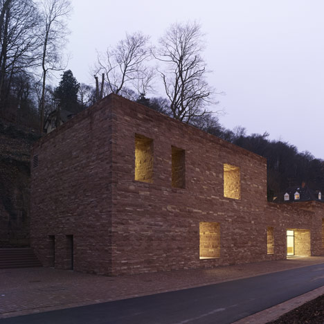
We love projects that involve castles. Windows are set within two-metre-deep recesses in the stone walls of this castle visitor centre in southwest Germany by Swiss architect Max Dudler.
Positioned at the entrance to the historic Heidelberg Castle ruins, the two-storey visitor's centre borders the retaining walls of the sloping grounds, alongside a seventeenth century saddle-store.
The roughly cut stone blocks that comprise the exterior walls are made from local sandstone.
Inside the building, the windows sit flush against the white-plastered walls, while the floor is finished in terrazzo.
If you're a fan of castles, see more stories about them here.
Photography is by Stefan Müller.
Here's some more information from Max Dudler:
Heidelberg Castle Visitor Centre
The first new building to be constructed at Heidelberg Castle for more than four hundred years – a visitor centre designed by architect Max Dudler – is now open to the public.
Heidelberg Castle ranks as one of the most important Renaissance buildings north of the Alps. Having been partially destroyed during the Thirty Years’ War, and on many occasions since, the castle was abandoned altogether in the eighteenth century. Today the famous ruin serves as a museum. Receiving more than one million visitors a year, it is one of the country’s top tourist destinations and makes a lasting impression on international tourists visiting Germany.
The purpose of the visitor centre is to familiarize guests with the castle before they proceed to the castle proper. The visitor centre showcases the castle’s history as well as orientating guests so as to ensure a trouble-free visit. In May 2009, Max Dudler’s design prevailed in the architectural selection procedure. The visitor centre’s foundation stone was laid in summer 2010, making it the first new building to be constructed at Heidelberg Castle for more than four hundred years. This building shows how the contemporary architecture of Max Dudler is rooted in history. At the same time, its abstract form underscores both the grandeur and actuality of this German cultural monument.
The new building is situated outside the old defensive ring wall, at the entrance gate to the castle and garden (Hortus Palatinus). The narrow strip of land chosen for the new structure lies between a small garden house and a saddle store built in the reign of Frederick V. The building backs onto a seventeenth century retaining wall which shores up the park terraces above. With its building lines following those of its neighbours, the sculpturally designed visitor centre structurally completes this small ensemble of buildings in the forecourt area.
In architectural terms, the building blends in with the surrounding historical fortifications through its re-interpretation of elements of the existing site’s architecture. The window embrasures, for example, are set more than two metres into its walls, echoing the large-sized apertures that can be seen in the neighbouring saddle store. The windows of the visitor centre are positioned according to the building’s interior requirements and also offer visitors new visual relationships with the entry building and garden outside. The popular Elisabeth Gate in particular can be seen from many parts of the interior. The façade’s deeply-set embrasures are made possible because of the special layout of the building: the broad expanse of its exterior walls hide a number of small side rooms and a stairwell. Like pockets (French: poches), these interior recesses offer space for display cabinets, shelves and seating areas, while the centre of the narrow building remains open.
For the façade, local Neckar Valley sandstone has been machine-cut to form a monolithic wall of roughly-cut blocks with joins that are barely visible. This masonry detailing is a contemporary re-interpretation of the historical retaining wall, with its hand-cut, undressed stonework. Unlike the heavy relief of the building’s exterior, the surfaces of its interior are smooth. The large window panes are fitted flush with the white plastered walls, as are the lighting panels set into the white plastered ceilings. The floor consists of a light blue polished terrazzo. All the fixtures and fittings in the recesses, as well as the doors and other furnishings are made of cherry wood.
Ensuring a smooth flow of large numbers of visitors was a particular challenge posed by the architectural brief. Dudler’s design solves this with its ingenious ‘architectural promenade’ through the building: visitors proceed from the entry hall through to the educational room, then up onto the roof terrace with its elevated views of the castle before exiting via the exterior stairs at the rear of the building to begin a tour of the castle proper. In this way, the full potential of this small building is realised, ensuring it has both multi-purpose usage and allows the maximum throughput of visitors.
Building Name: Besucherzentrum Schloss Heidelberg
Location: Heidelberger Schloss, Schlosshof 1, D-69117 Heidelberg
Client: Land Baden-Württemberg represented by Vermögen und Bau Baden-Württemberg, Mannheim Office
User: Staatliche Schlösser und Gärten Baden-Württemberg
Building Volumes: 490 m² usable floor area, 770 m² gross surface area, 3450 m³ gross building volume
Total building cost: 3 million Euros
Design and Construction Period:
Design commenced: April 2009
Construction commenced: 2010
Building Completion: December 2011
Architect: Max Dudler
Project Manager: Simone Boldrin
Co-workers: Patrick Gründel, Julia Werner

