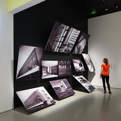
Architects Carmody Groarke and graphic designers A Practice For Everyday Life used Bauhaus-style colours and typography for the design of an exhibition about the celebrated art school at the Barbican gallery in London.
While some of the photography and artworks are arranged on boldly-coloured wall panels, others are juxtaposed at awkward angles that create unusual foreshortening.
A contemporary reinterpretation of Bauhaus letterpress typeface Breite Grotesk captions the entire exhibition.
Carmody Groarke have designed a few exhibitions for London galleries over the last couple of years. See our earlier stories about Drawing Fashion at The Design Museum and The Surreal House, which was also at the Barbican.
Photography is by Luke Hayes.
Here's some more information from Carmody Groarke:
Carmody Groarke and APFEL - Bauhaus: art as life, Barbican
In the latest in a series of acclaimed collaborations, architectural studio Carmody Groarke and graphic design agency A Practice for Everyday Life (APFEL) have worked together on the exhibition design for Bauhaus: Art as Life, opening on 3 May 2012.
Containing over 400 works from the world’s most prestigious and extensive Bauhaus collections, the exhibition presents an in-depth exploration of the School’s 14 year history, focusing particularly upon the lives of its students and staff and the vibrant, inventive community they created.
Challenged to contextualise the works on display whilst avoiding pastiche, they have designed an architectural installation of elemental forms that both compliments and enhances the exhibition’s contents.
Barbican Art Gallery has been spacially reinterpreted to create a bespoke viewing experience for its visitors, encouraging thought-provoking juxtapositions and interpretations of the exhibition’s contents.
Graphically, the exhibition’s design has been informed by an awareness of the Bauhaus’ own principles of colour, structure and typography. Vibrantly-painted walls, bold panels and supergraphics draw together objects, themes and ideas, and the typeface used throughout the exhibition, FF Bau, is a contemporary revival of Breite Grotesk, the letterpress typeface largely used within the Bauhaus itself.
APFEL were also commissioned to design the exhibition’s catalogue and marketing materials, further reinforcing the show’s fresh and distinctive visual identity.
“It is an honour to work on an exhibition about one of the most significant and influential movements in design history,” comments Andy Groarke, director and co-founder of Carmody Groarke. “We hope that visitors will be able to enjoy the collections as much as we have in designing the show with the curators and APFEL.”
Kirsty Carter, co-founder of APFEL, said “Now is an important time to put on an exhibition about the Bauhaus. It demonstrates the power of arts education and how design enhances our lives – at a time of arts and education cutbacks, we hope the exhibition might inspire our government to re-think how to spend their money.”
Leila Hasham, assistant curator at the Barbican, said “Carmody Groarke and APFEL have proved to be first-rate problem solvers on this project and together are always able to bring multiple relevant ideas to the table. Their work has always been informed by a true appreciation of the content, rather than just purely aesthetic considerations. Working with them has been a pleasure.”

