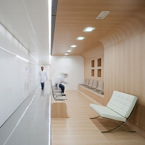
Spanish architects Estudio Hago have completed a dental surgery with walls of rounded wooden panels and white-tinted glass.
The surgery occupies a floor within an office block in Málaga.
Treatment rooms are lined up along the north side of the building so that they can benefit from even levels of natural light.
Offices and consultation rooms arranged in a row along the middle and their translucent walls allow some of this natural light to penetrate as far as the waiting room and reception on the other side.
We've featured a few interesting dental clinics on Dezeen, including one modelled on a drawing of a set of teeth. See them all here.
Photography is by Javier Callejas Sevilla.
Here's some more information from Estudio Hago:
DENTAL OFFICE
CONTINUOUS, CONSECUTIVE AND CONTIGUOUS
Spatial practices with white glass
This dental clinic is placed on the second floor of an office building. This project starts from seeing the clinic as a spatial complex and not as the combination of public and private fragments. In order to do so, we aim that several project and clinical aspects take part in the same spatial experience by organizing the flow of patients and the movement of medical personnel.
1. CONTINUOUS
Patients can perceive the idea of the clinic as a whole everywhere. The flow of people takes place all around the huge case made of translucent white glass going all over the clinic, from the reception to the waiting room and the medical rooms.
The flow of medical personnel fits into the batter of the vitreous wall. The medical activity takes place everywhere, from the inside of the case (laboratories and warehouse) to every single armchair in the medical rooms.
2. CONSECUTIVE
The functional programme becomes the image of the clinic, being the inside of the case the operations centre. The main uses follow in a consecutive way: reception-wait, perimetral corridor, laboratories-storage-sterilization-offices and medical rooms. The medical rooms are presented following the same plan and offering an infinite growth approach (as if there were three cases). These rooms are closed in order to accommodate the first visits and special treatments.
3. CONTIGUOUS
The spaces set out an organized exchange of materials, textures and reflexes that present contiguously different spatial experiences. The folded wood accommodates the waiting room and the reception. The high-gloss finishes flank the perimeter of the glass made case on the ceiling and on the floor.
We propose the powerful subtlety of changing the finish into the main figure in the space putting into dialogue the aesthetic area of the waiting room (with a domestic and soft finish) with the movement area of the vitreous perimeter (where the reflex shows the almost infinite in length and height space).
The result remains in the patient’s memory: a great space that represents a great medical team.
4. LIGHT EVERYWHERE
Glass and light form an alliance in order to cover all the spaces. The medical rooms are placed next to the perimeter of the façade (which is placed in the north) in order to take advantage of the constant natural lighting. The light is graduated through the glass so that it firstly floods into the working areas inside the case and then into the waiting areas.
Click above for larger image
Firm: Estudio Arquitectura Hago
Architects: Emilio Delgado Martos & Antonio Álvarez-Cienfuegos Rubio
Click above for larger image
Location: Málaga, Spain
Year of the project: 2011
Year of construction: 2011-2012
Area: 350 m2
Budget: 350.000 €
Engineering: Estudio Sinergia
Construction Company: Millangar Construcciones Costa del Sol
Wood: Carpintería Agüera
Glass: Cristal Era 2000

