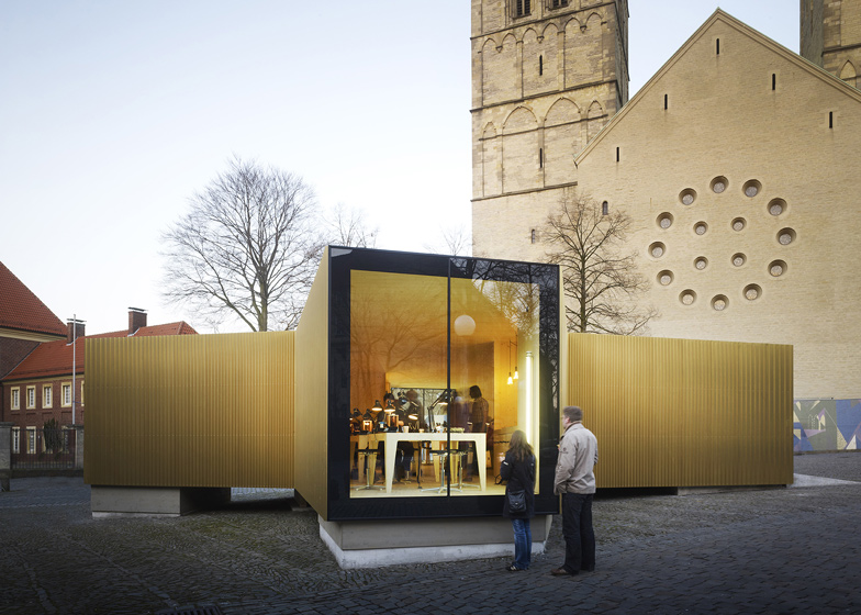
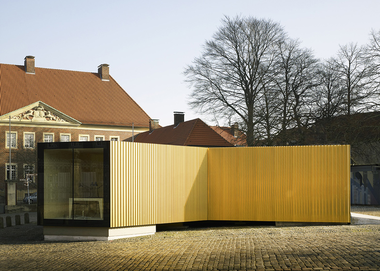
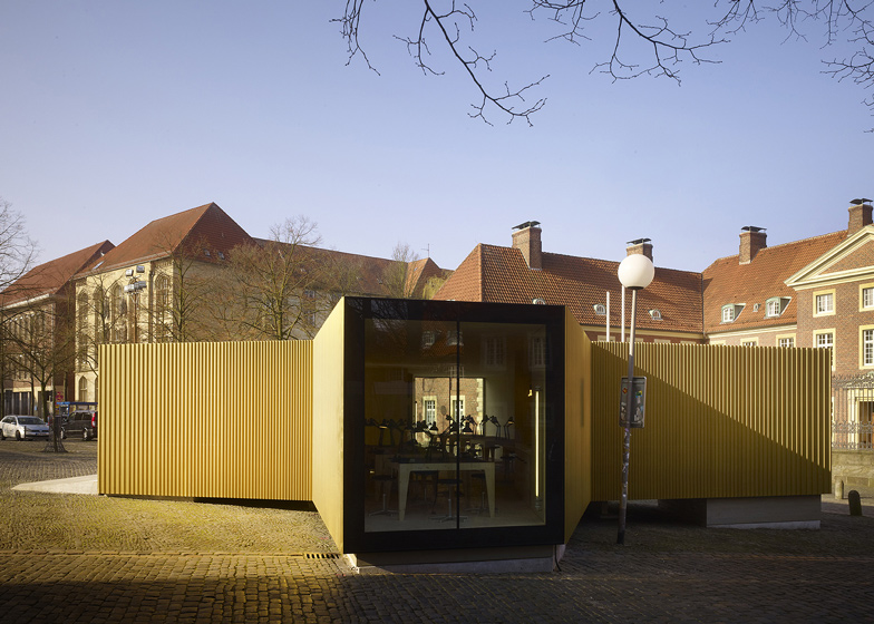
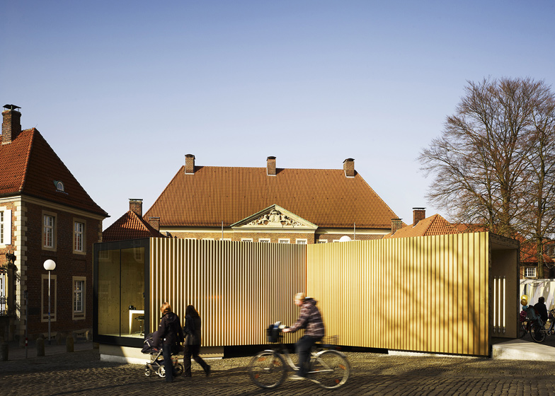
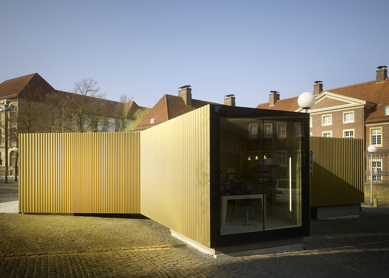
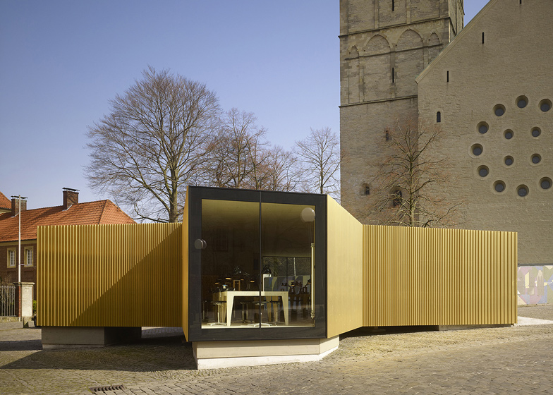
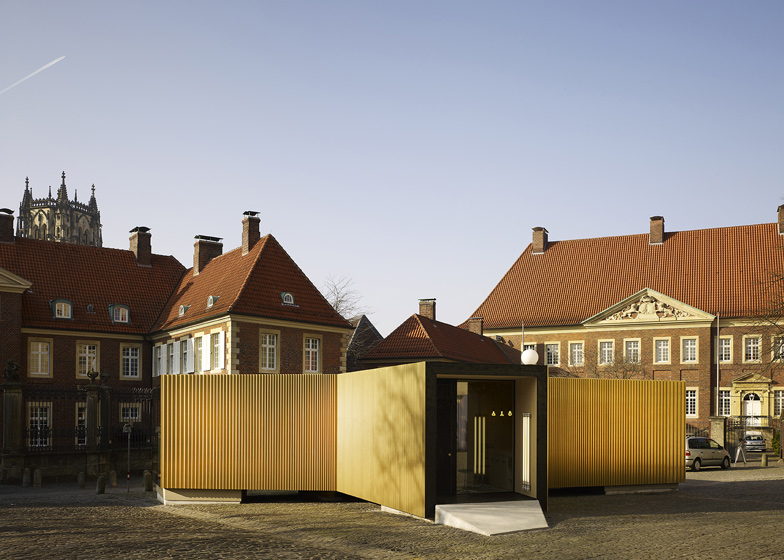
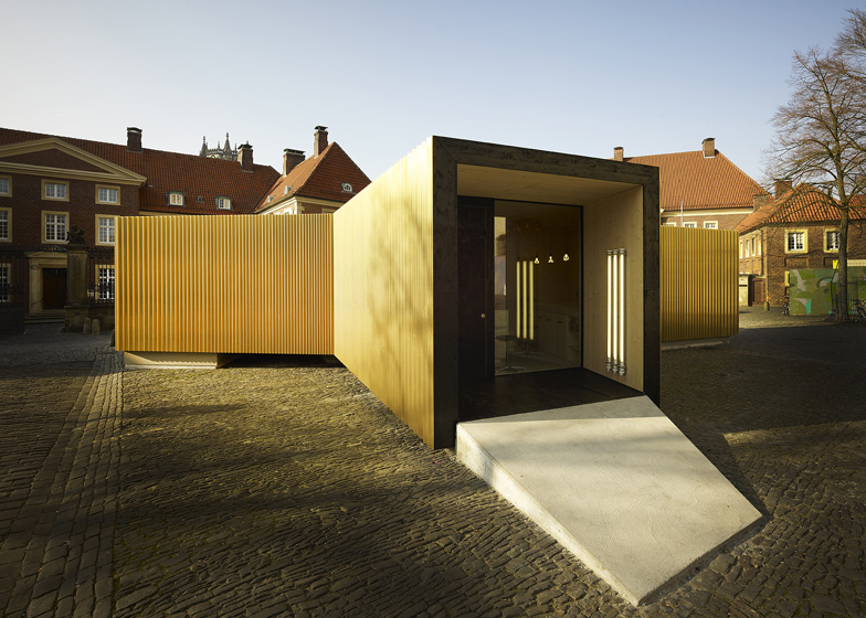
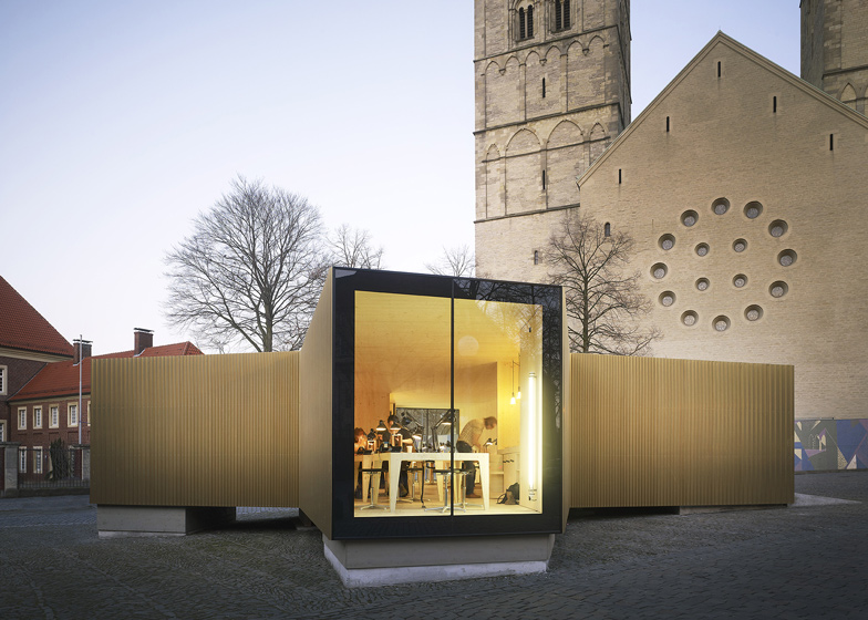
Slideshow: German architects modulorbeat and students from the Münster School of Architecture constructed a glittering golden pavilion to exhibit the techniques of medieval goldsmiths in Münster's central market square.
Planned and constructed in just six weeks, the Golden Workshop was installed to accompany an exhibition of the same theme taking place at the nearby LWL State Museum for Art and Cultural History.
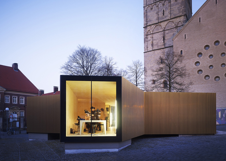
Four tapered wings gave the temporary pavilion a windmill-shaped plan, which accommodated a functioning metalwork foundry and a small information centre.
Ridged plates of golden copper clad the entire exterior and large square windows on the ends of each wing framed views of the activities taking place inside.
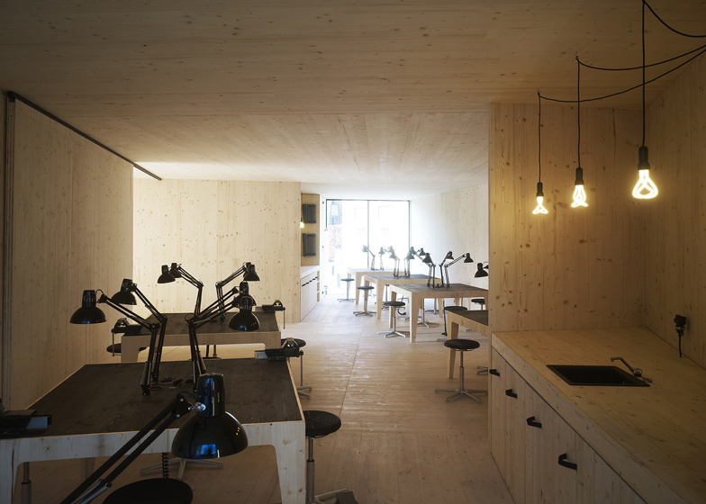
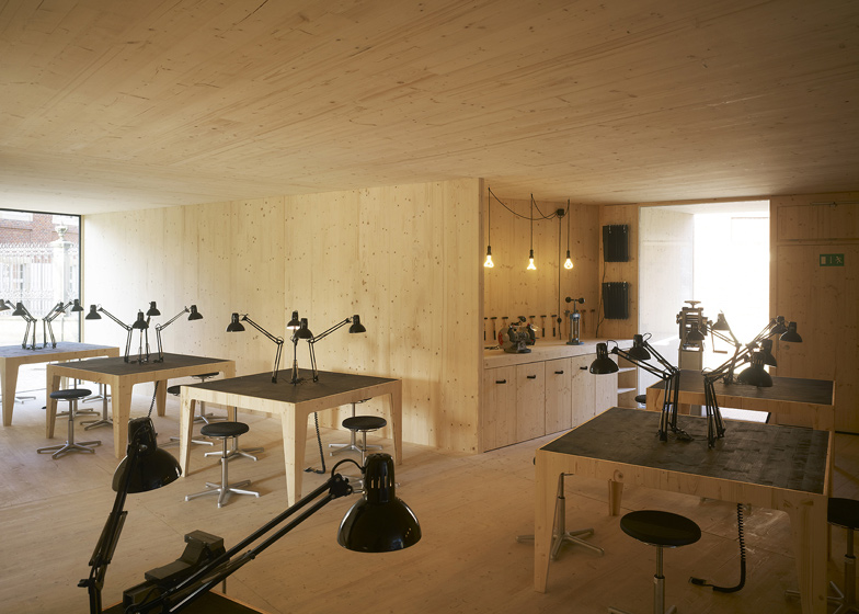
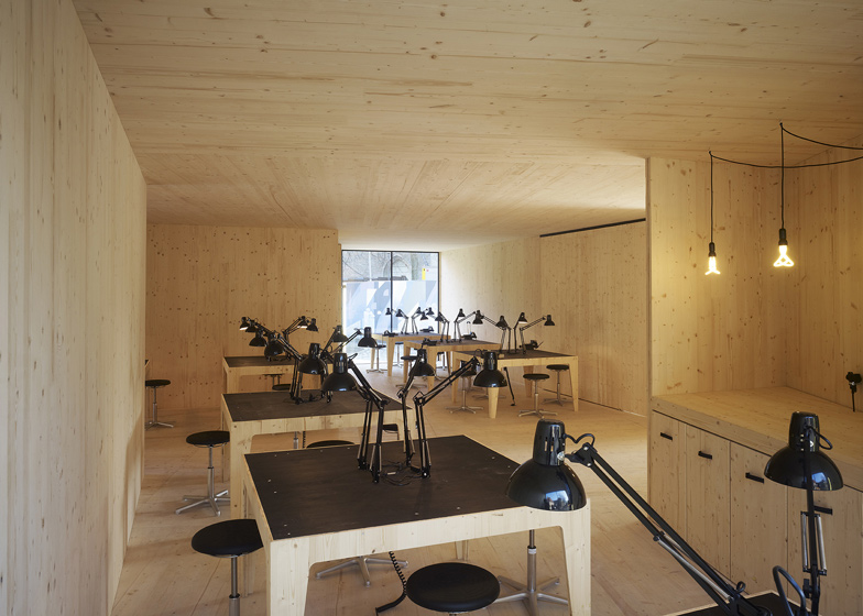
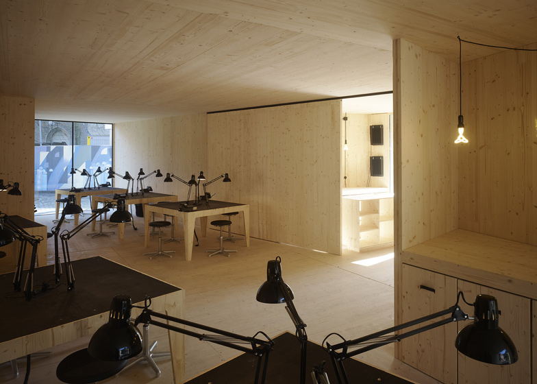
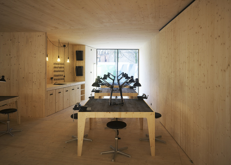
All of the surfaces and furniture inside the pavilion were plywood, while details such as desk lamps, tabletops and door handles were picked out in black.
We've spotted a trend for golden buildings in recent weeks. See our earlier stories about a golden library and a museum extension clad in golden shingles, or see all our stories about golden materials here.
Photography is by Christian Richters.
Here's some more explanation from modulorbeat:
“Golden Glory” and a Golden Workshop
On display in Münster from February 26 to May 28, 2012 is the exhibition “Golden Glory. Medieval Treasury Art in Westphalia”, developed by the Westfalen-Lippe Regional Council, the diocese Münster and the excellence cluster “Religion and Politics” at the University of Münster. The exhibition presents some of the finest goldsmith’s work from the late medieval period in Westphalia. Some 300 secular and sacral pieces may be seen across 1500 square meters: symbols for the infinite, the magical and the divine, expression of and testament to the power and wealth of their owners. The exhibition will be shown in Münster at two places simultaneously: at LWL State Museum for Art and Cultural History and at the Domkammer [St. Paul‘s Cathedral Treasury].
Both exhibition sites border the Münster Domplatz [cathedral square]. However, the LWL Museum is currently undergoing renovation and the Domkammer entrance has always been hard to find. The large exhibition suffers from lack of space, as well as an appropriate, more easily acces- sible entrance. In addition was the curatorial wish to present not only the historical objects, but also the artisanal process showing how they were actually created.
Thus arose the idea to erect a small, attractive pavilion containing a gold workshop as well as an information point: a temporary construction for the duration of the exhibition that should reflect the exhibition theme and draw notice to the Domplatz.
Münster’s Glittering Gold Pavilions, 2007 and 2012
The Münster-based architectural group “modulorbeat”, consisting of Marc Günnewig and Jan Kampshoff, was commissioned to design the pavilion. They had already created a portable, temporary pavilion in 2007 for “skulptur projekte münster”, which garnered much attention, not only due to its gold-coloured façade.
modulorbeat developed their new creation for “Golden Glory” together with students from the Münster School of Architecture (msa). At the time of their commission, Günnewig and Kampshoff were searching for a seminar theme to teach at the school.
In varying groups throughout the semester, several designs were developed, linked, revised, discarded and then revised anew, once the construction’s precise location on Domplatz had been determined. With a second group of students, they commenced planning and the realization of the 95 sq. metre pavilion, which was completed in six weeks’ time.
In order to compensate for the slope of the Domplatz, the pavilion was built on top of simple piles made of in-situ concrete and wood, which would leave no traces once they were dismantled. The building has a cross-shaped layout with four “wings”. Each wing open inwards like a funnel, so that the layout is more reminiscent of an abstract windmill than a crucifix. The effect is an inviting gesture to visitors, as the inside path opens up onto the central workshop area.
The walls are made of full wooden plywood panels. Indoors, the wood is visible, lending the foundry area a robust, resilient atmosphere. From the outside, the compact pavilion seems similarly robust, but here the façade is covered in eye-catching, gold-copper metal panels.
The furrowed, vertical profile of the shimmering panels along each of the four wings narrows towards the centre. This creates a dynamic rhythm, in which the sparkling metal mixes with a play of light and shadows that shifts with the passing of the sun overhead. The small pavilion seems to be a portable, accordion-like construction that could be folded up and transported to another location at any time.
The precise construction achieves a lot with little, while allowing for a merry playfulness: the simple forms and materials gain incredible comple- xity through subtle and precise displacements, elevating the project to a most entertaining building. Despite its symmetrical layout, it never looks like a cross but instead seems to reinvent itself at every new perspective. This awakens the urge to circle around the building again and again to look through the large openings at the end of the four wings into its centre.
Ceiling-high glass elements open up the building completely, so that the view from outside reaches into the foundry and beyond – through the lightly askew axis – to the opposite opening. Suddenly, the small building appears to be amazingly deep.
The architecture reflects the theme of the exhibition not only with its brilliant encasement, but much more in the fine workmanship and meticulous details that are unusual, especially for a temporary pavilion.
Using a very reduced selection of materials and colours, the pavilion’s interior design allows for the concentration required by this fine and detailed work. Floor, ceiling and all walls are, like all furniture and other components, crafted from a light coloured wood. This includes the sliding door, through which the foundry can be separated from the information area.
In contrast, everything having directly to do with the work has been painted pitch black: the table lamps, the work surfaces, the screw clamps, and even the oil radiators, lamp cables and the kitchen sink.
The interior was not only designed but also completely built by modulorbeat together with the students. In fact, all elements used are cost-effective, standardized components that can be found in any hardware shop; the consistent design and uniform colour scheme are what transform them into something elegant.
This is not merely for design’s sake, but serves as a stage for the foundry’s small protagonists: the golden elements are more recognizable when set against black.
Thus this marvellous architecture functions on all levels, from big to small. Even from a distance, the golden façade attracts passers-by and indicates the way inside, where the wood and black work surfaces then lead the eye to the tiniest, most valuable things – the objects, which this is all actually about.
This is the most golden gold foundry that Münster has ever seen, and awakens in its visitors what might be the greatest compliment a temporary building could ask for: the wish to call out, “linger on, thou art so fair!”

