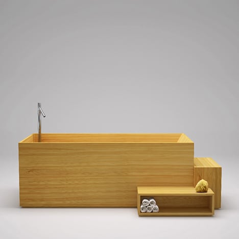
Japanese designers Nendo wanted their bathroom collection for Italian brand Bisazza Bagno to look as though the whole room has just been unpacked from the crate-like bath.
Wooden frames cradle a basin to make a wash stand and contain mirrors shaped like water droplets.
There are also tessellating clocks designed to be hung in a diagonal row, a towel rail that's just sticks in a stand and stackable containers for plants, brushes and soap.
Nendo also designed Bisazza's Transparent Mosaic Maison exhibition where the collection was unveiled in Milan last month - see photos from the show below.
Elle Decoration UK editor Michelle Ogundehin talks about this project as an example of recent collaborations between big companies and Japanese designers, and the calming effect they have on the industry, in the interview we filmed with her at Dezeen Studio.
See all our stories about Nendo »
Exhibition photographs are by Joakim Blockstrom.
Here's some more information from Nendo:
“nendo collection” by the Bisazza Bagno
Our objective for this bathroom collection was to create a strong singular impression by assembling the various elements of a bathroom suite as though they were 'all in the bath together'.
The feeling of connection that comes from a bath with someone you don't know at a hot spring or local public bath is an important part of Japanese culture.
Our bathroom collection for Bisazza expresses this feeling through its design. The two key parts of the strategy are details that present the different elements as though they have been stored together in a box, and elements that go together well when used in multiples. The taps are located inside the washbasin and bathtub, submerged in water alongside accessories like a soap dispenser or a water glass.
A tray placed inside the basin becomes an island for objects that need to be kept dry. The washbasin stand encloses the washbasin inside a wood frame, through which the water pipe rises up from the floor, turning into the tap.
The mirror glass has been removed in different places to mimic the effect of pools of water. This emphasizes the impression that the mirror resides in a frame.
The planters are designed as though in boxes, so that they can be stacked. The small ceramic container can be used as a toothbrush holder, bud vase or holder for other items. The container's shape was carefully designed to be easily used in multiples.
The wall clock can be lined up in multiples, too, creating the visual effect of horizontal continuity.
“transparent mosaic maison” exhibition by nendo
The spatial design for storied Italian mosaic tile maker Bisazza's exhibition of three bathroom suites - Hayon, Marcel and Nendo - at the 2012 Milano Salone. We took mosaic tiles with a thin layer of gold leaf sandwiched between glass layers, and stacked them vertically, rather than laying them flat as ordinarily done. Viewers' gazes passed through the gaps, gently demarcating the boundaries of the space.
We adhered colorless transparent mosaic tiles to marble benches to create an ambiguous texture, somewhere between that of marble and tile. Our idea was to bring out a new charm by emphasizing the glasslike quality of mosaic tiles, and to realize a comfortable space with a feeling of floating.

