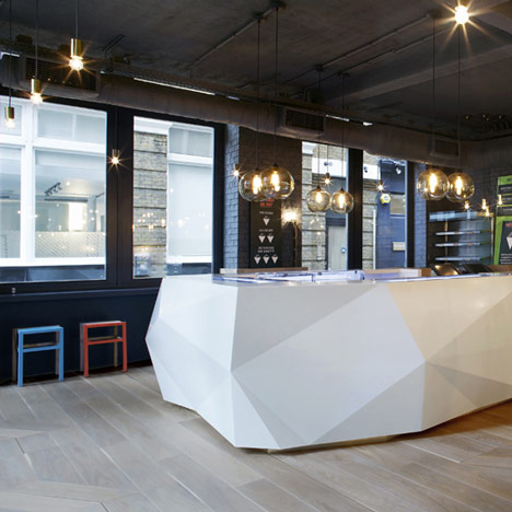
Yoobi Sushi by Gundry & Ducker
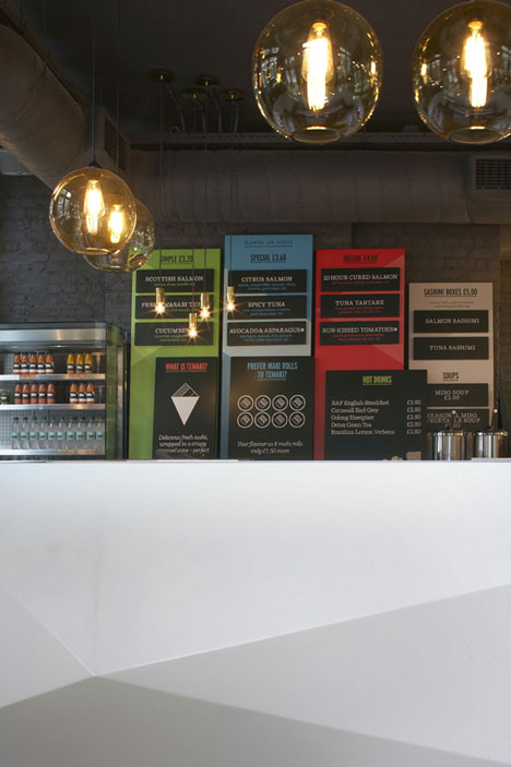
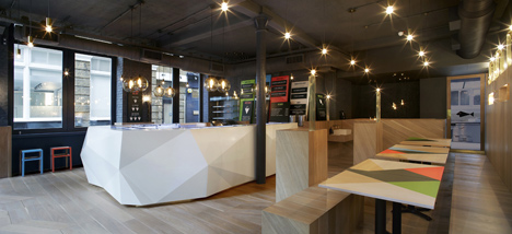
Sushi is prepared on a faceted white counter at this restaurant in London's Soho by architects Gundry & Ducker.
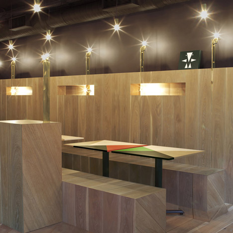
Named Yoobi Sushi, the restaurant occupies a former warehouse and the original brickwork is still visible beneath the new grey paintwork.
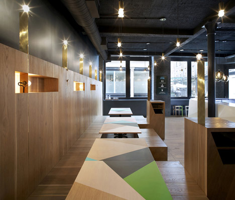
Tabletops are decorated with brightly coloured patterns and boxes matching the wood-panelled walls provide seating.
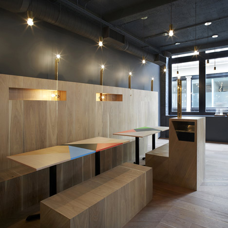
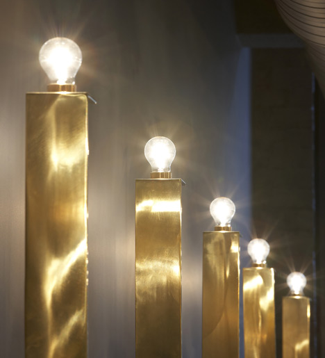
Light bulbs are mounted onto golden columns with fixtures concealed behind thin brass strips that run down the walls and zigzag across the floor.
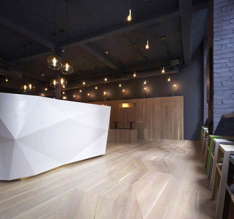
More lighting is provided by bubble-like pendant lamps suspended from the ceiling.
Gundry & Ducker have designed the interiors for a few UK eateries, including an Italian restaurant in Hertfordshire and a Thai restaurant nearby in London.
See all our stories about Gundry & Ducker »
Photography is by Hufton + Crow.
Here's some more from the architects:
Gundry & Ducker – Yoobi Sushi Lexington Street London
Yoobi is London's first temakeria. Temaki is fresh sushi wrapped in a cone. It is a unique sushi that was developed in Brazil, which has the largest population of Japanese people outside of Japan.
The brief was that the interior should reflect Rio, Tokyo and also London.
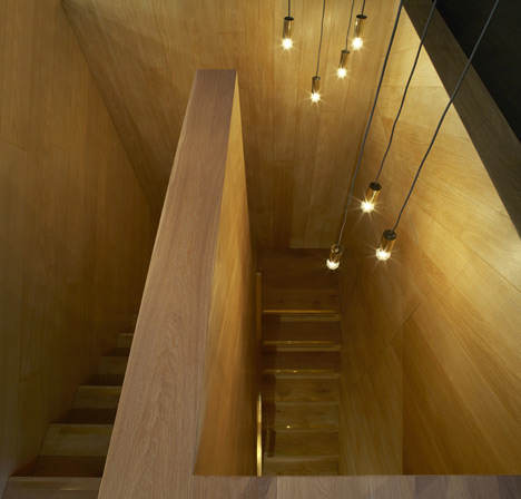
The existing building, a former warehouse, is stripped back to its original brick and painted out dark grey. A new timber lining is inserted which is folded into simple benches and plinths and counters. Marquetry patterns are inlaid into the timber lining which appear like shadows cast from the objects in the room.
Brass lines at regular intervals are inlaid into the floor, these follow the marquetry patterns and also form light fittings, and coat hooks which protrude out of the timber boxing. The lining is simple in form but rich in detail.
The counter from where you can see the sushi being freshly prepared is a contrasting pure white crystalline object. This sits on the timber lining and addresses the entrance to the shop.
Bespoke Pink, Pink lime and orange patterned tables are based on fresh seafood colours and reflect the Yoobi branding and graphics developed by Ico Design.
Branding & Graphics: Ico Design