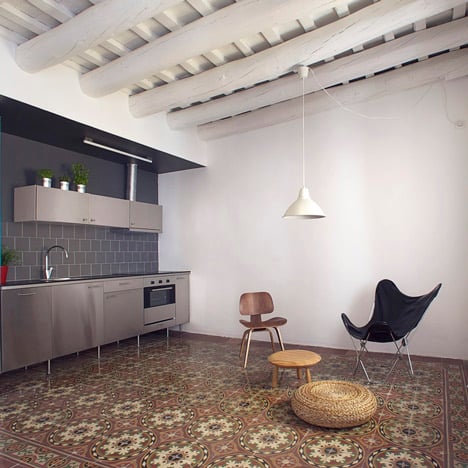
This Barcelona apartment by Spanish studio Nook Architects combines modern kitchen and bathroom fittings alongside original mosaic flooring and exposed wooden ceiling beams.
The architects couldn't remove the load-bearing wall at the centre of the residence, so decided to wrap the new bathrooms and kitchen around it instead.
The kitchen now lines the edge of an open-plan living and dining room, while the bathrooms face the bedroom on the other side.
The bedroom door slides across to screen both the washroom and the toilet, so only one of these rooms can be enclosed at once.
See more stories about apartment interiors »
Here's some more information from Nook Architects:
Casa Roc | Apartment in Barcelona | nookarchitects
Located in Barcelona’s historic Gothic Quarter, this residence was first found on a very precarious state.
Several interventions of different time periods and of low construction quality had accumulated, layering on top of the original construction.
Its distribution was the result of common customs of the past in which the space was highly compartmentalized, generating small rooms with little or no natural light or ventilation.
It was clear from the beginning that the space had to be oxygenated, especially because of its limited dimensions, but the existence of a bearing wall that divides the apartment in two halves made us ponder about how to achieve the feeling of a continuous space while integrating the rigid input that the structure had to offer.
Therefore, we came up with the idea of a box that wrapped and integrated the bearing wall, containing the wet areas of the apartment, simultaneously dividing the residence in night and day zones, and separating the new construction from the salvaged original features.
To further exploit this idea of a box and its interior location within the apartment, dark finishes were used in both the kitchen and the bathroom, therefore the wet areas of the house are perceived as dark closets that open up to the white, neutral, and luminous areas that surround it.
The kitchen is anchored to the bearing wall on the side that faces the exterior facade, and is open to the living area which features its original mosaic tiles, restored wooden beams and updated exterior doors and windows.
These were refurbished in order to preserve the original woodwork but meet current comfort standards by substituting the original glass with double-glazed panels.
Previous plan
The bathroom was placed on the other side of the wall and opening up to the bedroom, which faces a much calmer interior courtyard. Here, a warmer and contemporary language was used.
New plan
The aluminum windows were changed to natural wood. These were also made larger and the once gloomy gallery was transformed into a sunny terrace to bring in more natural light.
Placing the wet areas in the core of the residence, however, presented another challenge because there was no plumbing installation in the interior.
The only sanitary drainage pipe was located on the exterior gallery, where a small bathroom had been built. This was solved by elevating the entire floor level of the bedroom-bathroom, further emphasizing this area as the newly created night zone.
A limited budget was an incentive for ingenious ideas and for scarifying features that are not essential in a one-user apartment, therefore a single sliding door, dubbed “3 in 1”, eliminates the need for multiple doors: one can choose to either close the bedroom, close the bathroom or close the water closet.
Architects: nook architects
Situation: Barcelona, Spain
Project Year: 2012
Photography: nieve | Productora Audiovisual
Furniture: Openhouse

