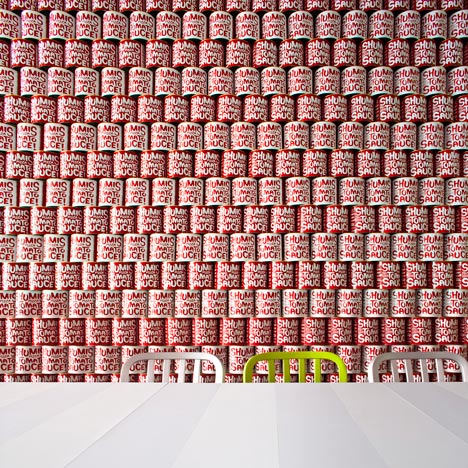
Cheap materials combine with references to American pop culture in the interior of this small pizzeria by Tel Aviv-based Studio OPA.
The designers also considered the restaurant's industrial location in the Israeli town of Rishon LeZion when selecting the raw finishes and neon lighting.
There's wallpaper printed with tins of tomato sauce reminiscent of Andy Warhol's soup-can prints in one space, which also features lime green paint and chairs that contrast with the orange ceiling fans.
Other surfaces and furniture are made from chunky chipboard with glass covering the tabletops.
Photography is by Yoav Gurin.
Here's another industrial restaurant interior in Israel with huge lights hanging over the tables. See all of our stories from Israel here.
Here is some more information from the designers:
Shumis – An American Pizza Shop
Influenced by American Pop culture.
Located in an industrial area.
Cheap, simple, accessible materials.
Strong color pallete
A dramatic space
Communal dining creates a joint experience
As in all our projects, we first try to think as the potential client. We try to think like him, act like him, and especially understand what he wants, what he aspires to, what he most enjoys receiving.We approach each of our projects with the intention of having fun, but this project we especially enjoyed, since we had to walk in the shoes of potential pizza consumers.
So it turns out that the basic psychology of contemporary pizza consumers is simple. People who come in for pizza are usually families or groups of friends who come to eat and spend time together. On the one hand, they know that pizza isn't the healthiest food in the world. On the other hand, if they are eating something that doesn't provide them with all the nutritional values, they at least want to enjoy it, big time! That was the basic concept we approached this project with.
We also based our design on the fact that in association and intuition, pizza is related to the ultimate homeland – America. We let influences from American pop culture take over us, and went with them.
The fact that the pizzeria was to be located in an industrial area, contributed to the design's identity. If the DNA of the design was American pop culture, then the flesh and skin were cheap, simple, available materials, which are close, and bring us closer to the nature of the location. The emphasis in tones and style was of course bright strong colors, and on creating a dramatic space, which enhances the client's experience. From there, all we had to do was to let the muses talk, the ovens burn, the mouths chew and the faces smile.

