Villa Jian by CU Office
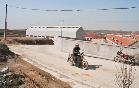
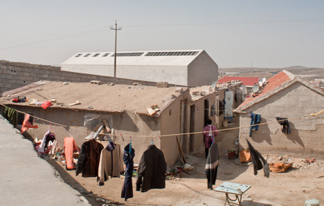
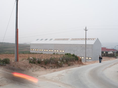
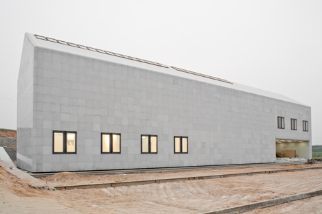
Beijing architects CU Office have completed a contemporary granite office building that uses a traditional local measuring system in a rapidly developing agricultural city in eastern China.
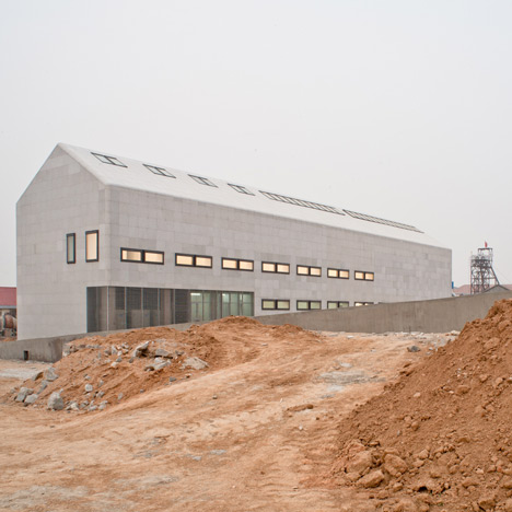
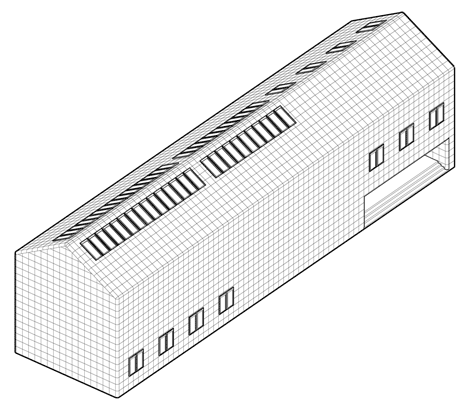
The barn-like building has smoothly chamfered edges and is named Villa Jian, after a local term for an average-sized room or space: the architects were asked to provide eleven of them inside the two-storey structure.
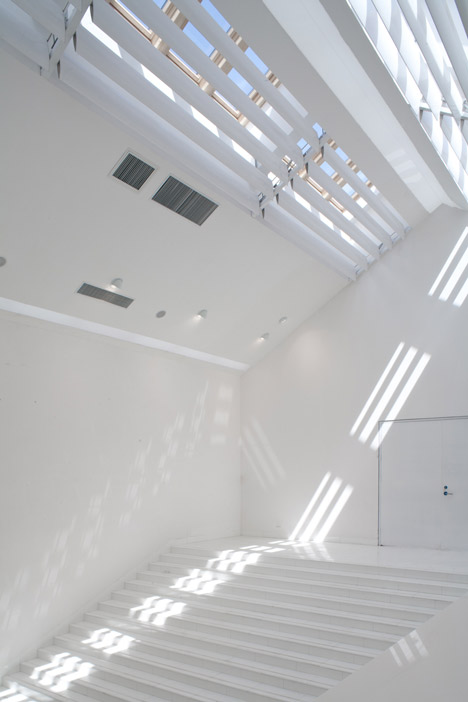
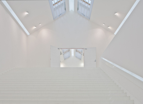
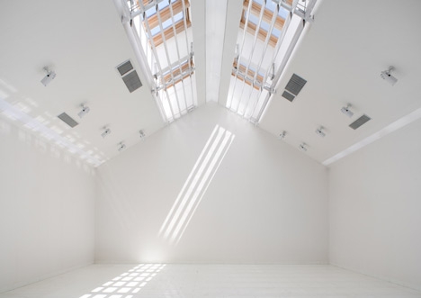
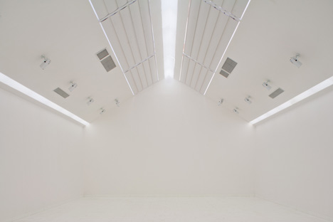
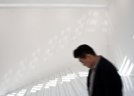
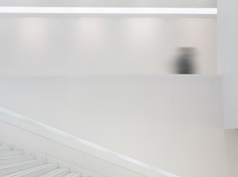
A staircase the width of the building connects the ground floor with the storey above, providing informal seating during events held in the building's exhibition spaces.
Another project we've recently featured from a fast-developing Chinese town is an exhibition centre on the beach of a former fishing village.
Photography is by Brando Posocco.
Here's some more text from CU Office:
The concept of Villa Jian came from the local architecture word called “Jian”. In the local architecture culture, there was one commonly used for building space base unit that is "Jian", one "Jian" represented a width of about 3.3 m to 3.6 m of spatial scale.
This word "Jian” not only represented a space base unit, but also strongly linked with the local traditional form of construction.
Before going further to the development of the design, the client‘s requirement was to build 11 “Jian”. Thus, there was a given condition of designing a big house with a double-slope roof covering 11 “jian”.
According to the needs of the client, the building consisted of main two basic functions: office space and exhibition space, both of the functions were limited to a semi-open private property.
The starting point was how to combine the semi-open exhibition space with a semi-closed office space under a single roof.
The idea was finally to divide both the exhibition and the office into two parts: public exhibition and private exhibition, public office and private office.
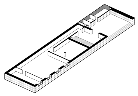
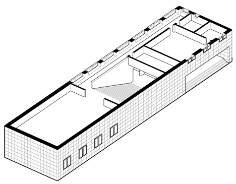
Public exhibition and office space were placed in the first floor, and the private exhibition and private office were placed in the second floor.
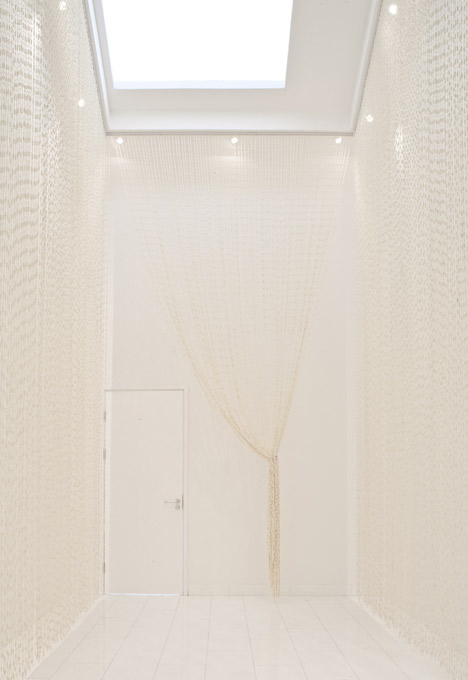
Therefore, the entrance was designed to be a semi-open exhibition space, while the other side on the first floor was proposed to be the staff offices.
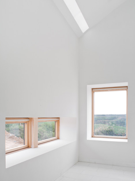
On the second floor, just opposite to the first floor, above the entrance of the first floor were a private parlor and a private office, and the other part was a private exhibition hall.
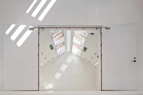
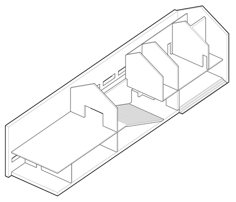
The entire function spaces have become an X-form in the section; the center position of the X has become the hub of linking two functions and two stories.
Here wide stair steps were designed for seating as well where the semi-open exhibition space and the semi-closed office space have dramatically been intersected together.
This stair hall, as a mixed space, had not only a circulation function but also a dual function for the exhibition performances and the meeting space. Thus, a mixed space system linking different regular functions was the core concept of the building.
Project Description: Private Office
Project Location: Yantai, Guangdong province, China
Client: Private
Site area: 10,000 m2
Building area: 1000m2
Design: 2011
Completion: 2012
Chief designer: Che Fei, Zhang Xuefeng
Design team: Zhao Chao, Li Huihui, Zhang Xin, Cui Jingyi, Zeng Yilan, Chang Yue