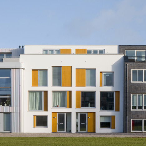
Dutch architecture studio GAAGA designed an asymmetrical facade to make these two houses in Leiden look like only one.
The building stands on a tightly-packed plot in Nieuw Leyden, a former industrial area designated as an experimental housing zone.
MVRDV in Rotterdam have conceived a master plan for the area which allows people to develop their own homes, with the only fixed criterion being the building's maximum volume.
The architects made use of the limited space by designing the facade as a single entity, avoiding symmetry between the two halves. Only the two front doors side-by-side indicate that the building is divided into two homes.
Inside the houses, staircases are detached from the walls and positioned centrally to divide the space and screen off the kitchen.
The ground floor has a multi-purpose room and toilet as well as a parking space accessed from the rear.
On the first floor are the kitchen, dining area and living area, plus a patio at the back.
The second floor contains three bedrooms and a bathroom, and the top floor has outdoor terraces either side of a multi-purpose room.
Photographs are by Marcel van der Burg.
Here's more information from the architects:
Two-in-One House, Leiden
Situated in the urban planning area Nieuw Leyden, the project includes two separate houses combined into one single looking volume. Both houses, practically identical on the inside, are designed as one entity on the outside, only the two entrance doors reveal the presence of two homes.
The project is developed within an urban framework that, due to its underlying low-rise, high dense concept, challenges to a new way of living and to a new housing typology. The framework, which consists of rectangular plots divided in eighteen small, back to back parcels on top of a communal semi-sunken parking garage, calls for new spatial and formal solutions regarding the use of the available space, daylight, privacy, outside spaces, the relation between parking and house, the way of entering, flexibility and identity.
Both houses are organized vertically: a multifunctional room and storage room in the basement, the living area and a patio on the first floor and the more private functions like bedrooms and bathroom on the second floor. On the roof there is a small multifunctional room with a terrace at the front and back side. Despite of the relatively small plot the design of each house aims at an integration of spatial qualities – like the play of light, intriguing vistas and routing – and practical values in terms of usable and flexible space suitable for family life.
Click above for larger image
In achieving this, the unfamiliar positioning of the main staircase parallel to and detached from the bearing wall plays a pivotal role. At ground and second floor the stair borders a passage on one side and rooms on the other, leaving most of the space along the bearing wall for storage, installation and sanitary facilities. At the first floor, the freestanding stair subtly screens off the kitchen area and divides the open space into different functional areas. In this way the living area gets an open yet intimate character with intriguing vistas. Also, the staircase is an eye-catcher that acts as an integral part of the furniture.
Click above for larger image
In the context of Nieuw Leyden, where each house is different from its neighbour, making two identical looking houses next to each other would be an aberration. To conceal the fact that the project comprises two identical houses the facade is designed as one entity.
The design of the facade is based on a neutral grid, avoiding an evident hierarchy. Because all openings look – despite their differences in size and infill – similar, it is not immediately clear what is happening inside. From the outside one cannot discern a bedroom from a living room. In this way the facade acts like a mask, a 3-D layer that conceals the structure behind.
The facade consists of a white framework, in which rectangular openings are filled in with aluminum window frames and wooden panels. The wooden panels vary in position, some are placed close to the white stucco surface and some are placed deep into the facade. In combination with the wooden surfaces around the openings the idea of the facade as a 3-D layer is intensified. Furthermore, the variable wooden infill gives the projects its expressive and dynamic looks.
Architects: GAAGA
Team: Esther Stevelink and Arie Bergsma
Location: Leiden, The Netherlands
Client: Nieuw Leyden CV
Realisation: 2009 - 2012
Contractor: Verbeij Bouw, Boskoop.
Structural Engineering: Buro Broersma, Den Haag
Energy performance & building physics: GAAGA - Arie Bergsma

