Maruma House by Fernanda Canales
Rectilinear blocks of glass and concrete overlap one another at this house in Mexico City by architect Fernanda Canales (+ slideshow).
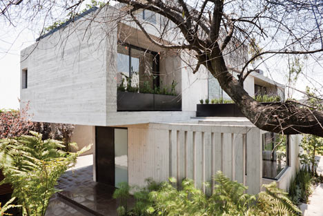
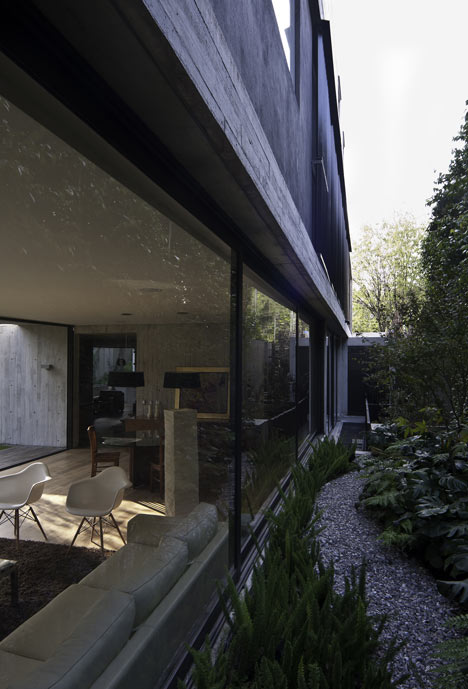
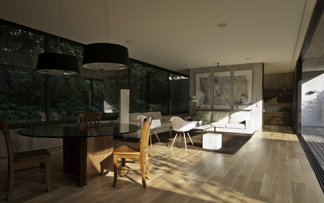
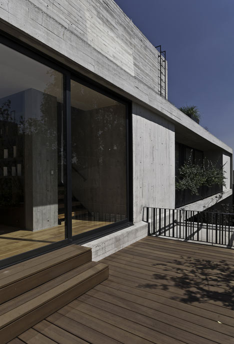
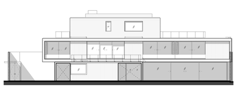
Glazed walls have been positioned on the longer side elevations rather than at the front and back to screen the interior spaces from neighbouring properties and the adjacent street.
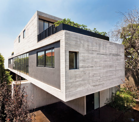
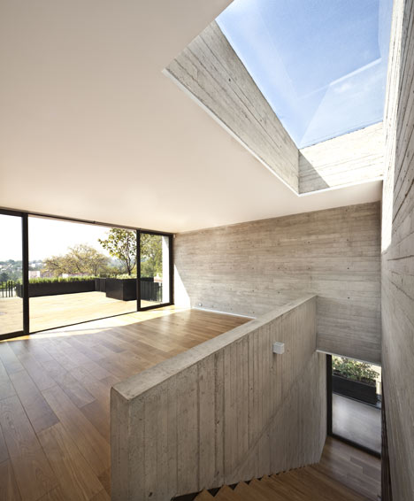
Concrete walls behind the glazed parts of the exterior conceal the kitchen on the ground floor, as well as bathrooms and dressing rooms on the two storeys above.
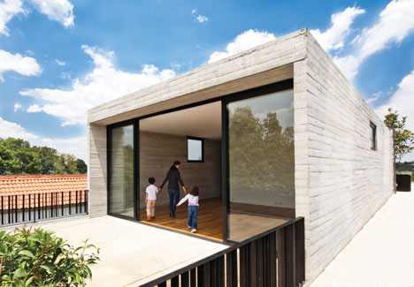
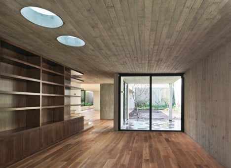
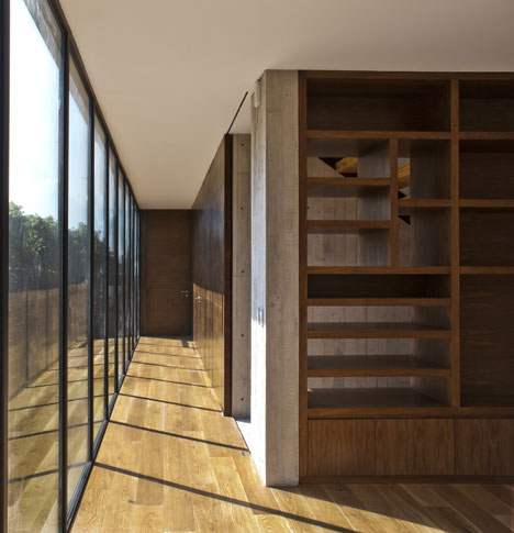
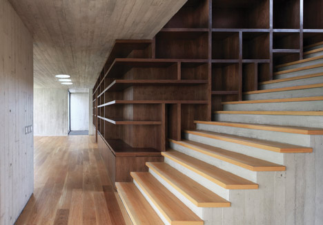
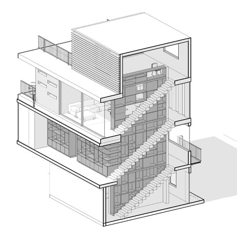
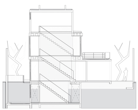
A three and half storey-high bookshelf stretches down though each of the floors and into the basement, where it is used for storing wine.
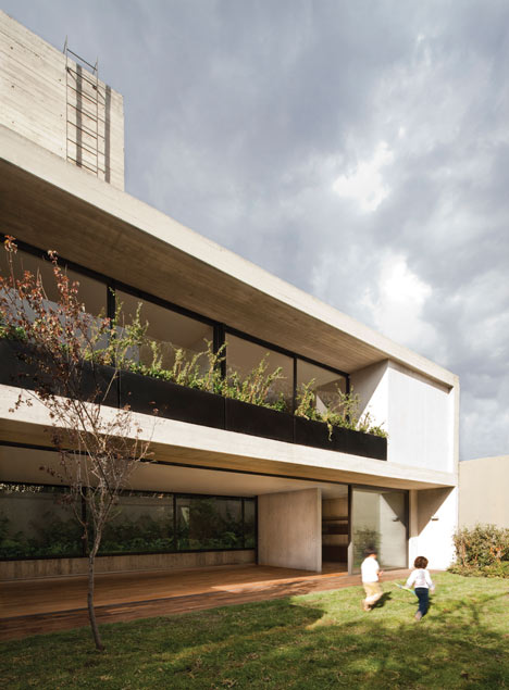
Exposed concrete has been popular in a few Mexican houses we've featured, including one with a twisted upper floor and one with wonky windows and a glass bridge.
See all our stories about Mexico »
Photography is by Sandra Pereznieto, apart from where otherwise stated.
Here's some extra information from Canales:
Maruma House
In a city with almost 20 million inhabitants, the project became a way to explore the fiction of individuality as well as to deal with disguised luxury.
Above: photograph is by Luis Gordoa
Located in a residential area in the central part of Mexico City, the house becomes an exercise to achieve simultaneously openness and privacy.
Above: photograph is by Luis Gordoa
Between a strong urban and social complexity and searching for the essence of primitive dwelling, the house deals with spatial continuity alongside with a bold presence.
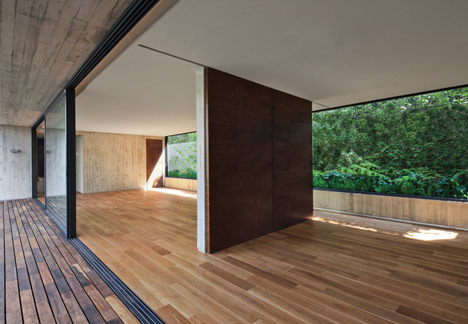
How is it possible to accomplish spaciousness while surrounded by massive houses on adjacent sites?
Above: photograph is by Luis Gordoa
How is it possible to achieve spatial flexibility under a program based on divided and isolates spaces?
With a system of overlapping boxes the project takes shape allowing fluid space by adding up and connecting different areas, and in other cases, leaving the boxes as independent and closed elements.
Considering the project as an occasion to test unconventional layouts, the house plus garden logic is rejected, allowing dwelling spaces, roof terraces and natural landscape to blen seamlessly together.
Above: photograph is by Luis Gordoa
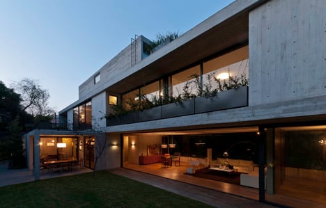
By continuing the linear condition of the plot, the project takes shape as an elongated and elevated body sitting over a transparent volume opened up onto the garden on the ground level that separates the house from the limits of the site thus emphasizing the independency in relation to the adjacent houses.
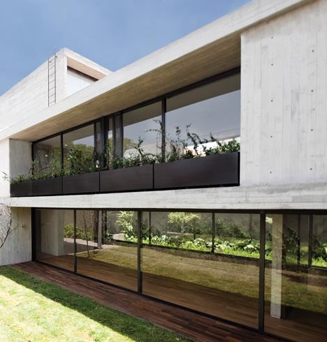
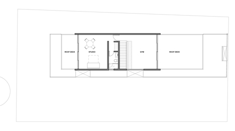
Another rectangular volume is placed on the second level and continues the play of overlapped boxes, opening up to a series of terraces.
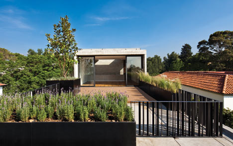
The house, characterized by the use of natural light, is aligned slightly to its northern limit in order to generate a garden and greater openings that take advantage of daylight.
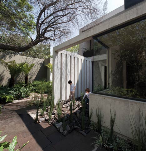
On the shortest sides of the site, the front and the back of the house are solid faces, while the house opens to both of its longitudinal sides.
Above: photograph is by Luis Gordoa
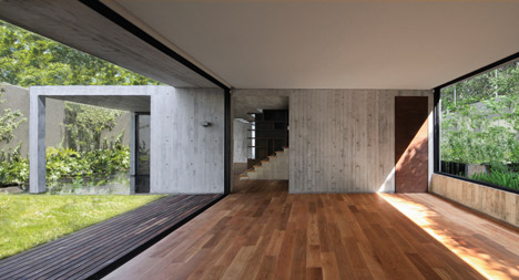
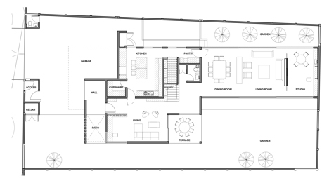
With the idea to create wide-open spaces and take advantage of the orientations, the ground floor is designed as the most public space, made up by a rectangular volume, with gardens to both of its sides, allowing a flexible space opened entirely to the exterior.
A smaller box –which houses the access, a small living room, the kitchen and a roofed terrace- intersects the transparent volume and holds the rest of the house which seems to float above.
Click above for larger image
The service areas are placed in the basement trying to free as much space for the garden as possible.
Click above for larger image
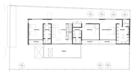
The volume that contains the living room and main entrance is a compact box that holds a green terrace on top which, along with a series of balconies for each bedroom, tries to set apart the house from the neighbour.
Click above for larger image
The first level, destined to bedrooms and a family room, is designed as an elongated and transparent body at both of its long facades, interrupted only by three small solid boxes which house bathrooms and closets.
By alternating the balconies of the bedrooms with these concrete boxes, the play between solids and voids that characterises the project is accentuated.
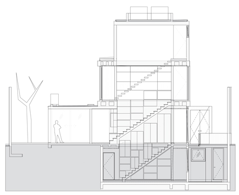
The piece that connects the different spaces is a large wooden bookshelf that holds the central staircase and goes all the way from the basement to the top floor.
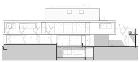
The stairs, with the bookshelf on one of its sides, generate a wall-furniture which starts at the access door and goes through the living room until it bends and elevates to the next level converted as a bookshelf at the top floor of the house.
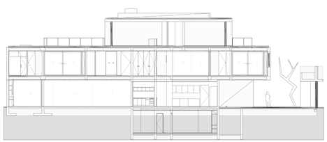
This three-story tall bookshelf unfolds into the basement as a wine cellar, generating a wooden body on every level has varying openings depending on the privacy and program of each area.
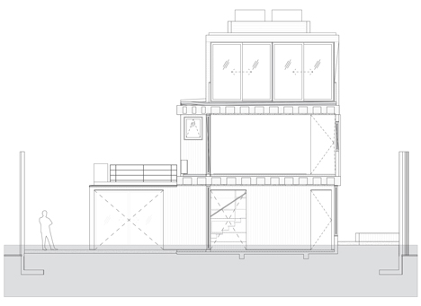
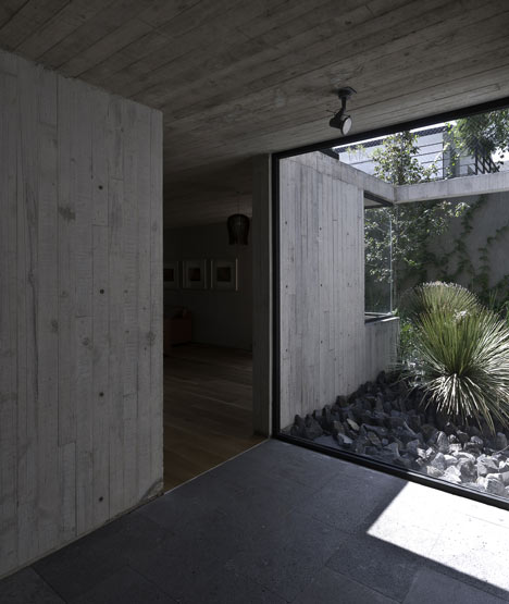
Towards the street, the house is seen as an anonymous volume. This external solidity is interrupted at the interior with a small patio in the area near the main access that connects with the living room and garden.
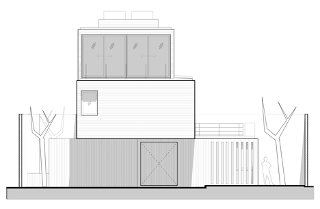
By means of the overlapping of solids and void the house is perceived to have larger spaces allowing the landscape to blend into its interior as well as extending the house outwards.
Location: Mexico City
Area: 450m2
Year: 2011