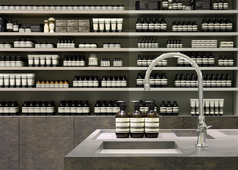
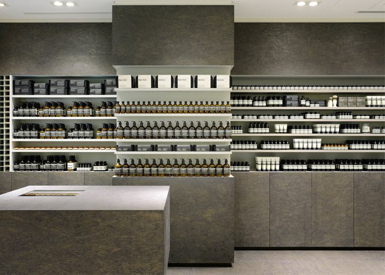
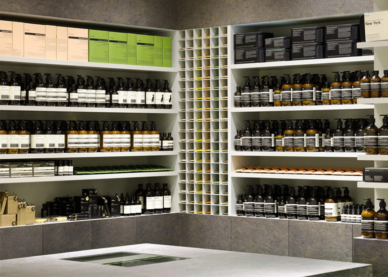
Chunky chipboard surfaces have been sanded and stained to look like marble at this Aesop skincare shop in Tokyo by Japanese studio Torafu Architects (+ slideshow).
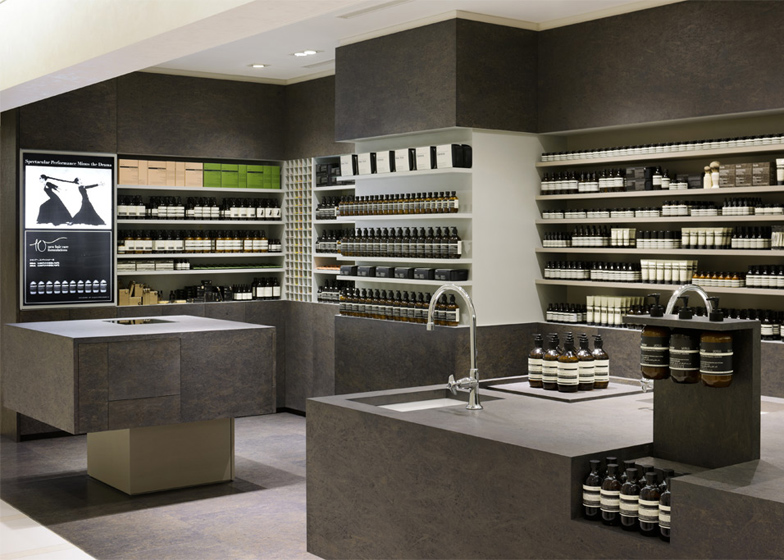
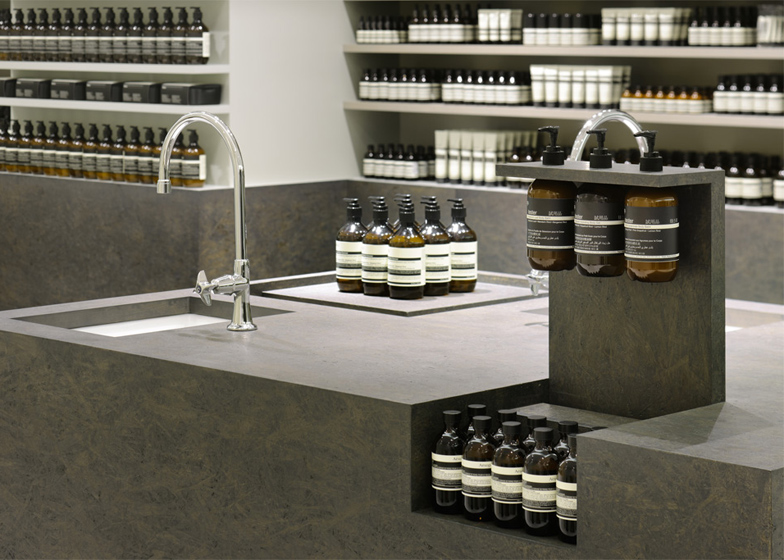
A muted brown stain coats the wooden walls and countertops and bottles sit within recessed shelves and openings.
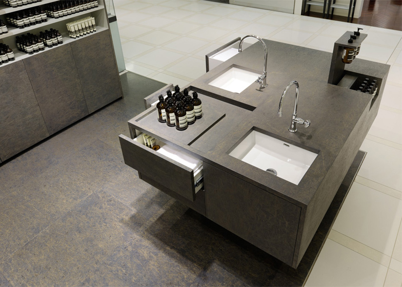
Two island counters accommodate hidden drawers and cupboards, sinks and a cash register.
Other Aesop stores we've published include a shop filled with translucent boxes on stilts and a kiosk made from newspapers.
See all our stories about Aesop »
See all our stories about Torafu Architects »
Photography is by Takumi Ota.
Here's some more information from Torafu Architects:
Aesop Shin-Marunouchi - Torafu Architects
For Aesop, an Australian skincare brand celebrating its 25th year anniversary this year, we proposed an interior fit-out located in the Shin-Marunouchi Building. Concurrent to this, we also designed Aesop Yokohama Bay Quarter, which opened at the same time.
Aesop's skincare products emphasise on maintenance to restore the skin’s natural health, and in a similar way we had chosen a key material that reflects this idea for the two stores. OSB (Oriented Strand Board) is a wood which has characteristic textures and patterns, and of which are accentuated are accentuated once sanded and stained in different ways. While associated as a rough material typically used in construction, as it is stained the wood adopts a stone-like appearance. The result is a distinct materiality which be felt throughout the store space.
At Aesop Shin-Marunouchi, the OSB has been stained with a brown colour to distinguish the store with its neighbours within the bright surrounding environment. The central band of display seen stretched across the back wall binds the store space to a single point of focus, naturally drawing customers towards the products.
In the foreground of the shops are stand-alone functional counters that allow the corner shop space to be freely circulated. Small stores require an efficient use of space, so the activities essential to the shop’s operation have been carefully considered and housed into the ‘floating’ boxes to assist in operational processes. We thought about how the volumes of these counters can be opened at various parts when required, and eventually closed back into a simple box.
Even located within a large commercial building, we have focused on how we can clearly reflect Aesop’s brand image into these stores.
Principle use: shop
Production: Ishimaru
Credit: Graphic design: Aesop
Building site: Shin-Marunouchi Building, Marunouchi, Tokyo Total floor area: 22.53m2
Design period: 2012.02-2012.06
Construction period: 2012.06

