NH Office Building by General Design
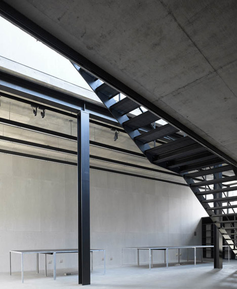
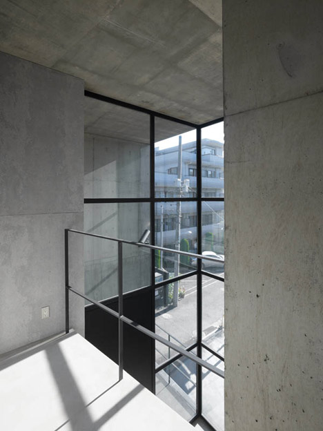
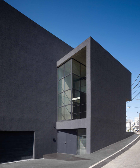
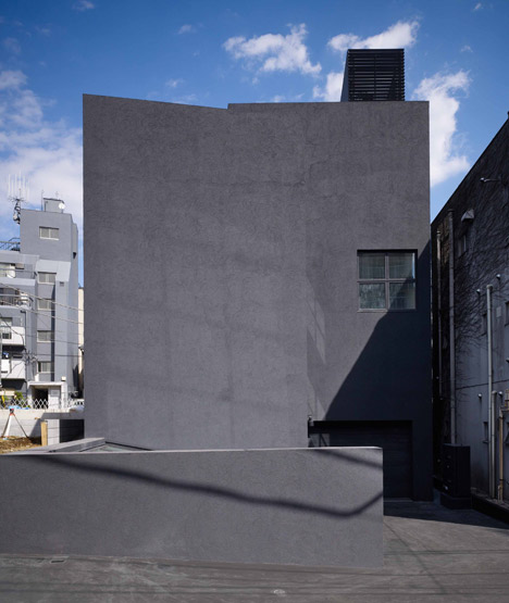
More concrete from Tokyo: the headquarters of clothing company Neighborhood has a bare concrete and steel interior that reflects the heavy-duty aesthetic of the brand.
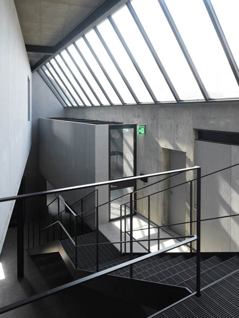
Designed by Japanese architects General Design, the warehouse-like building contains staff offices on its ground, mezzanine and first floors, and presentation areas and a car park occupy the two basement levels.
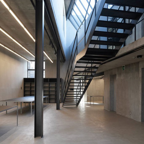
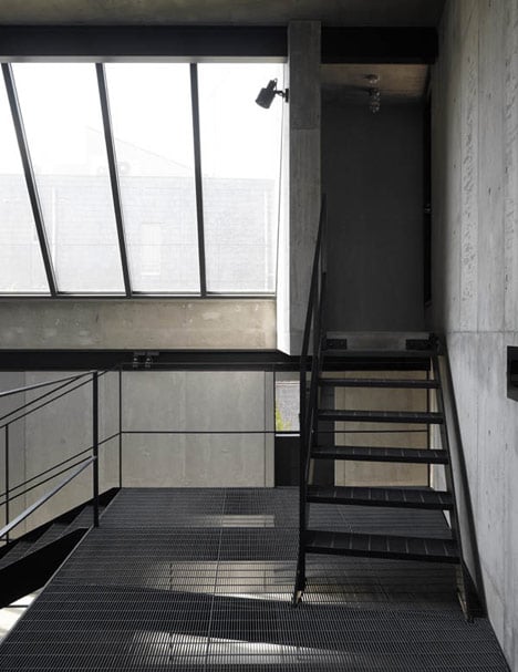
A double-height workspace is central to the design and is naturally lit from above by a row of clerestory windows.
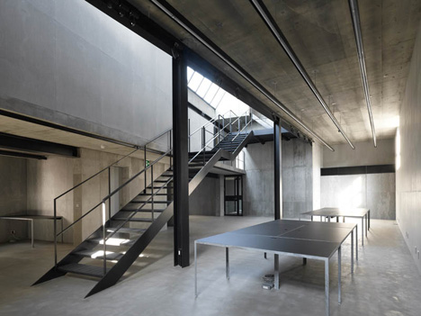
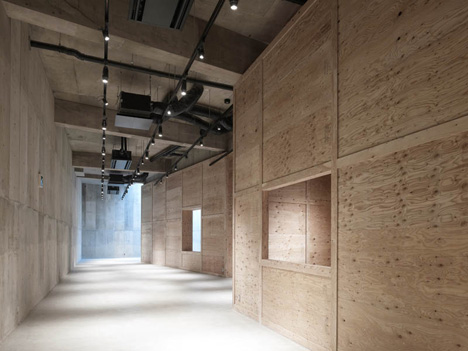
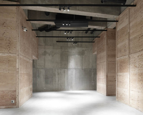
Cement panels line the walls in this room, while plywood partitions separate spaces in the lower basement.
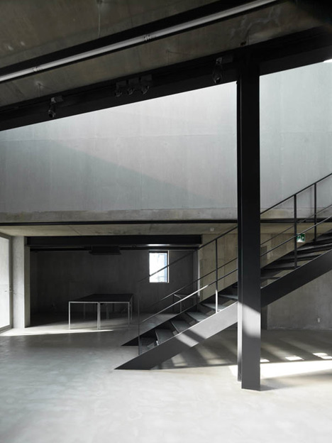
"We hope that this building will eventually be nicely worn out " explain the architects, "like a piece of good vintage clothing that you’ve cherished for a long time."
The building are located in the Shibuya district, close to the two main branches of the store.
We've featured a couple of other concrete buildings by General Design on Dezeen, including a shop with no windows.
See all our stories about concrete »
Photography is by Daici Ano.
There's more text below from General Design:
NH Office Building
Shibuya, Tokyo
This is a head office building of a Tokyo-based apparel brand “Neighborhood” which offers basic clothing influenced by various subcultures associated with motorcycles, military, outdoor etc., located in Shibuya district in Tokyo.
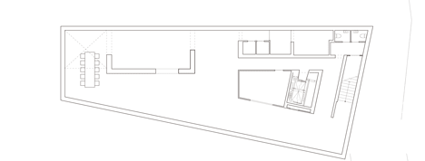
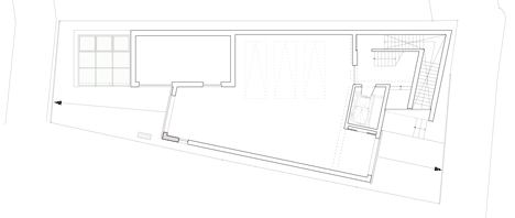
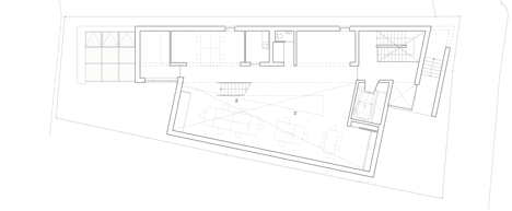
The building consists of workspaces on the first and the second floors, garage and presentation room on the basement floors.
Since the company has a relatively small number of employees, it was not top priority to maximize office space.
Instead of typical office building plan, using entire floor area for office space with vertical circulation located in the back, we decided to allow more space for interconnectivity between workspaces on all floors, to enhance creative and productive work environment.
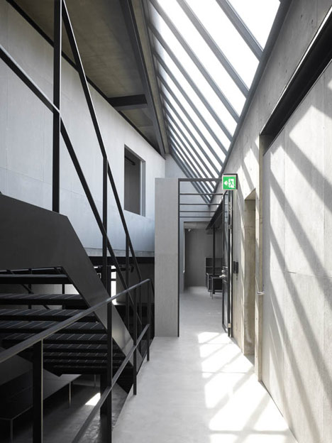
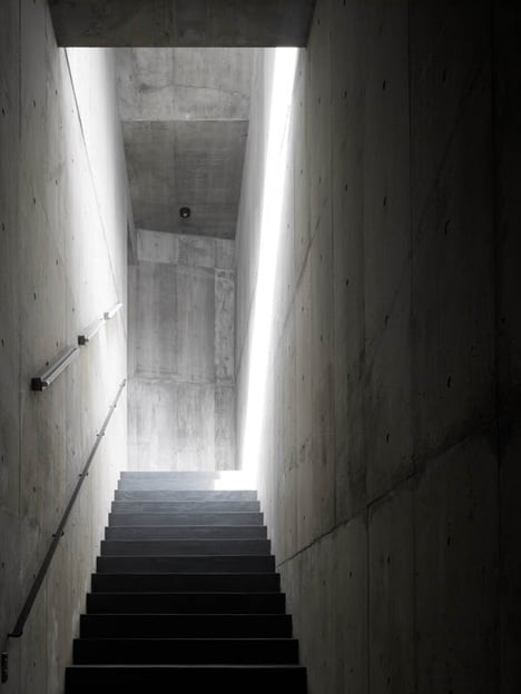
Long skylight is provided along the central axis, creating a sort of long and thin light well along the central axis.
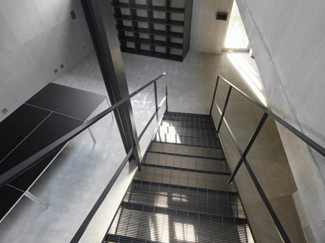
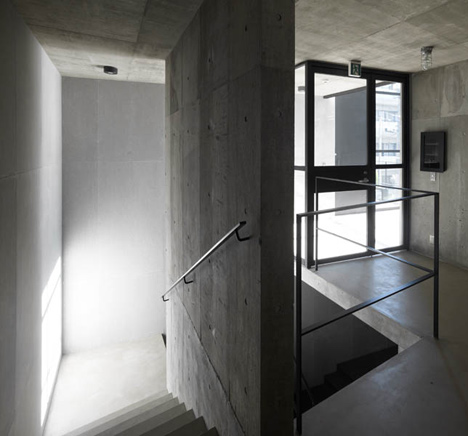
All workspaces are located at different levels on both sides of the light well, and they are connected with gently inclined stairs running along the central axis.
The light well helps them to keep comfortable distance between all workspaces, while creating a sense of togetherness at the same time.
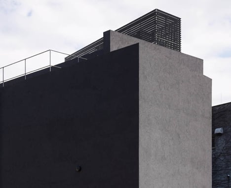
We intended to create rather bare and unembellished space like a warehouse. Finish materials are rough exposed concrete, fiber reinforced cement board, black painted steel and larch plywood.
We selected ordinary and rough materials used in industrial environment, in order to minimize the sense of “newness” and emphasized strong presence of each element.
We hope that this building will eventually be nicely worn out and be even more attractive as time goes by, like a piece of good vintage clothing that you’ve cherished for a long time. Our ambition is to propose future vintage architecture.
NH office building.
Architect: Shin Ohori / General Design

Location: shibuya Tokyo
Structural system: reinforced concrete

Site area: 402.17m2
Built area: 236.98m2
Total floor area: 992.31m2