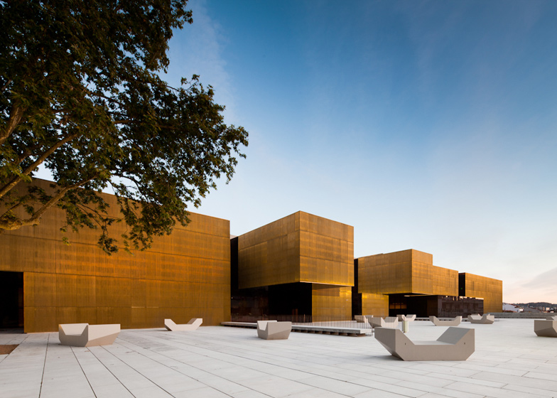
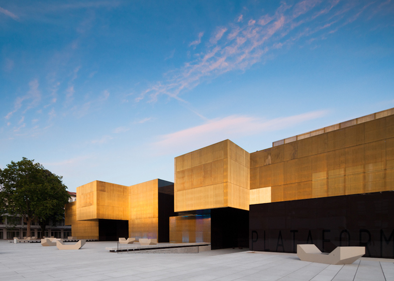
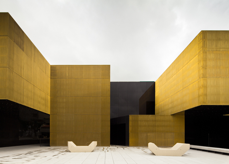
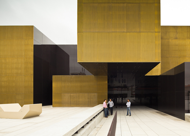
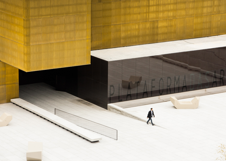
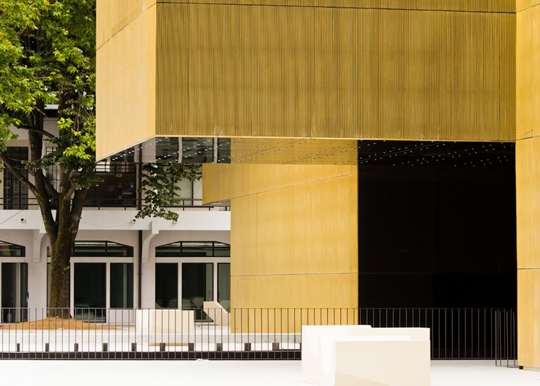
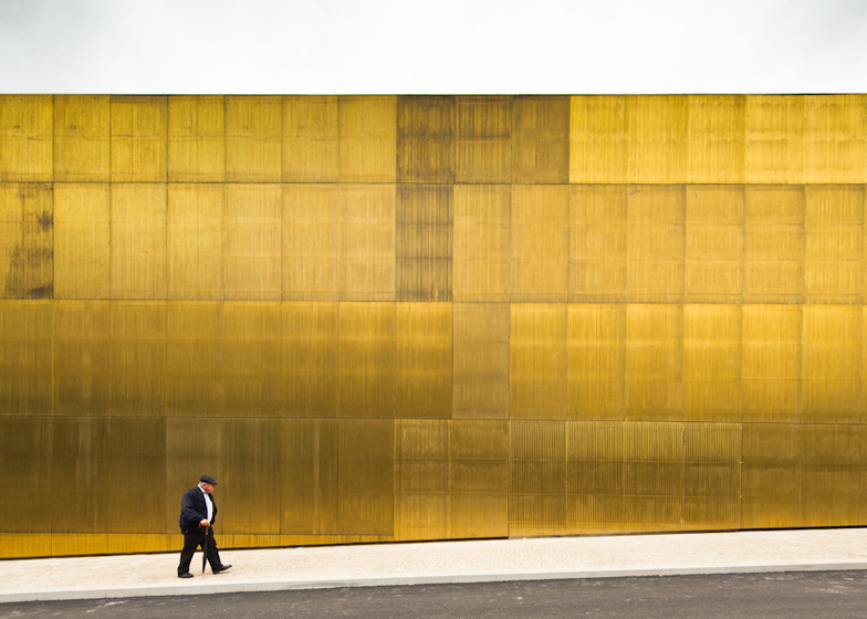
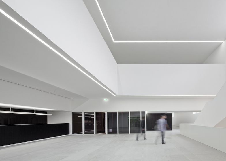
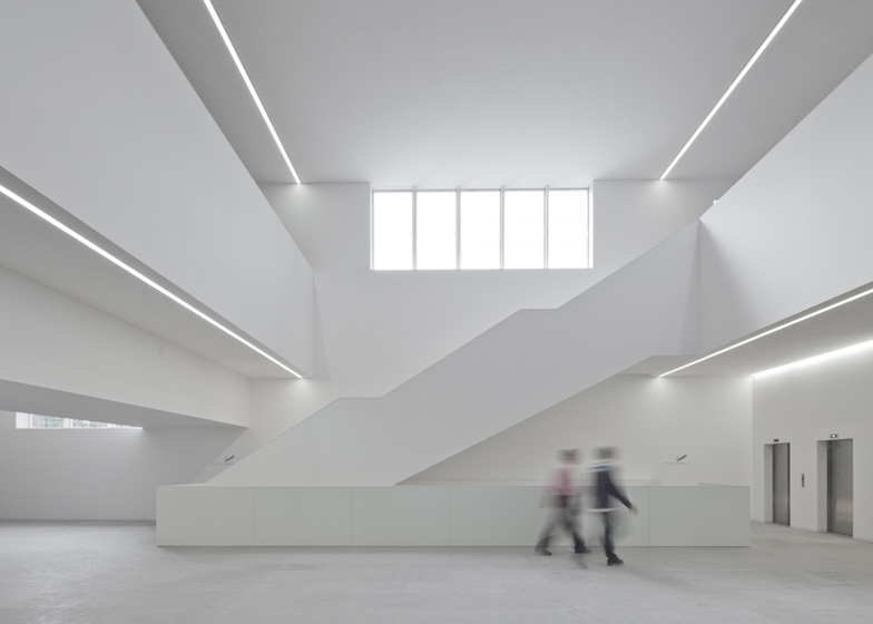
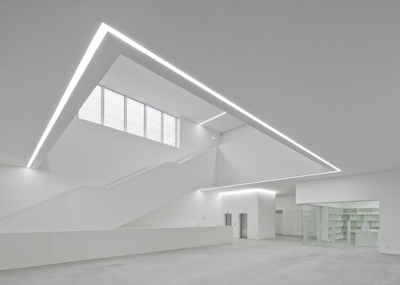
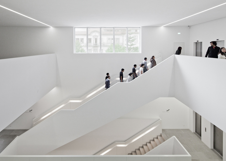
Shimmering brass walls surround this arts centre that Portuguese firm Pitagoras Arquitectos have just completed in Guimarães.
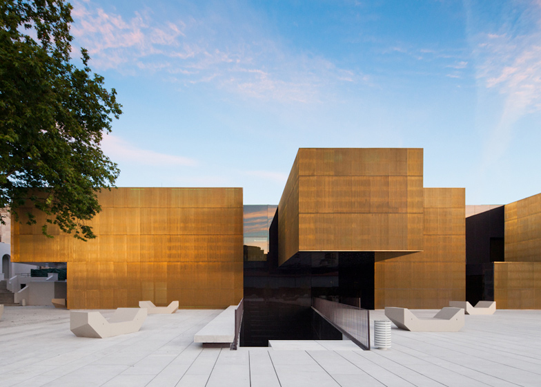
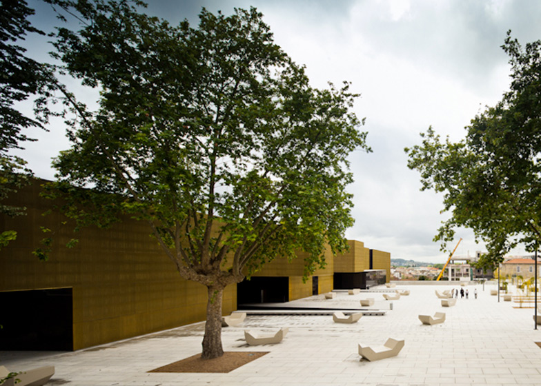
The new two-storey structure comprises a series of irregularly stacked volumes that extend out from a refurbished row of existing buildings on the edge of an old market square in the city centre.
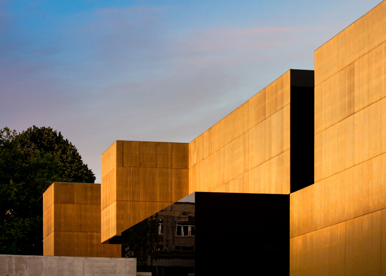
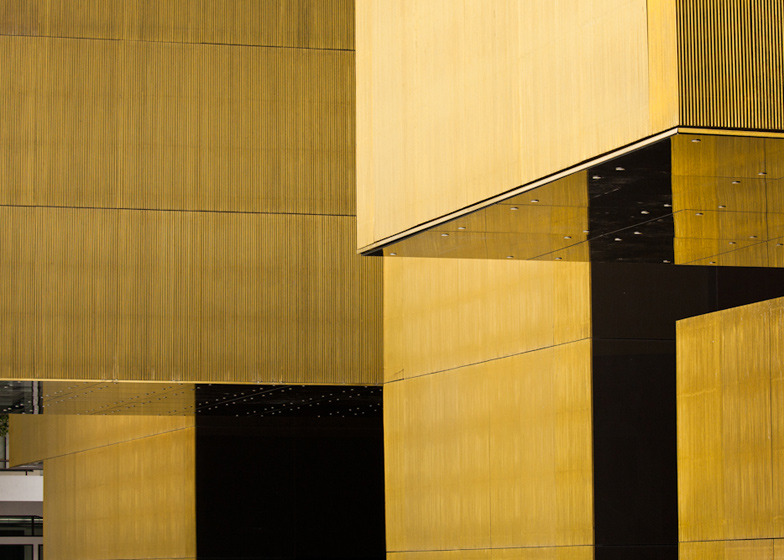
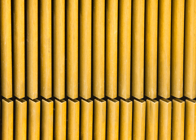
Rows of rectilinear brass pipes give the centre its ridged golden facade, while mirrors clad the underside of cantilevered rooms on the first floor.
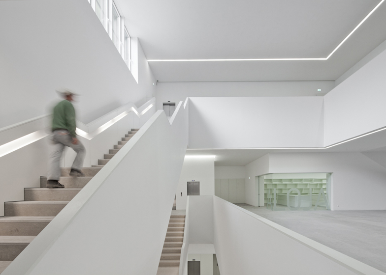
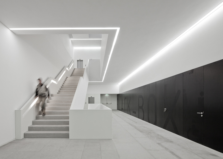
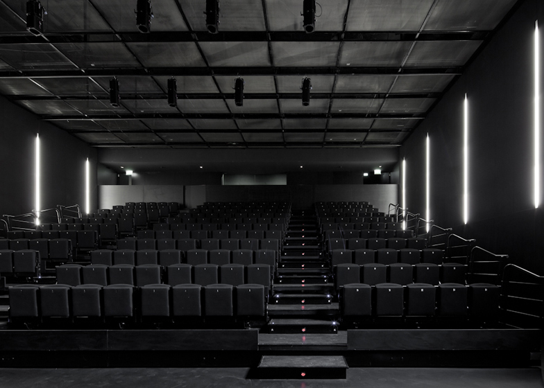
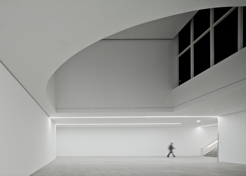
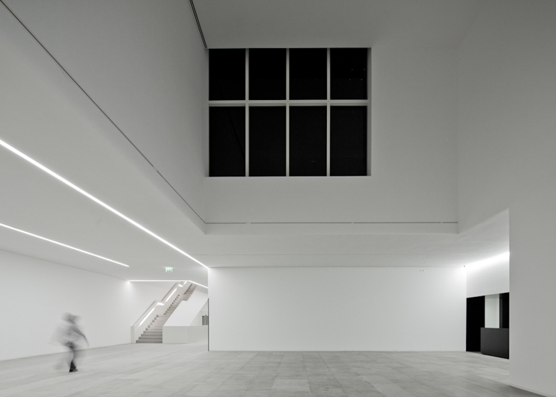
Two underground levels are located beneath the square to provide galleries, an auditorium and a car park, plus the building also houses creative workshops and offices.
The opening of the centre ties in with the city's status as European Capital of Culture for 2012 and will showcase a permanent collection of works by local artist Jose de Guimarães.
Buildings with golden exteriors have been popular in the last year and so far we've featured a library, a pavilion, a museum and a wedding chapel with golden walls.
See all our stories about golden projects »
Photography is by Joao Morgado.
Here's some text prepared by the architects:
Platform of Arts and Creativity
International Centre for the Arts Jose de Guimarães
Guimarães, Portugal
The buildings that make up the Municipal Market and the space defined by them, commonly referred to as "the square", a name inherited from market square are, as a unit, characteristic elements of the urban landscape of the city of Guimarães.
The grounds of the old municipal market boasted a privileged and very central location with excellent accesses, very close to the Toural Square and the historic center.
With this project, the transformation of the marketplace into a multifunctional space dedicated to artistic, economic, cultural and social activities within the scope of European Capital of Culture 2012, allowed for the physical and functional reintegration into the urban fabric, to become a reality and so, to recover one key area of the city space.
In addition, the operation extended to adjacent plots, enabling the regeneration of the interior space of the block, which was completely uncharacterized, as a result of its occupation by a marble processing industry.
The program provided a clear concept and defined the objectives intended to achieve with this infrastructure, listing a series of skills and spaces that constitute the functional program for both the new and the existing buildings, as well as the adjacent plots of land.
For this purpose three major program areas were defined:
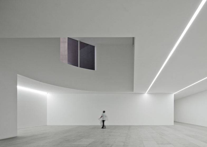
1. Art Center, which houses a permanent collection, in this case the Collection of José Guimarães, temporary exhibition area, a multipurpose space for additional activities, performances and shows, in addition to a series of complementary services.
2. Creative Labs (business support offices) for the reception and installation of activities related to creative industries, allowing the development of business projects.
3. Workshops to Support Emerging Creativity, consisting of workspaces and creative vocation for young creators in various areas, hoping to develop projects on a temporary basis.
Finally, the intent to recover the existing building on the eastern side, trying to promote the installation of additional commercial activities that could enhance the creation of a space with a broad scope in regards to multidisciplinary cultural activities.
The whole structure, according to the program would complement the existing equipment in the city, as well as those which are under development within the European Capital of Culture.
When interpreting the program, we aimed to allow for the possibility of each one of its components to function independently and simultaneously, creating accesses to each of the various services and support areas, as well as to the outdoor square and garden.
We opted for a methodology of intervention that involves the rehabilitation of the existing building to the east, keeping the materials and textures, but redoing the entire inside at level 0.
For the building at north, and for reasons previously mentioned, the façade towards the Avenue, which characterizes the building, is renovated, but its interior and façade facing the square were object of and almost complete demolition and redesign.
Although it is intended to maintain the scale and the existing formal relations, we propose a new solution for the building that promotes a strong relationship with the square and emphasizes the relationship of this structure with the outer space.
The new building takes a radically different language, by contrast with its surroundings, both from the standpoint of their language and image, discrete, repetitive, as well as by the succession of volumes, with full and empty, marked by the juxtaposition of contrasting surfaces.
The coatings, a grid of metal profiles in brass and glass surfaces chromatised on ventilated façades, accentuates a range of textures that is intended display, more dense and opaque in the majority of faces in the case of the metal structure, and transparent when it covertly comes to glass surfaces that intentionally conceal the few openings that the building comprises.
This series of volumes and dissonant elements, which result from decomposition of the initial volume, was originated by the need to create a variety of different spaces in the exhibition area, creating a tension evident in the volume of the building and the relationship with the space of the square, making it the main feature of its design.
For the square, we formulated a proposal with a drawing significantly more aseptic and a coating with large concrete slabs, as a counterpart to the surrounding buildings, characterized as a large reception and a multifunctional meeting area, translated into a physical platform, summing its vocation as public space by nature.
Click above for larger image
It will be an area purposely under fitted, with the preservation of the large trees to the east, by introducing some elements of vegetation along the north building, but leaving most of the free space allowing for the development of numerous spontaneously or organized activities, in the scope of the Platform or not.
Click above for larger image
The urban furniture used in the square comprises moveable elements, allowing for a more versatile use.
Click above for larger image
Location: Guimarães
Date: July 2012
Click above for larger image
Architects: Pitágoras Architects
Project team: Fernando Sá, Raul Roque, Alexandre Lima, Manuel Roque
Click above for larger image
Click above for larger image
Click above for larger image
Click above for larger image

