The Edge Gallery by Ministry of Design
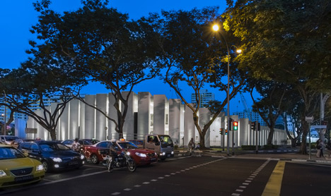
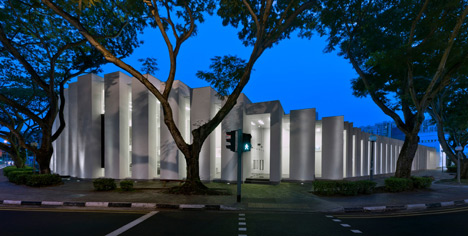
Narrow glass openings provide glimpses through the rampart-like facade of this property showroom in Singapore by architects Ministry of Design (+ slideshow).
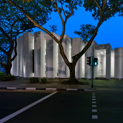
Named the Edge Gallery, the building contains a double-height sales gallery and two show apartments for developer UOL, who are constructing three residential towers on a former hotel and theatre site nearby.
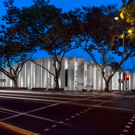
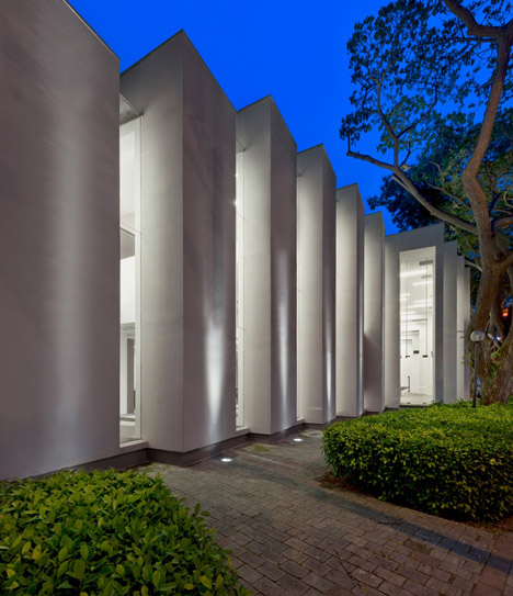
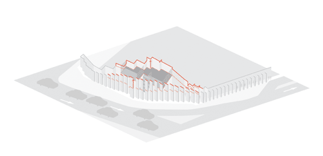
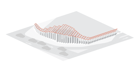
The walls of the two-storey building comprise a series of L-shaped columns that wrap over the roof, while doors and windows fill the gaps between.
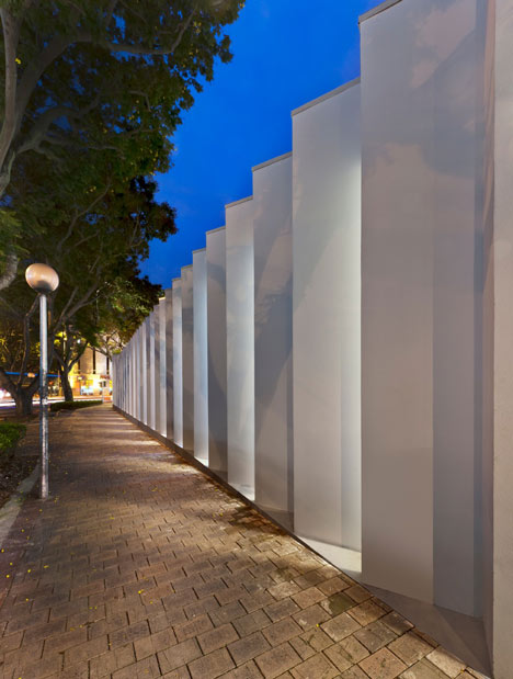
Unlike most showrooms, there are no signs or advertisements on the exterior of the building at all.
Other projects we've featured by Ministry of Design include a monochrome hotel and an extremely pointy pavilion.
See all our stories about Singapore »
Photography is by CI&A Photography.
Here's some text from the architects:
The Edge Gallery
Architecture + Interiors + Furniture Design
910 sqm | Singapore | Completed 2012
Scope
The Edge Gallery explores and redefines the typology of the Singaporean condominium show gallery on several fronts.
Commissioned by a reputed Singaporean developer, the project for the design of a sales gallery and two show flats of a 244 unit residential development is located at a major intersection along Singapore's eastern city fringe.
Explorations
Firstly, the design synthesizes unique characteristics of the site context with the client's programmatic requirements.
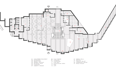
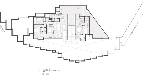
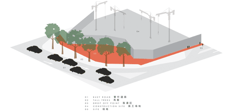
Key site issues included the unique semi-circle shaped site, noisy surroundings and a distant vehicular drop off point.
On another front, the design also sought to challenge conventional Singaporean show gallery precedents which seem to ignore the potential for unique architectural solutions as a valid and powerful marketing device.
In contrast to this, the Edge Gallery departs from the formulaic combination of staid glass boxes and over-sized billboards.
Click image above for larger image
Relying instead on the inherent branding value of an iconic architectural statement as a more relevant, subtle & sophisticated form of advertisement.
Click image above for larger image
Incidentally, the project met with significant sales success within its first week and has established a possible new alternative model for the Singaporean show gallery.
Click image above for larger image
Solution
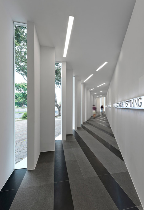
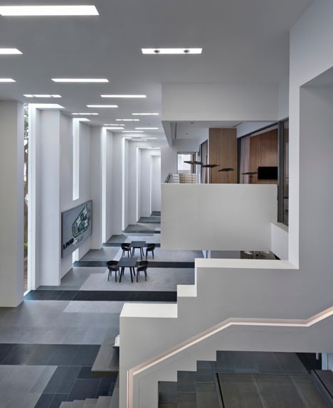
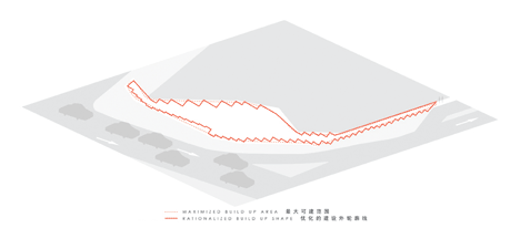
The building can be understood as a series of white L-shaped walls paired with interstitial vertical glass strips contouring in harmony with the shape of the site to form the overall building.
Click image above for larger image
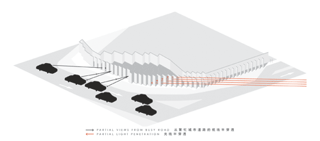
The glass strips are intentionally turned away from the oncoming traffic flow but allow for views ports and entry portals.
Click image above for larger image
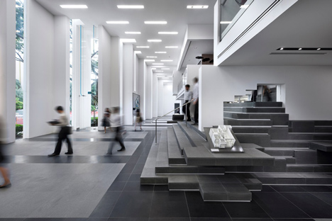
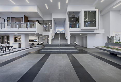
The alternating rhythm of wall and glass is continued in the building's section, peaking at over 7m to form a double-height internal space into which the show flats and balconies face, simulating high-rise living.
Click image above for larger image
The interior design takes its cues from the overarching design language, applying it to floor and wall patterns or finishes.
Click image above for larger image
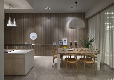
The show flats question the notion of contemporary luxury, eschewing typical elements of ostentation for more understated luxury and authentic material richness.