Uchi Lounge 02 by Facet Studio
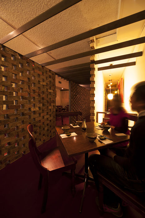
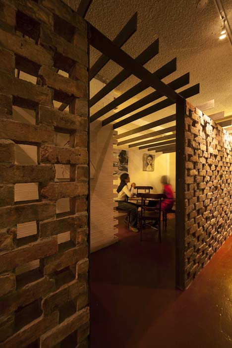
A screen made from century-old bricks divides this Japanese restaurant in Sydney, designed by Australia and Japan-based architects Facet Studio.
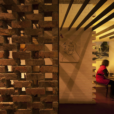
Facet Studio inserted the wall to provide a new route from the restaurant's entrance to the tables.
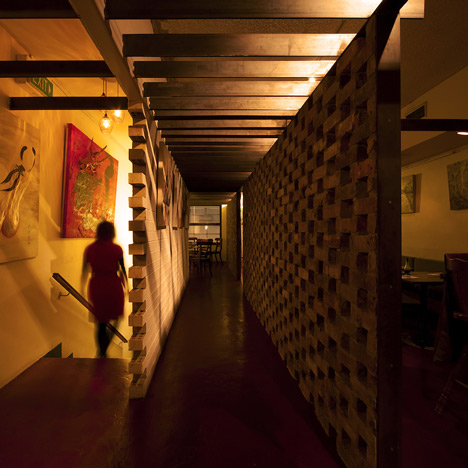
Low steel beams jut out from the adjacent wall to steady the bricks.
Previous projects by Facet Studio we've featured on Dezeen include a shop in Sydney full of vending machines that dispense T-shirts and a vintage boutique in Osaka with shelves made from stacked timber.
See all our stories about bricks »
See all our stories about restaurants »
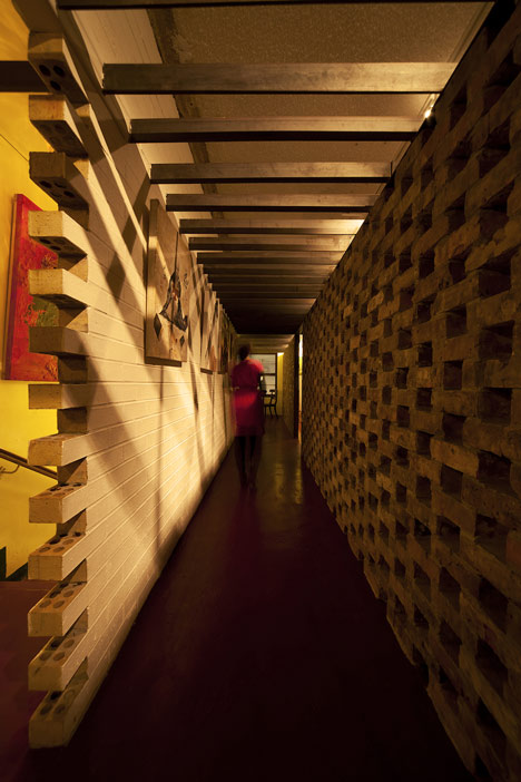
Photographs are by Andrew Chung.
Here's some more information from the designers:
This is an existing Japanese restaurant popular with regular customers who are after the chef’s specialty dishes. It seemed to have captured the regulars with not only the deliciousness of cuisine but also the indefinably nostalgia-filled space. So how do we enhance the experience of appreciating the cuisine, without destroying this atmosphere treasured by regulars? As we have been working with 'repetition' as a means to build up a deep excitement within people, we thought to utilise this effect to enhance, rather than break, this indefinable nostalgia.
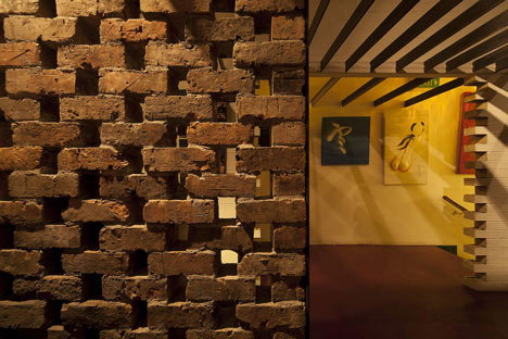
There we designed a new circulation path from entry to table, by 'repeating' the recycled bricks from 100 years ago (in response to the indefinable nostalgia) and rustic raw steel (in response to the client’s preference). It is a tunnel to enhance expectation towards the cuisines when one proceeds towards the table. The longer the distance of travel, the more room for enhancing this expectation.
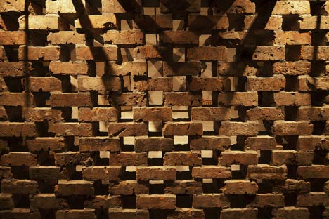
The 'brickwall with 1/3 of its length punctured' and 'brickwall with 1/4 of its length punctured' alternated for a lengthy 15m. The raw steel louvres, located 1m below the existing ceiling, correspond with the rhythm of the brick screen by spacing at one or two brick lengths. The resulting light and shadow create a repetitive rhythm, coming together in the tunnel. This repetitive rhythm enhances expectations, which in turn enhances the sensitivity to taste. When one reaches the table, it is the time the desire for the cuisine reaches its peak.

Floor plan - click above for larger image
Programme: Restaurant fitout
Project team: Yoshihito Kashiwagi, Olivia Shih, Neo Di Sheng, Benjamin Chan
Location: Sydney, Australia
Area: 77 sq. m.
Year: 2011