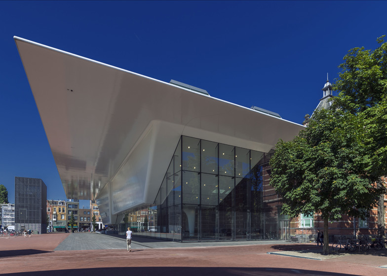
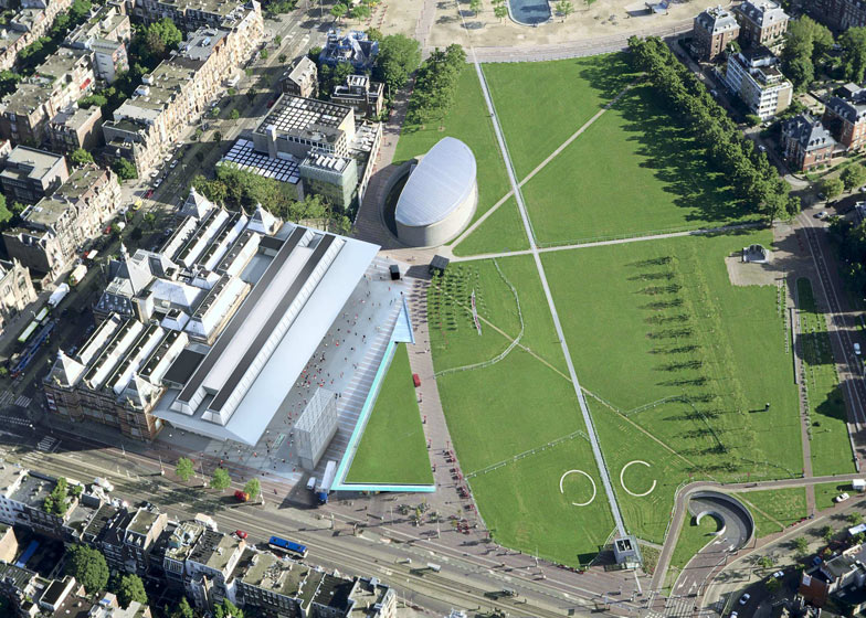
Benthem Crouwel Architects have completed the new extension to the Stedelijk Museum in Amsterdam, which looks rather like the underside of a kitchen sink (+ slideshow).
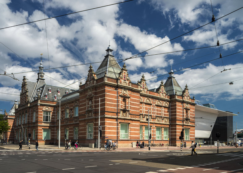
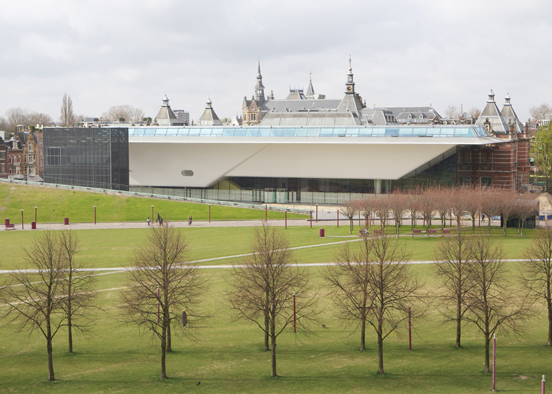
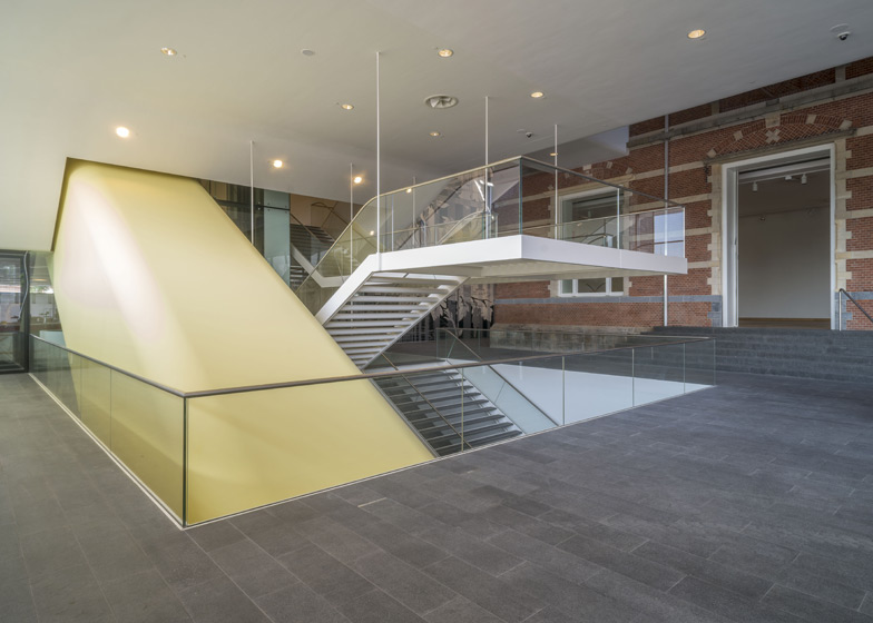
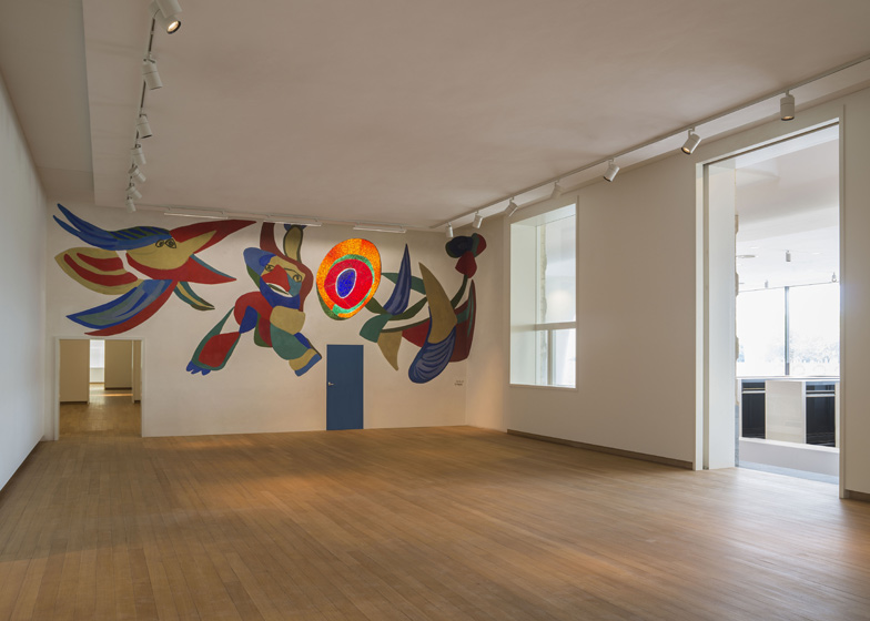
Designed by A. W. Weissman in 1895 the museum's original red brick building has been renovated and enlarged with a curvy white extension, part of which is underground.
The entrance is situated in a transparent facade facing onto the open grassy expanse of Museumplein.
The upper edges of the white extension extend outwards to shelter the plaza.
Above image is by Ernst van Deursen
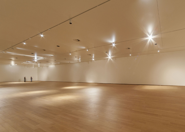
The museum's shop and restaurant are located next to the entrance, while a large exhibition hall, library and 'knowledge centre' all lie below ground.
Above image is by KLM Carto
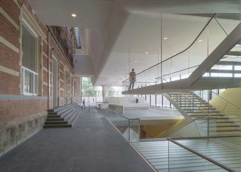
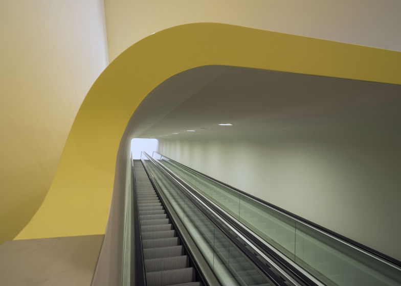
Two escalators in an enclosed tube connect the exhibition spaces on the lower and upper levels, allowing visitors to bypass the entrance area.
We recently featured another large white extension to a red brick building – a museum in a former brewery in Zurich.
See all our stories about museums »
See all our stories about Amsterdam »
Photographs are by John Lewis Marshall except where otherwise stated.
Here's some more information from the architects:
Amsterdam's Stedelijk Museum is renovated and enlarged. Designed by A.W. Weissman, the building is celebrated for its majestic staircase, grand rooms and natural lighting. These strong points have been retained in the design along with the colour white introduced throughout the museum by former director Willem Sandberg. The existing building is left almost entirely intact and in full view by lifting part of the new volume into space and sinking the rest underground.
Its entrance has been moved to the open expanse of Museumplein where it occupies a spacious transparent extension. The smooth white volume above the entrance, also known as ‘the Bathtub’, has a seamless construction of reinforced fibre and a roof jutting far into space. With this change in orientation and the jutting roof, the museum comes to lie alongside a roofed plaza that belongs as much to the building as to Museumplein. Against the backdrop of the old building, the white synthetic volume is the new powerful image of the Stedelijk Museum.
Besides the entrance, a museum shop and the restaurant with terrace are situated in the transparent addition on ground level. Below the square are among others, a knowledge centre, a library and a large exhibition hall of 1100 m2. From this lowest level in the building it is possible to move to a new exhibition hall in the floating volume level. Via two escalators in an enclosed "tube", straight through the new entrance hall, the two exhibition areas are connected. This way the visitor crosses the entrance area without leaving the exhibition route and without being distracted by the public functions; visitors remain in the museum atmosphere.
The detailing and color on the inside of the old and new buildings is in alignment, making the explicit contrast between the old building and the new building barely noticeable when walking through the museum. The Weissman building is reinstated in its former glory as it embarks on a new life, facing Museumplein, under one roof with the new addition.
Client: City of Amsterdam
Architect: Benthem Crouwel Architekten
Gross floor area: 12000 m²
Start design: 2004
Start construction: 2007
Completion: 2012


