Wu Residence by Neri&Hu
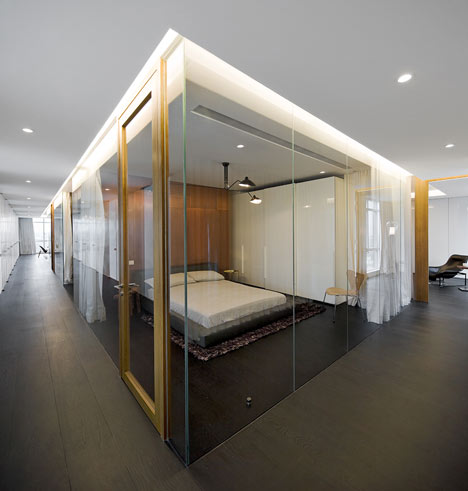
A large glass vitrine holds rooms like exhibits at the centre of this apartment in Singapore by Chinese architects Neri&Hu.
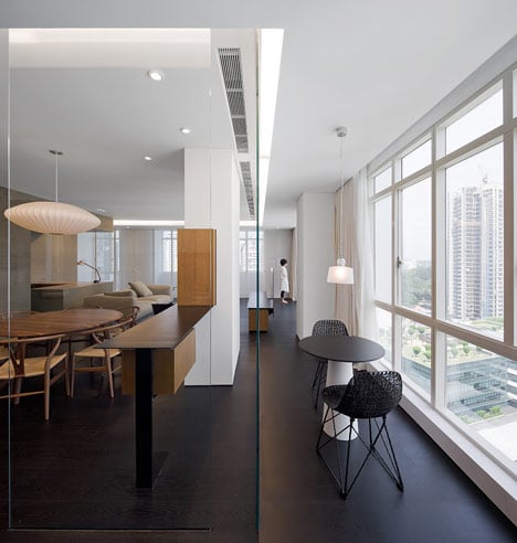
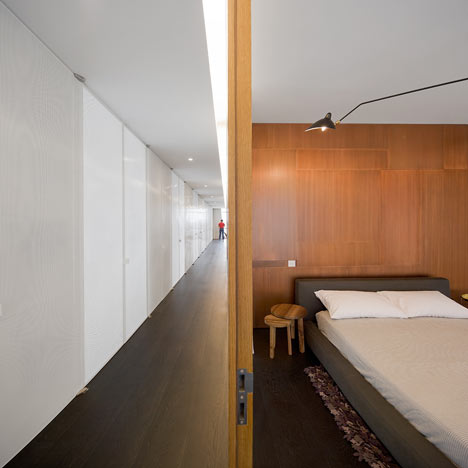
Only the kitchen meets the walls of the Wu Residence, while other rooms are surrounded by a single corridor that lines the perimeter.
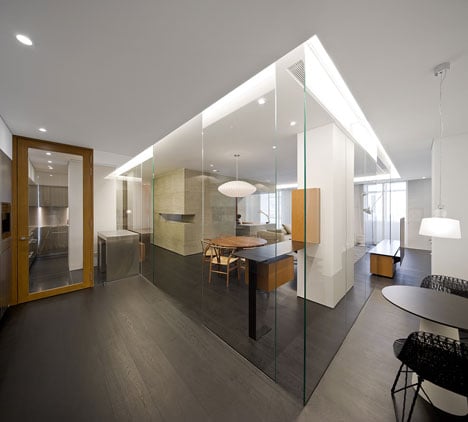
"The client was provoked by his kids that he was not cool enough," Lyndon Neri told Dezeen. "So he selected the craziest scheme."
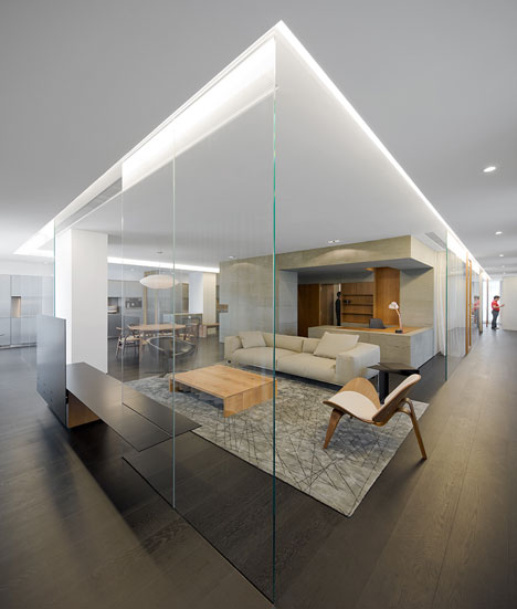
Behind the layer of glass, Chinese stone defines the walls and surfaces of the study, the bathroom is lined with copper and the master bedroom is positioned in front of a single wooden wall.
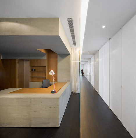
Translucent curtains are all that screen the rooms from the surrounding corridor.
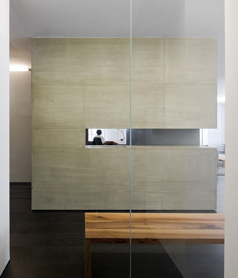
"By having this transparency the entire flat felt bigger," said Neri.
See more stories about Neri&Hu here, including our interview with Lyndon Neri about the hotel they completed inside a former army headquarters.
See more stories about apartments »
Photography is by Pedro Pegenaute.
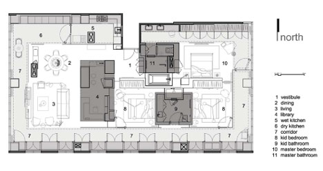
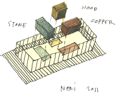
Plan - click above for larger image
Here's a design statement from Neri&Hu:
Wu Residence: Design Statement
Shanghai-based architects Neri&Hu recently completed a 250 square-meter private residence in a high rise tower in the heart of Singapore. The client’s mandate was simple: “Give me three bedrooms and a project that will challenge the conventional notion of what a flat should be.” Rising up to this challenge, Neri&Hu initiated the project by questioning the fundamentals of the “house” typology itself, asking themselves: How can we free up the plan and make it feel light and loft-like? What is the relationship between the communal and private? When and how should privacy be maintained, if at all? What are the essential and non-essential program components that make a “home”? What is domesticity?
The resulting parti breaks though all conventions of the standard apartment layout by placing the rooms away from the building edge, reserving a continuous corridor along the entire perimeter. Rather than enter into the center and then radiate outwards towards individual rooms, a configuration often taken for granted as the ideal condition in high rise residences, here, the private zone forms the core of the space, while the public circulation zone envelops and ties everything together. The strategic insertion of three free floating volumes, clad in wood, stone, and copper, adds to the depth of the spatial layers, enclosing within them the most private and intimate rooms of all—the study and the two bathrooms. The remaining space is kept transparent, pushing the boundaries of how open and extroverted a room can be, while still maintaining privacy. The project rejects the parcelization of spaces found typically in apartment layouts, creating an openness and expansiveness that is more conducive to the contemporary lifestyle.