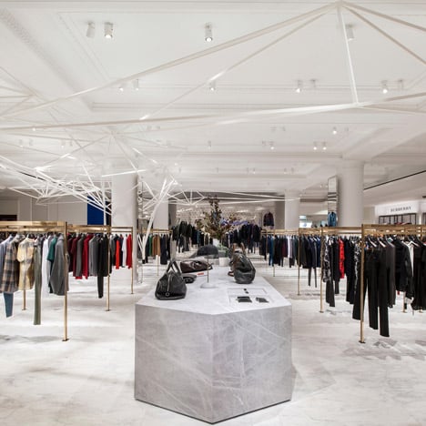
Selfridges Men's Designer Space by Alex Cochrane
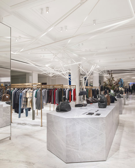
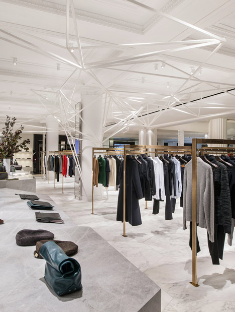
A geometric sculpture grows from a column and branches across the ceiling of the new designer menswear space designed by architect Alex Cochrane for London department store Selfridges.
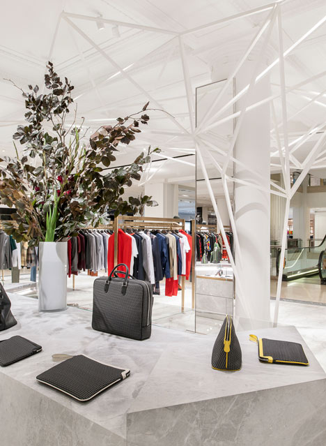
"We wanted to challenge the way items of clothes, products and accessories are displayed," Cochrane told Dezeen during a tour of the space before it was opened.
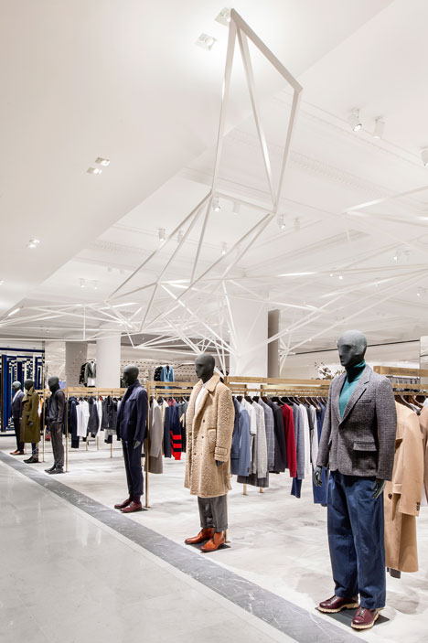
Manequins are lined up like soldiers at the end of each row of brass clothing rails and selected garments hang on brass rods that slide in and out of a mirrored wall where required.
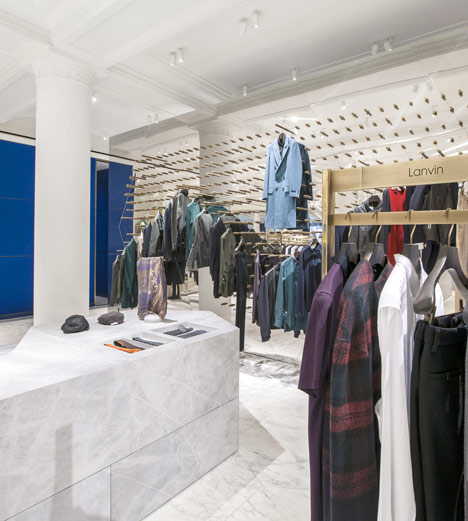
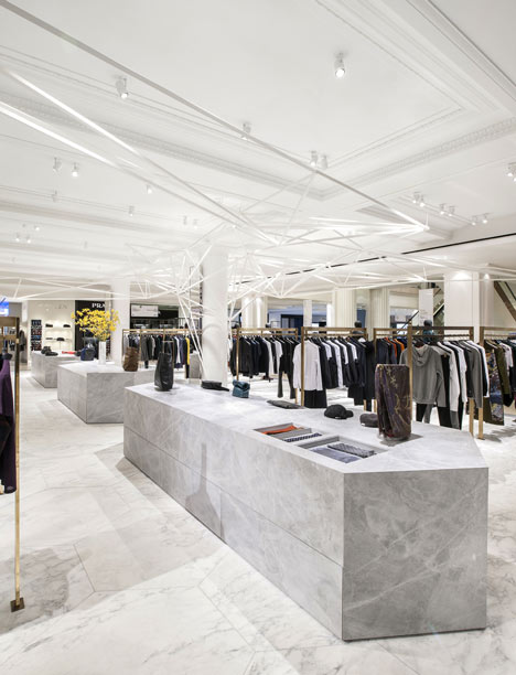
The angular plinths used for displaying accessories are clad with the same material as the floor tiles, a rare light-grey Bleu de Savoie marble that comes from a single quarry in France.
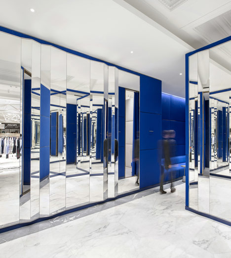
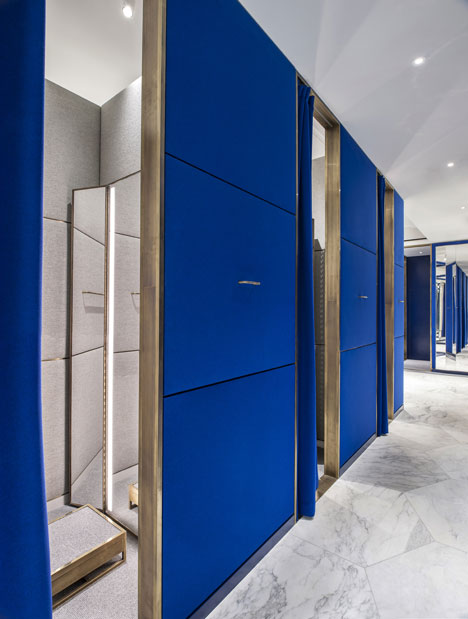
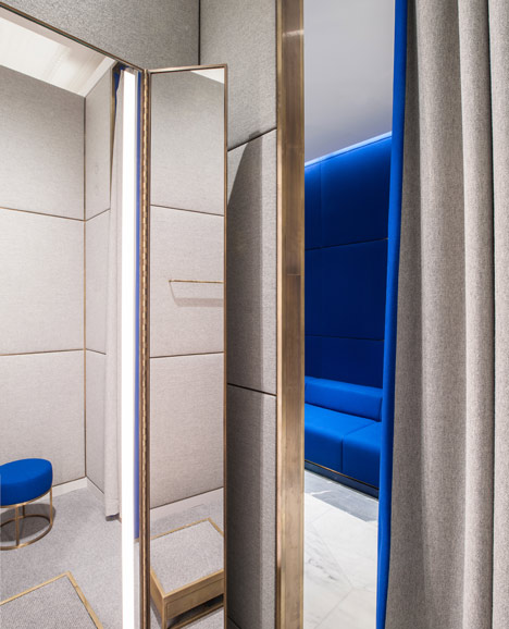
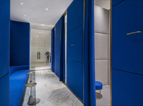
The fitting rooms are lined with zig-zagging mirrors and bright blue fabric, providing a contrast to the simple palette in the main space.
The project is on the first floor of the department store, which is also currently hosting a pop-up concept store for Louis Vuitton designed by Yayoi Kusama.
Photos are by Andrew Meredith.
Here is some more information from Alex Cochrane:
From the start we worked with Selfridges to challenge the conventional approaches towards retail design, luxury and display. We pushed the boat out but they encouraged us to do so. We shared a creative understanding and a confidence that allowed us to investigate and then build a series of unique display elements. We developed these elements to be dynamic in their form, execution and materiality so as to welcome and inspire the visitor. In essence, our approach was sculpture park meets retail.
The Men’s Designer Display Elements
The hanging rails greatly influenced our approach in designing the Men’s Designer area. It was essential that the rails showcased the international brands in the best possible light. We preferred an ordered and repetitive layout of fixed rails that would define a legible retail environment and a coherent customer experience. The solid brass rails with a patinated bronze finish are all of one size and are positioned in pairs along the perimeter walkways and either side of the three stone plinths. The gaps between the rails allow the customer to freely view the merchandise or cross the floor without obstruction.
They create a form of buffer zone between the central aisle and the high traffic walkways that surround the mat. This is advantageous, as the Men’s Designer area is very much exposed to its surroundings. This buffer zone ensures that the aisle remains a haven where the customer can quietly view the brands in their entirety without the distractions that often accompany large retail environments.
The Stone Plinth
Selfridges shared our view that some merchandise would be better presented on slanted surfaces. We designed three monumental stone plinths that would be placed in succession down the middle of the central aisle of the Men’s Designer area. They appear to be solid blocks of stone that have been sculpted back to allow for a varying amount of flat and slanted surfaces. The hexagonal cut corners, which match the shapes of the stone floor, only heighten the sculptural qualities of the plinths.
Their gravitas ensures that that they are not just viewed as display units but also as permanent architectural components integral with the shop floor. A light grey marble was chosen for its consistent veining and colouring. This stone also worked well against the large white and grey veined the hexagonal floor slabs. Very fine detailing and precision in the fabrication and cutting process were key in defining the purity and solidity of the objects. The plinths include storage drawers but they remain discreet to the eye. A glass display unit is incorporated in the central plinth housing the smaller accessories.
Feature Wall
It was always our intention that the rear of the Men’s Designer floor should include a dramatic display element that would activate what was until recently an uneventful part of the floor. The large mirror-polished wall contains 700 solid brass rods that are free to slide in and out at varying lengths to hold merchandise. Depending on the brand objectives, this feature wall can generate numerous display and three-dimensional relief formations increasing the playful dynamics of the retail environment.
The mirror-polished stainless steel reflects and distorts the environment and like the canopy structure provides a point of focus for the customer to view from afar. The design of the wall was very much inspired by the Pinscreen toy patented by Ward Fleming in the 1980s.
Canopy Structure
The canopy structure originally stemmed from Selfridges’ desire for a pop-up shop within the Men’s Designer area. This pop-up shop would frame a location where a brand could be showcased in a more theatrical light.
We initially proposed a modest size structure that countered the repetitive order of the rails, flooring and the traditional coved ceiling. The structure took on an organic and random form. But as the project developed the structure just kept on growing, spreading out along the underside of the coffers and beyond the limits of the space and over the walkways eventually becoming an unmissable point of interest within the central atrium. We welcomed this expansion as it helped to define the Men’s Designer floor area within the larger context of the central atrium and the numerous brands that occupy it.
We developed the sculpture through a series of models including a 1-to-1 prototype. We paid particular attention to its fluidity so that it would serve as a directional tool inviting the customer off the walkways and onto the shop floor. The sculpture is theatrical with its tree-like form, but we opted for a white finish to match the coffered ceiling. We preferred to maintain a level of subtlety in order that all the varying elements worked together rather than against each other.
The Fitting Rooms
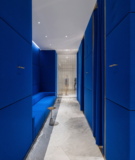
The Fitting Room Area offers the customer a very different experience from that on the shop floor. To enter the Fitting Rooms one first encounters a lobby space of faceted mirrors that pull you into a lowly lit corridor. The fabric-lined walls, soft lighting, relaxed seating and unique fixtures allow the customer to quietly and calmly consider the merchandise away from the movement and sounds of the main floor.