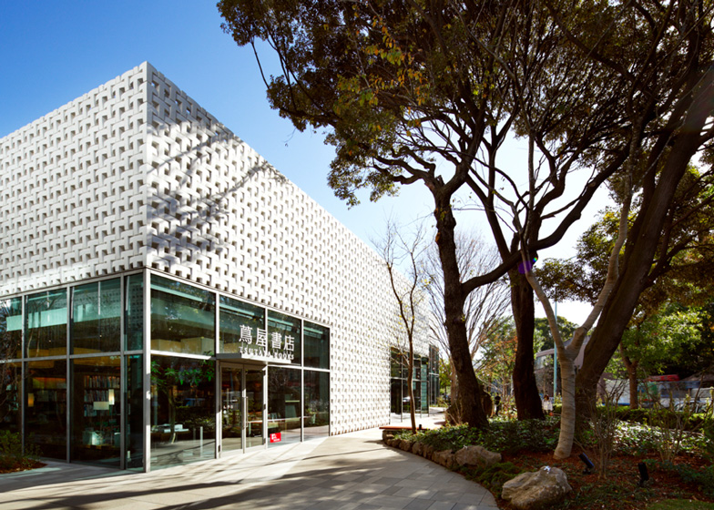
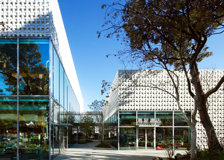
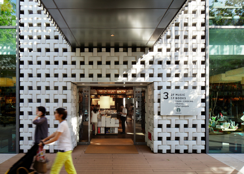
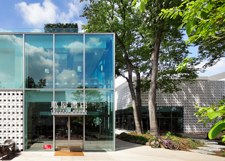
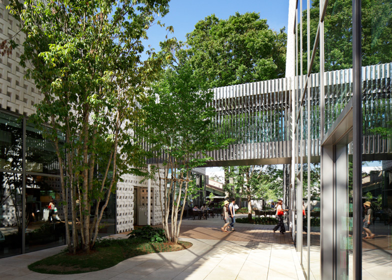
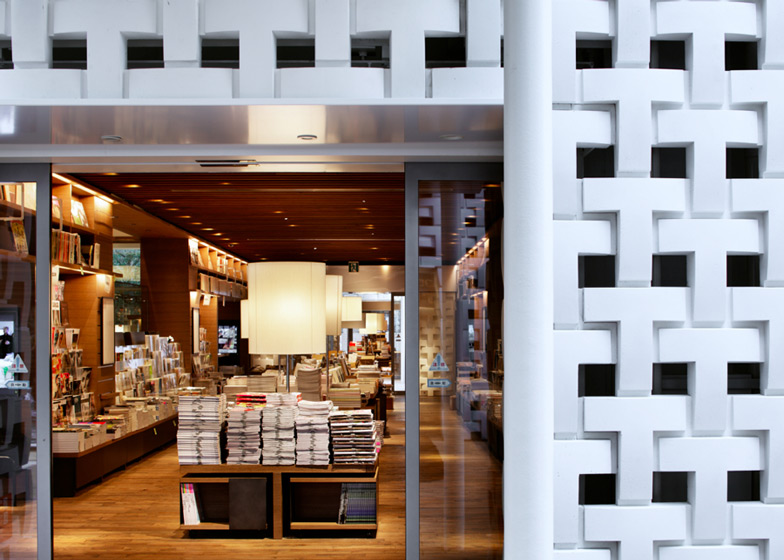
The latticed facade of this Tokyo bookstore by Klein Dytham Architecture comprises hundreds of interlocking T-shapes that subtly reference the logo of entertainment retailer Tsutaya (+ slideshow).
"The T idea for the project came to us during the initial briefing session with the CEO of Tsutaya," architect Mark Dytham told Dezeen. "He was hoping for an iconic building, branded in a non-branded way, without having to rely on signage."
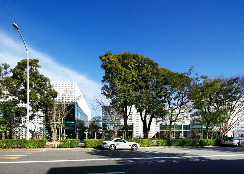
The little shapes also combine to create larger Ts on the elevations of the three buildings that make up the complex.
The grid created by the shapes lines up with the structural systems, and Dytham explained how this helped them to "determine the general layout" of each building.
This layout was also influenced by the locations of several large trees, which the buildings nestle between.
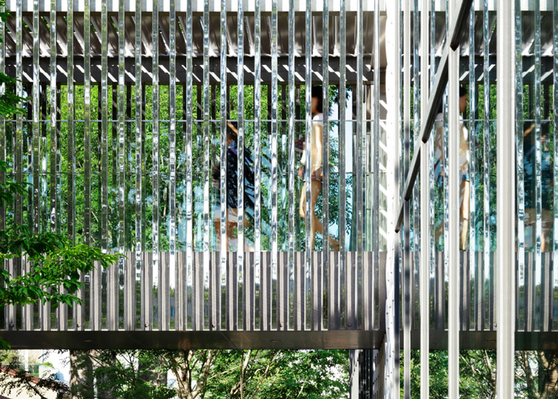
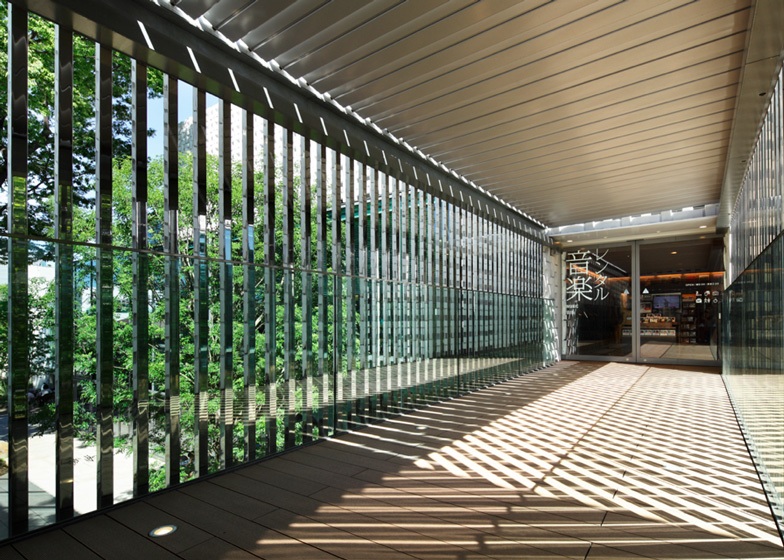
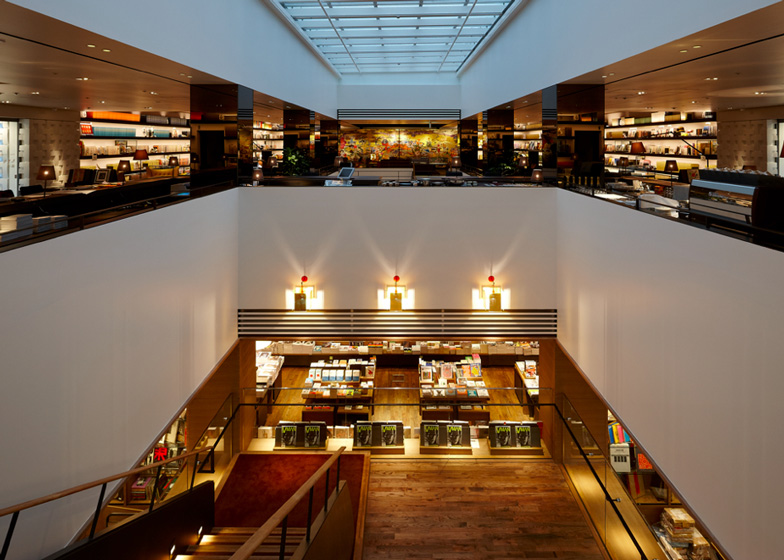
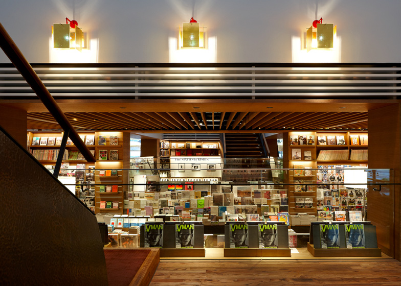
Louvred steel bridges link up with aisles on the first floor of each block, which the architects refer to as the "magazine street".
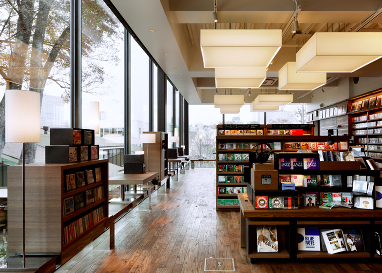
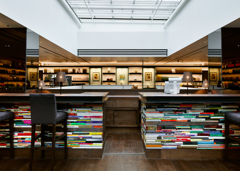
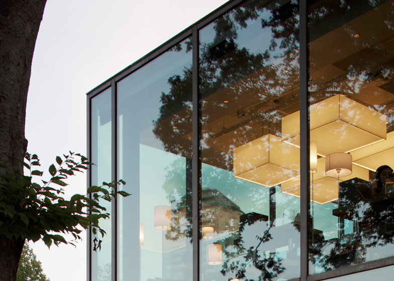
As well as sales areas for books, CDs and DVDs, the store also contains a convenience store, a lounge and cafe.
Other projects we've featured by Klein Dytham Architecture include an airport lounge for Virgin Atlantic and a combined home and salon.
See more stories about Klein Dytham Architecture »
Photography is by Nacasa & Partners.
Here's a project description from Klein Dytham:
T-Site, Daikanyama, Tokyo
Klein Dytham architecture won the T-Site commission in a 2 stage invited competition. 77 architects were invited to submit proposals and KDa made it to the final selection with Kengo Kuma, Atelier Bow Wow, Mikan Gumi and Kumiko Inui, before winning the project in the final round.
KDa’s new Daikanyama T-Site is a campus-like complex for Tsutaya, a giant in Japan’s book, music, and movie retail market.
Located in Daikanyama, an up-market but relaxed, low-rise Tokyo shopping district, it stands alongside the legendary Hillside Terrace buildings designed by Pritzker Prize-winning architect Fumihiko Maki.
Slotted between large existing trees on the site, the three pavilions are organized by a “magazine street” that threads through the complex, blurring interior and exterior.
Tailored particularly to over-50 “premium age” customers, Tsutaya’s normal product range is complimented by a series of boutique spaces carrying carefully curated product ranges.
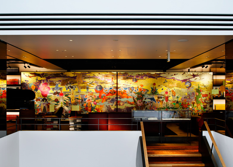
Other facilities include a café, an upscale convenience store, and the Anjin lounge, where visitors can browse a library of classic design magazines and books or peruse artworks for sale as they eat, drink, read, chat, or relax.
Externally, KDa’s characteristic wit emerges in subtle ways – the perforated screens of the façade are formed from the Ts of the Tsutaya logo, and much larger T-shapes are disguised in the building plans and elevations.
Architecture and interior design: Klein Dytham architecture
Art Direction: Tomoko Ikegai
Architectural Consultant: RIA
Structural Engineer: Structured Environment
Main Contractor: Kajima Construction
Ground floor plan - click above for larger image

