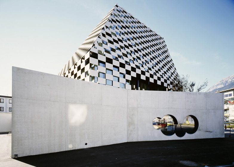
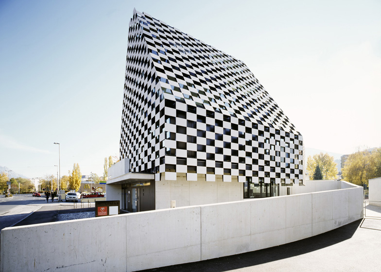
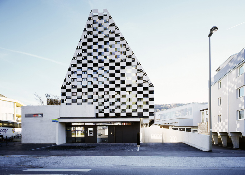
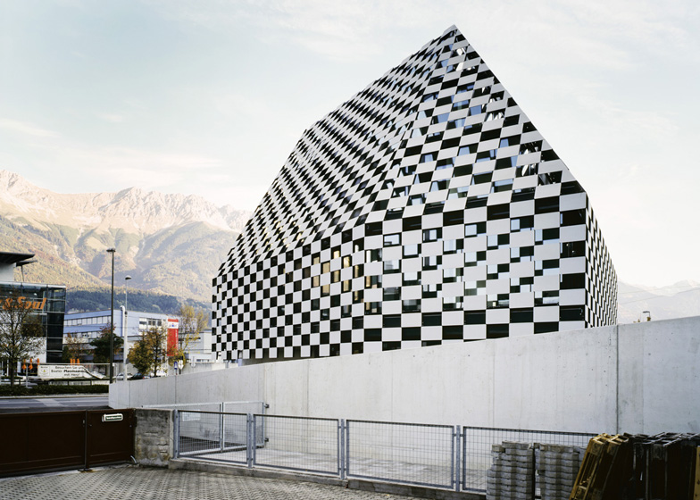
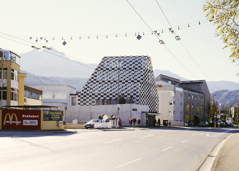
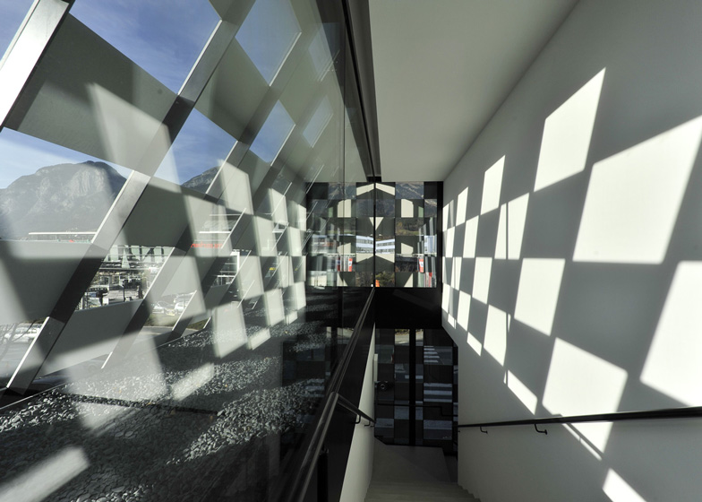
A chequerboard of solid and void cloaks the tapered glass walls of this bank in Innsbruck by Austrian architect Rainer Köberl (photographs by Lukas Schaller + slideshow).
The four-storey building, for European bank BTV, has a steeply gabled profile that creates enough height for two more storeys than are usually permitted in the area by local planning authorities.
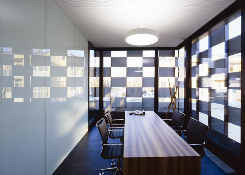
The fibre-reinforced concrete panels function like louvres to moderate the daylight passing into the building.
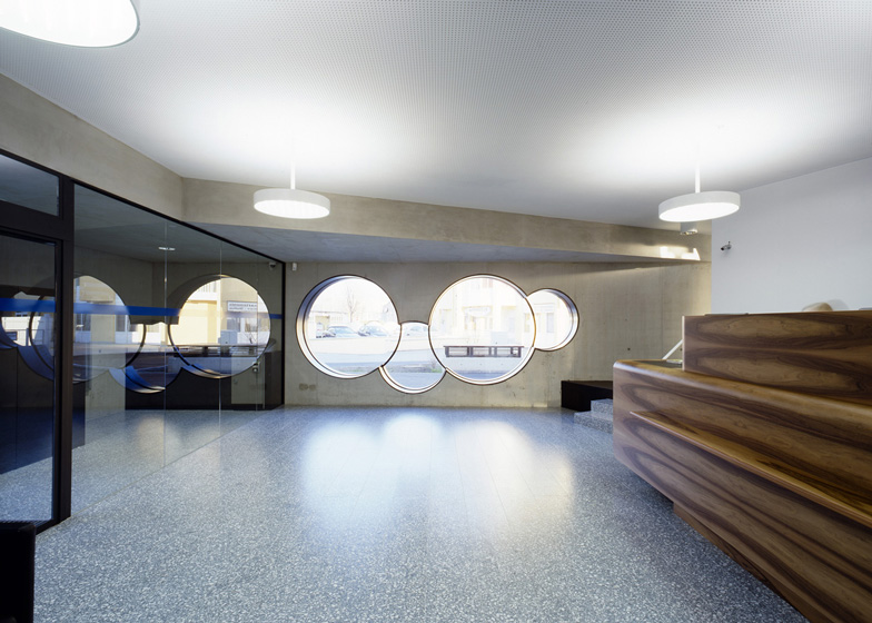
Below the chequered screen, a wall of concrete surrounds the ground floor, with windows in the shape of overlapping circles.
The bank occupies the ground and first floors of the building, while the two upstairs floors are rented by a doctor and a shipping company.
We've featured a few interesting banks on Dezeen, including one with cardboard meeting rooms.
See all our stories about banks »
Here's a project description from the photographer:
Black and white squares cover the building in a regular pattern. It suggests a chessboard, but also has something of the white snow-covered mountains that surround Innsbruck.
What really inspired Rainer Köberl for this new building on the edge of town he did not divulge to me. But one thing is for sure: he succeeded in making a strong statement.
He created a building that can hold its own in an urban architectural jumble without having to resort to great formal contortions.
We are standing on Mitterweg, a street extremely busy with both car traffic and pedestrians. A building supply store, even several large supermarkets, schools, residential buildings and commercial enterprises extend along its right and left sides.
The Vier Länder Bank, known as BTV for short, wanted to have a new building for a branch built here on Mitterweg and held a competition by invitation for its design.
The jury was chaired by the Viennese architect Heinz Tesar, who had built the head office for BTV, the so-called Stadtforum (completed in 2006), in Innsbruck’s historic centre.
In the course of the competition, the bank realised the property was actually too small for its needs and it did not award a prize. After being able to purchase an additional small lot adjoining the property, it invited the same participants to a second round.
That provided the Innsbruck architect Rainer Köberl a good opportunity to give his design an edge. He kept the pointy cap-like shape rising up to a peak, but proposed a different material for the facade and was able to win the competition.
The striking feature of this bank building is its steeply rising roof – Köberl wanted to make the building as tall as possible so it is not swamped by the surrounding urban architectural jumble. Actually, only two storeys are allowed in this location.
Site plan - click above for larger image
That is why the body of the building bends sharply towards the roof ridge from the second storey upward. Underscoring the shape is the striking pattern of the facade.
Ground floor plan - click above for larger image
Like a chessboard, the outer skin consists of square, concrete-coloured panels made of fibre-reinforced concrete alternating with black air holes of the same size. In order to be better able to gauge the size of the individual panels, Köberl recounts, he went to Vaduz. There, Hans Jörg Göritz had realised a similarly steeply rising form of roof ending in a point for the Landesforum and Landesparlament (parliament) of the principality of Liechtenstein, though in this case of small-sized bricks.
First floor plan - click above for larger image
Using the measurements of the bricks, Köberl was then able to count up and calculate what seemed to him the right size of panel for his own building. Behind the facade’s outer skin, the reinforced concrete structure with glazing all around tapers towards the top like a stepped pyramid. A 60-centimetre-wide steel maintenance balcony is positioned between the glass skin and outer skin of the facade.
Second floor plan - click above for larger image
Attached to it are steel struts which, in turn, hold the fibre-reinforced concrete panels. From the outside this net house allows hardly any views of the interior. From indoors, on the other hand, the dark squares scarcely obstruct the view out – better still, they help shut out the ugly neighbouring buildings and allow the focus on beautiful sights such as the silhouette of the mountains.
Third floor plan - click above for larger image
A concrete wall beginning its gradual ascent parallel to the garage entrance wraps once around the whole building at a certain distance from it, but then comes into contact with it on the east side after all.
Section - click above for larger image
Round windows are cut into the wall here; they provide views into and out of the more public part of the bank. Everywhere else the wall protects the offices from direct view but, because it is at a distance, it lets enough daylight indoors and creates a small inner court planted with greenery.
Section - click above for larger image
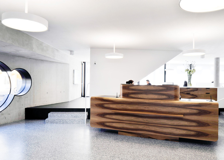
The bank occupies the ground floor and the first upper storey. Downstairs are the staff offices, reception counter and self-service area. Upstairs are meeting rooms and a small terrace, popular for private telephone calls or short breaks for smoking. The bank rents out the top two storeys to a doctor and a shipping company respectively.

