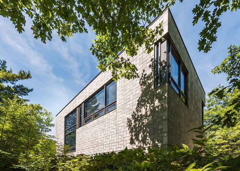
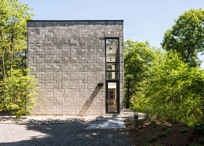
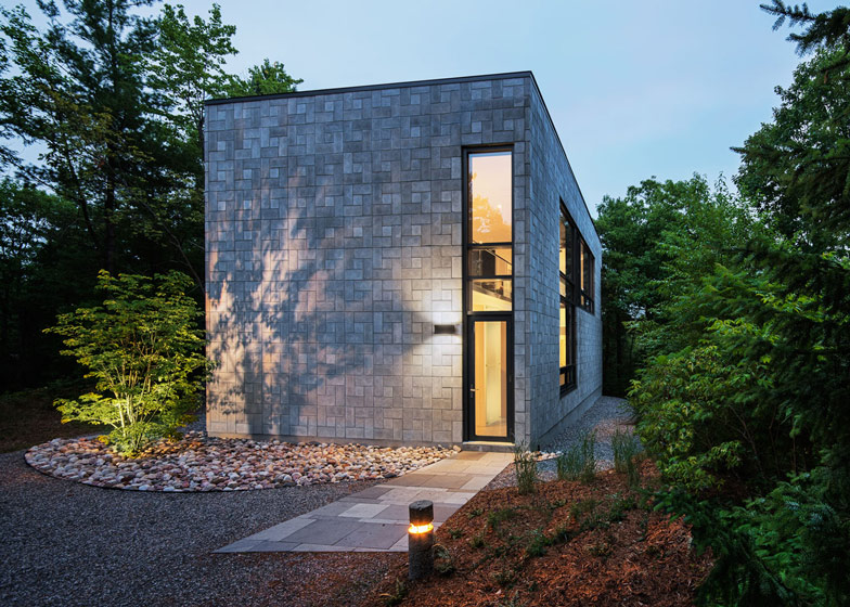
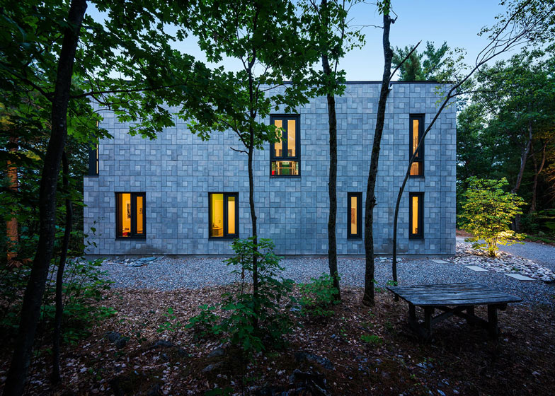
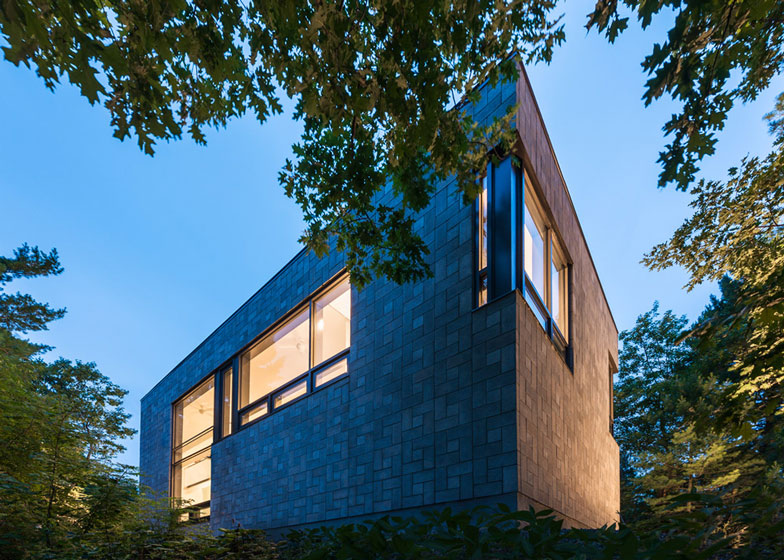
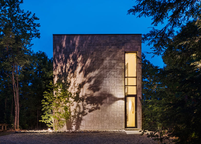
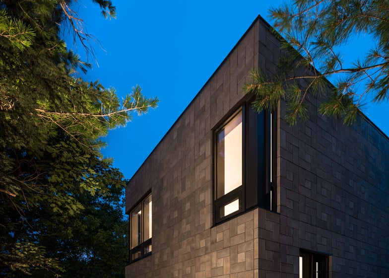
Concrete bricks create geometric patterns on the facade of this house in Québec by architects Kariouk Associates (+ slideshow).
Architect Paul duBellet Kariouk describes the arrangement as a "basket-weave" and it explains how it "takes a very coarse industrial material and makes something graceful out of it."
"We came up with this pattern by buying a stack of the blocks and just playing with them in the office," DuBellet Kariouk told Dezeen. "The use of small and large blocks creates a more varied shadow pattern that also helps to break down the scale of the house."
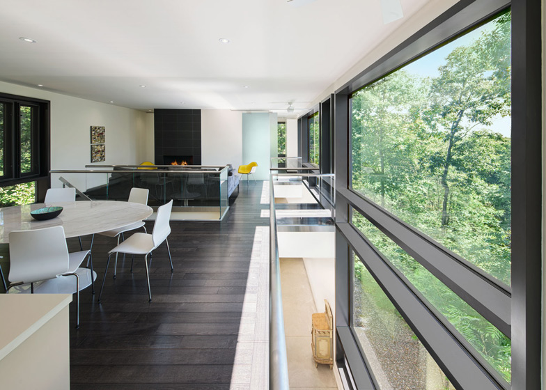
The entrance sits at the base of a tall and narrow window, and leads into a double-height corridor that spans the length of the two-storey house.
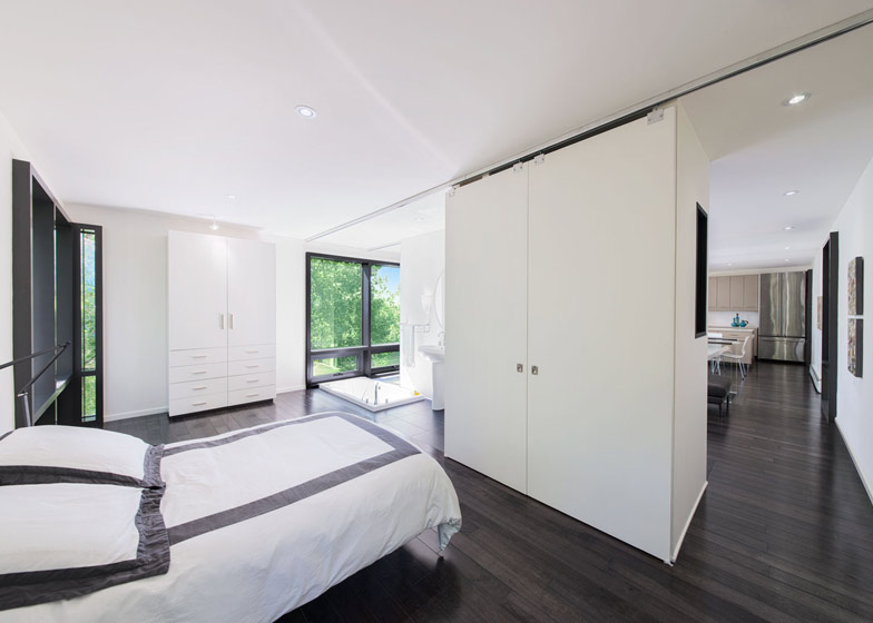
Two bridges cross the corridor on the first floor, including one that is actually a suspended bathtub.
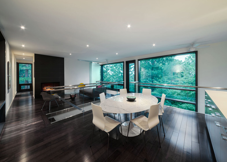
This bath belongs to the first floor bedroom, which is located beyond a dining room, kitchen and living room.
The family's children use the rooms on the ground floor, which include two bedrooms and a television room.
Other residential projects we've featured in Canada include a glass photographer's residence and a timber-clad extension.
Photography is by Photolux Studios, Christian Lalonde.
Here's a project description from the architects:
Chelsea Hill House
Design Challenge:
The logistical challenge was to create within a small home a segregation of spaces for the very different habits (privacy, acoustical, tidiness, etc.) of teenagers and adults while avoiding choppy spaces.
Design Solution:
The house is conceived as a very simple masonry volume: "the foundation of the family” which overlooks a beautiful river valley. The spaces most used by the teenagers, their bedrooms, a TV area, and sports equipment storage, are all placed on the ground level. Durable surfaces such as a radiant concrete floor are used throughout this level.
The formal areas of the house, the living area, dining area, kitchen, but also the master bedroom and bathroom, are all located upstairs and, as such, are given the most privileged views. Here, as well as on the stairway that leads to the main living level, more rich materials such as wood floors and glass railings are introduced with higher ceilings.
While all of the noisy and messy areas fall out of view by being placed directly beneath the living areas, the two levels are joined by the double-height entryway and hallway below. In this way, the primary living level is perceived to float lightly above the serene vista beyond. Though the home is constructed of fundamentally simple, industrial materials, one significant “cushy” indulgence was included: a bathtub suspended in the double-height space that looks over the valley. This tub, sunken in the floor, is accessed from the master bedroom and, if needed, is closed off from the adjacent living area by a sliding frosted-glass screen.
Ground floor plan - click above for larger image
Architectural team: Paul Kariouk, Chris Davis, Susan Gardiner, Cedric Boulet
General contractor: Sabean Custom Building (Stephen Sabean)
Structural engineering: The Paterson Group (Zbig Kisilewicz)
First floor plan - click above for larger image
Location: Chelsea, Québec
Project dates: 2006-2008
Second floor plan - click above for larger image

