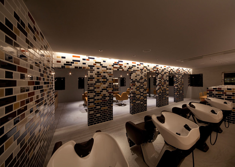
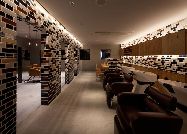
Architect Hiroyuki Miyake used a traditional English bricklaying pattern for the ceramic tiles on the walls of this beauty salon in Toyokawa, Japan.
"I tried to express alternative nostalgia by using glossy colourful tiles instead bricks," Miyake told Dezeen.
Displaying a graduated pattern of autumn colours, the tiles line the inside of the shampoo area and also clad the building's exterior.
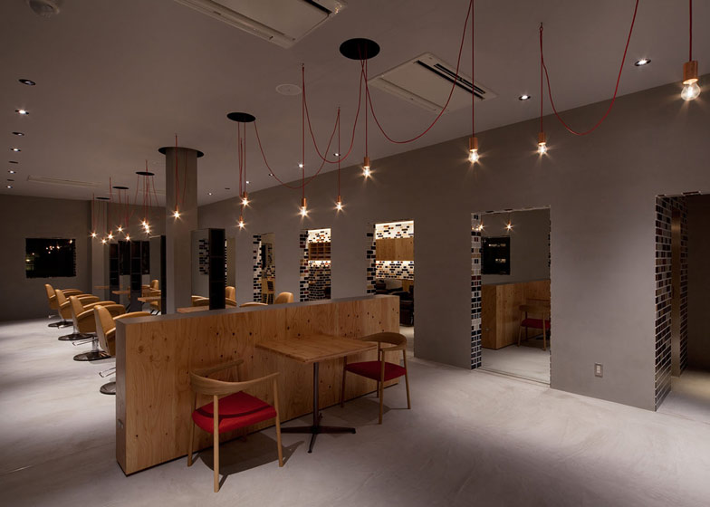
A partition that separates the styling and shampoo areas features doorways that copy the rhythm of the windows opposite.
The are no tiles on the walls of the styling area, where free-standing mirrors are arranged in a line and naked light bulbs hang on copper fixings overhead.
This isn't the first salon we've featured by Hiroyuki Miyake, following one with a zigzagging steel screen.
See more stories about salons and spas »
Photographs are by Rikoh Adachi.
Here's a description from Hiroyuki Miyake:
Beauty salon "Granny.F" designed by Hiroyuki Miyake
This beauty salon is located in Toyokawa , Aichi , Japan. It was renovated from the existing empty building.
Although the outer wall of tiling is carried out based on the British brick pattern, it is expressing coexistence of tradition and novel by the gradation pattern, and rich gloss.
The sun takes for sinking and the tile loses own color gradually. However, instead, it becomes one big background which projects the expression of a town which always changes, such as the sky at sunset and a headlight of the car which goes a passage.
By suppressing the lighting to an outer wall side, the light from the window arranged at equal intervals is emphasized, and a homely atmosphere is expressed by showing an internal situation in fragments.
The tile which is visible to the opening side of an outer wall or a partition wall is settled like "skin", and the gray space is emphasizing "inner side."
The pendant light of the naked light bulb hung at random has given shiny and coloring into the space arranged symmetrically.
The pendant lights are covered with copper leaf.
Internal styling area is changed completely with the exterior, and the space of dim mortar gray spreads. This is a place which creates beauty and the leading role is a person to the last. Space is positioning that it is only a background.
A shampoo area is positioning called the exterior, being in an inside by choosing the same tile as an outer wall.
The gradation of a tile and indirect lighting wraps people in a rich feeling of tolerance.
People experience various services and spend a relax time while going those space back and forth.
Plan - click above for larger image


