Zapata y Herrera lawyers' office by Masquespacio
Spanish design studio Masquespacio have turned a dilapidated Valencia art gallery into an office for a law firm, featuring clusters of empty picture frames on the walls (+ slideshow).
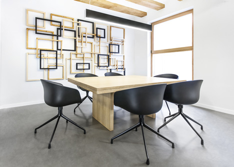
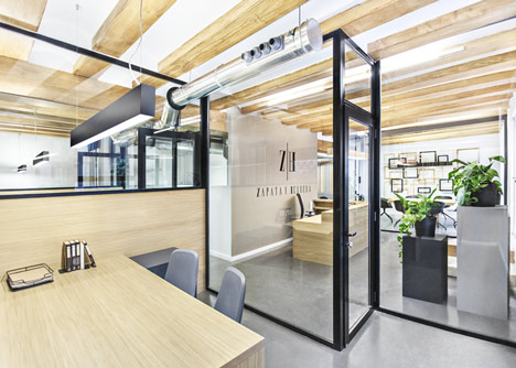
The 100 square metre office has been divided into compact work areas with full-length glazed walls.
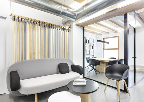
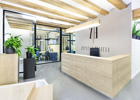
The original wooden ceiling beams were restored to complement the wood of the tables, counter and chair legs.
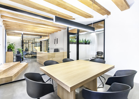
The overlapping wooden picture frames on the meeting room wall are "a metaphor of the diplomas usually displayed in a law firm," the designers explained.
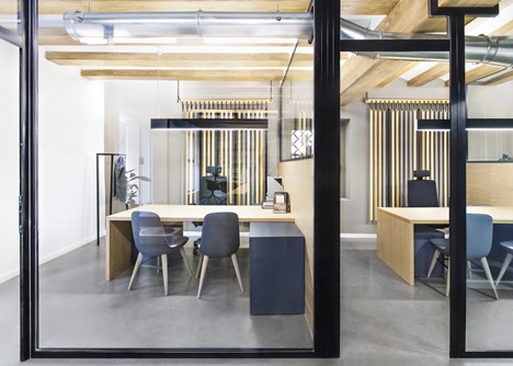
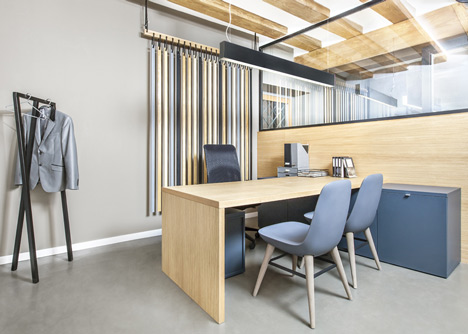
Thin strips of wood hanging vertically on the walls are partially painted in the company's colours of grey and black, which are also picked up in the furniture around the office.
Other buildings in Valencia we've featured include a house with a glass facade that reveals what's going on inside and a nursery with circular holes in its concrete walls.
We've featured lots of offices on Dezeen, most recently a Russian internet company with walls designed to look like pixels – see all of them here.
See all our stories about offices »
See all our stories about Valencia »
See all our stories about Spain »
Photographs are by David Rodríguez from Cualiti.
Here's more information from the architects:
Masquespacio present their last project realised in an emblematic building from the end of the 19th century, situated in the historic centre of Valencia, Spain. The project designed for the law office Zapata y Herrera starts from his historic values to which are added the firm’s corporate values by the use of colours black, grey and natural wood tones.
At first the old beams have been restored, making them an essential element of the project. The noble wood is one of the protagonists of the office, not wanting to stand out, but in order to transmit confidence as one of the most important values of Zapata y Herrera. The grey colour takes over, symbolising stability and professionalism, while the powerful black transmits certain elegance and especially the seriousness with which the firm practices its profession.
Down the noble wooden entry stairs is standing out the combination of different sensations transmitted by the office. Some will call it elegant and sophisticated, while others call it sober and robust. Going further into the description of the lawyers' office, on the left we can find the offices where the central element is a curtain of wood strips that repeats the colours of the firm's values. The small space was maximised using L-shaped tables positioned above the storage lockers. The three pillars from the entry garden at their time are repeating the primary colours.
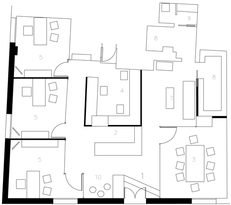
Above: office plan
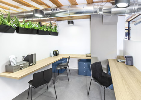
In front of the last offices and behind the reception we can find the interns' area with a sense of green offered by a range of aloe vera plants matching with the Green chair from Javier Mariscal, 100% recycled and 100% recyclable
On the other way of the entrance we find the boardroom starring a bunch of frames proposing a metaphor of the diplomas usually exposed in a law firm. The oeuvre, as well as the wood strips curtains where created by Masquespacio’s creative director, Ana Milena Hernández Palacios. At last, alongside the boardroom is situated a lobby in which we can recognise the Float couch, the latest design from Karim Rashid for Spanish brand Sancal.
Masquespacio in this project didn’t want to fall into the usual clichés of a law firm, so they converted them into metaphors. The law office Zapata y Herrera can be considered as an example of a corporate space that transmits its values, giving more importance to the work of their employees highlighting their seriousness, professionalism and confidence, with a vanguardian look unusual for a law firm.
Finished: 22/09/2012
Space: 100 m2
Client: Zapata y Herrera
Address: Plaza San Nicolas 3, 46001 Valencia
Design: Masquespacio
Address: Paseo de la Alameda 65, 34 B, 46023 Valencia
Designer: Ana Milena Hernández Palacios
Graphic Design, oeuvre and interior design by Ana Milena Hernández Palacios
Materials:
Construction: José Manuel Paz Agra Construcciones
Visitor office chairs: De Vorm
Director chairs: Inclass
Couch and lobby tables: Sancal
Intern chairs: 114 Mobles
General lighting: Arkos Light
Reception lighting: Luzifer
Lobby and boardroom chairs: Hay
Storage lockers: BM2000
Floor: Rapidmix