Aesop Tiquetonne by Ciguë
Glass bottles rest on rows of hand-made iron nails along the walls of this Aesop skin and haircare shop in Paris by French designers Ciguë (+ slideshow).
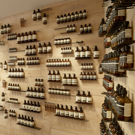
Located in one of the city's oldest neighbourhoods, Aesop Tiquetonne was inspired by old-fashioned workshops and garages, where tools are often fixed to the walls with hooks or nails.
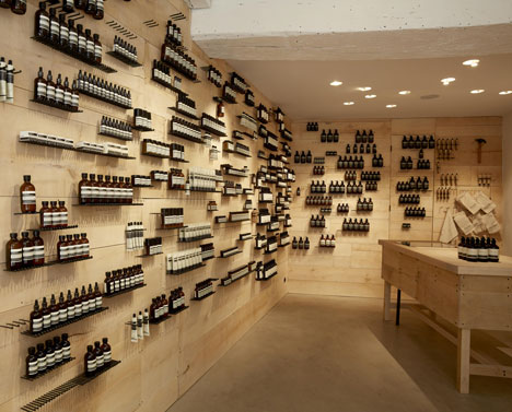
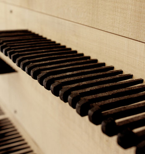
Architect Hugo Haas told Dezeen that he had bought the nails during a visit to Japan, and had decided later to use them to create an entire shelving system. "The main idea with Aesop is to find different ways of displaying their products," said Haas. "The bottles are so classical they have their own existence. They just need a good background to help them levitate."
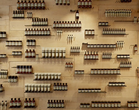
The square-sectioned nails form neat rows along the sycamore-covered walls, creating spaces to hang and stand products of different sizes. "These old nails are pretty hard to control, so to make sure we had straight lines we laser-drilled them to the wall," explained Haas.
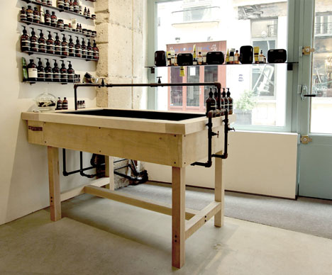
Unlike other Aesop stores designed by Ciguë, the counter and sink are separated from one another, due to the narrowness of the shop.
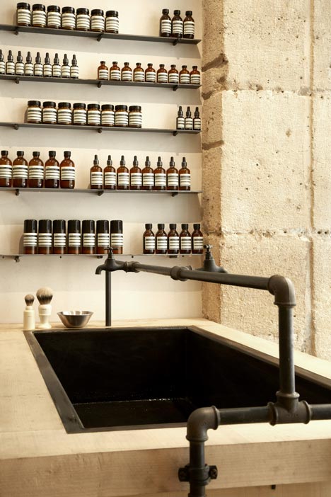
The taps and pipes are made from unpolished steel, and the architects chose to fit them themselves instead of consulting a plumber.
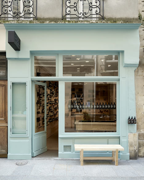
Pale blue paint gives the shop a colourful exterior. "The only place we wanted to put colour was the window," said Haas. "We didn't want to use colour in the store, as we prefer to use the colours that are inherent to materials. It seems a more natural process for us."
Aesop regularly commission designers to come up with unique concepts for their stores and this is the fifth one created by Ciguë. Others we’ve featured by the studio include one filled with steel caps from the city’s plumbing network and one modelled on a medical laboratory.
See all our stories about Aesop »
For job opportunities at Aesop, visit their company profile on Dezeen Jobs.
Here's some text from Aesop:
Aesop's latest Parisian signature space, a fresh collaboration with Cigue, opened in rue Tiquetonne in mid-June. Home to many tradesmen in the mid-twentieth century, the area features a number of workshops that have remained unchanged for decades. The store's design is entirely in keeping with this aesthetic - reminiscent of a garden workshop housing well-worn tools that defy obsolescence.
The design makes ingenious use of the most humble materials; shelving is fashioned from rows of large, hand-made square-sectioned wrought iron nailed - on which Aesop products are arranged like lovingly ordered implements. Walls feature stone and raw sycamore maple wood, which is also used for a large sink. A waxed concrete floor and pipes and taps of unpolished steel add further references to modest industry. The interior represents not only respect for local tradition, but a marriage of intelligent design, straightforward functionality and unadorned beauty.