20th Street Residence by SFOSL
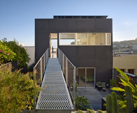
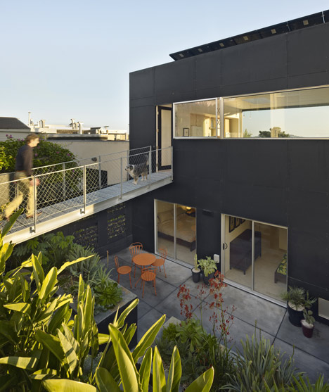
This rooftop house extension by Californian architects SFOSL has a metal bridge at its entrance and a facade that folds open.
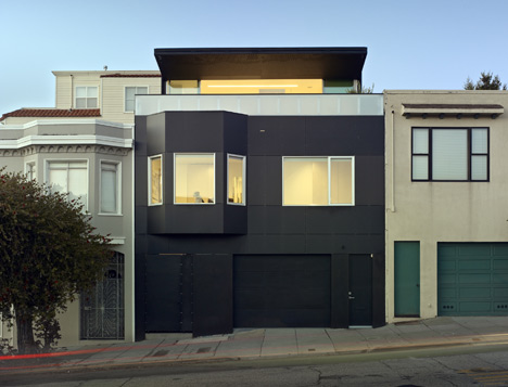
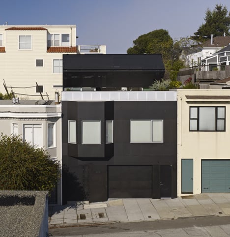
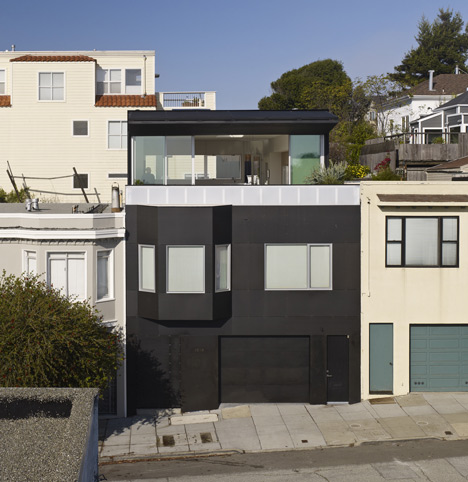
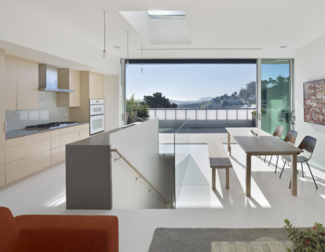
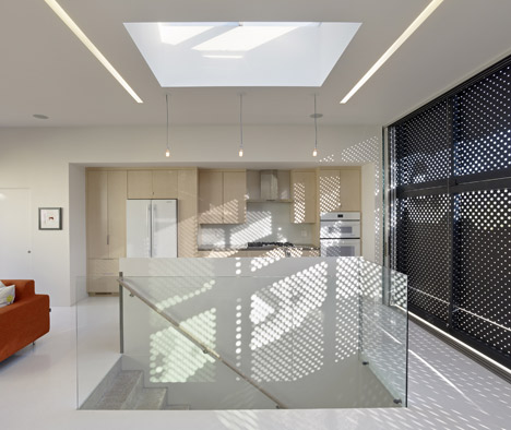
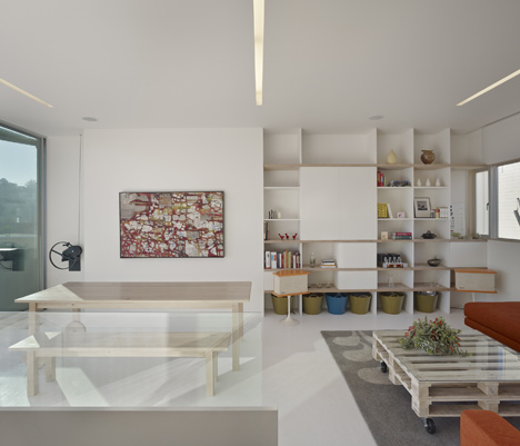
The architects weren't permitted to adapt the volume of the derelict house, so instead designed a rooftop living room that is barely visible from the street but offers residents a view out over the San Francisco bay.
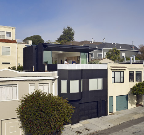
"The box on top incorporates the maximum allowable zoning volume," said architect Andreas Tingulstad. Other restrictions included a necessary 4.5 metre setback from the facade and a maximum total height of 10 metres.
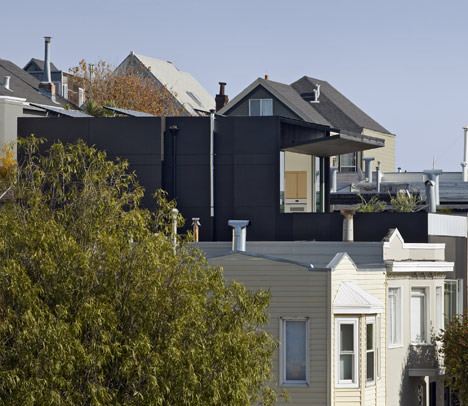
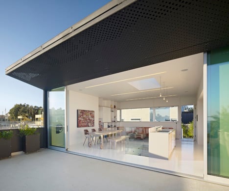
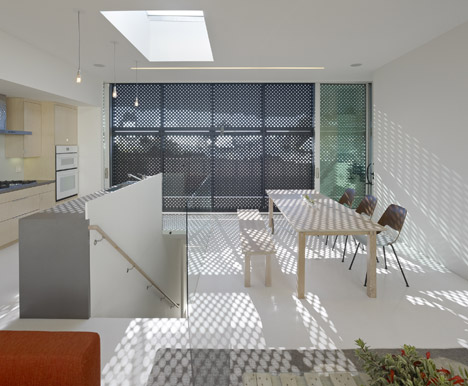
A perforated screen folds down over the south-facing facade of the new room to prevent it overheating during the day.
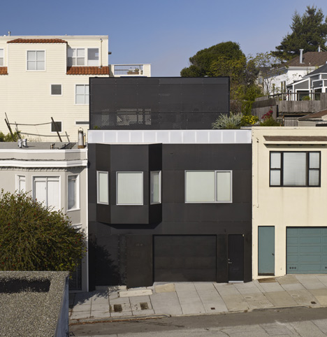
"The operable sunshade is perforated by an abstraction of the blocks' facades, integrating the context of the neighbourhood into the building," explained Tingulstad.
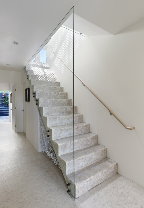
A wooden staircase provides a route down to rooms on the first floor, while the metal bridge stretches back to meet a patio that steps down to the same level.
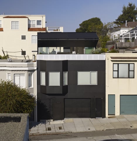
The exterior of the house is painted black to set it apart from its white, grey and cream-coloured neighbours.
Other American houses we've featured on Dezeen recently include a country house clad in shimmering aluminium panels and a writer’s hideaway clad in black-stained cedar.
See more stories about residential extensions »
Photography is by Bruce Damonte.
Here's a project description from SFOSL:
20th Street – San Francisco
The client came to us with a derelict home on 20th Street by Potrero Hill.
The client's had a basic need for an upgrade but also more space – to achieve this it soon became evident that expanding up through the roof was our only way.
This would not only meet their needs, but could potentially take advantage of the view overlooking the San Francisco Bay.
The existing 1575 sq. ft became 2225 sq ft – the private domain would remain on the 2nd floor – while the public functions would rise to an addition on the roof – a classic but clear programmatic division.
We chose to fully comply with all the zoning regulations, and let that be the solution to our design strategies.
We maneuvered through many City issues, but managed to solve the project requirements within the required setback of 15 feet, extending 32 feet in height, all within 175 dollars per sq ft.
We were not allowed to change the existing façade other than replacing windows and cladding due to the fact that the city had designated this block as historic.
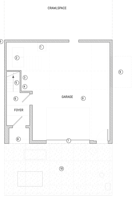
Ground floor plan - click above for larger image
Although we felt that the building itself had no particular historical significance – it was first and foremost a volume - but we felt the block could make sense. We proceeded by distilling the façade components in order to highlight the common denominator of the individual houses.
As the home faces south, the new dining and living space would be excessively hot in the sun during the San Francisco’s Indian summer. We naturally wanted to capture as much of the view as possible, but also ensure that privacy and cooling issues were resolved.
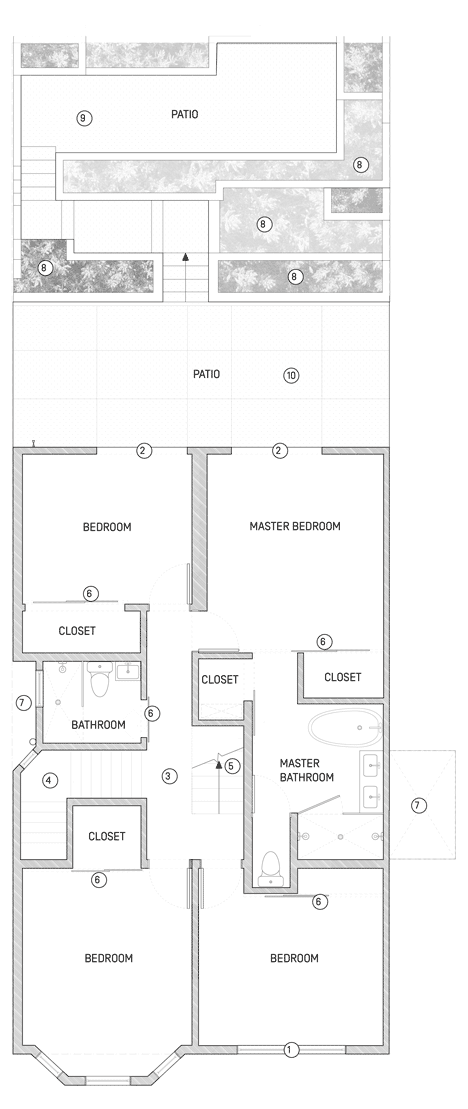
First floor plan - click above for larger image
The extension would become an outdoor / indoor space enabling the free roaming from the deck in front, through the public space and back to a formerly unappreciated terraced garden in the rear. We wanted as big of an expanse as possible, but simultaneously we wanted to allow for privacy – the solution was a flexible sunscreen. By perforating the skate-ramp cladding with a pixilated image of the street we combined the city setback guidelines, the shading- and the privacy strategy with the City’s wish to embrace the character of this block.
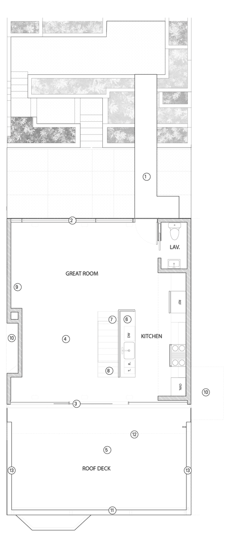
Second floor plan - Click above for larger image
The once obsolete and underutilized backyard was given new meaning by enabling a continuous loop in-between the private and public functions. The new indoor stair and the outdoors catwalk bridge now connect the private and secluded 2nd floor to the living area on the 3rd level. This allows the owners’ two dogs a free passage to the rear yard 24-7. Our only other injection apart from the color black and the bridge connection was an aim of the highest possible degree of floral diversity - to give the backyard that oasis feeling.
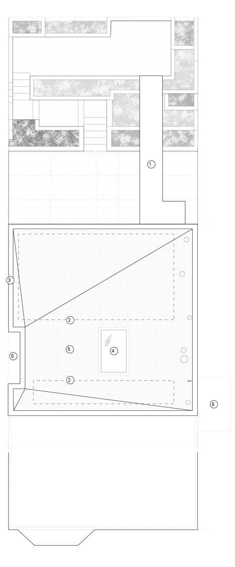
Roof plan - click above for larger image
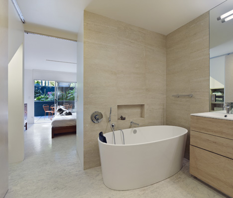
For the interior we embraced the client’s love of raw construction materials. They especially wished for many visible and unpainted wooden surfaces combined with brightness and gloss. We recycled wooden roof joists and custom-built a shelving system. PSL beams were used for the stair connecting the old house to the new, and OSB sheets connected the 2nd floor to the entry.
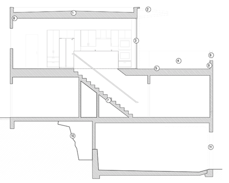
Section - click above for larger image
To weave the house into the urban fabric the building was clad in the inexpensive Ramp Armor material, used to make skateboard ramps. This material, with its precision, makes the building autonomous and differentiates it from the neighboring houses – while simultaneously enhancing the original design by pinpointing the primary components of the original vernacular – in that sense the building once and for all reaches its full potential within the historic envelope.
Sustainable Design is imperative to us. For this project we installed solar panels, and reused existing materials and minimized new materials to minimize waste. Our take on sustainability is foremost about the use of square footage. In every project – and maybe especially in this renovation and extension, every square foot has been thought through in its intention and objective. If we detect a spatial blind spot – we make sure it goes away or comes to life.
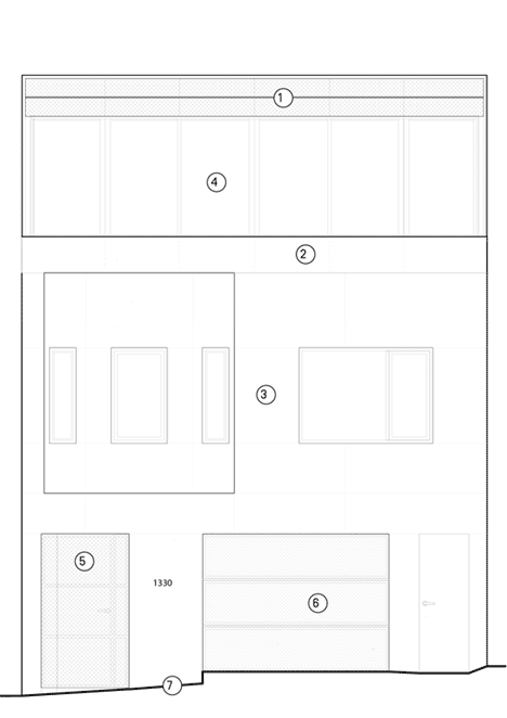
Front elevation - click above for larger image
Architect: Casper Mork Ulnes, Andreas Tingulstad, Grygoriy Ladigin.
Location: 1330 20th Street, San Francisco
Year Completed: 2012
General Contractor: Natal Modica Construction, Inc.
Engineer: Double D Engineering
Metal Work: Defauw Design & Fabrication
Landscape Architects: Flora Grubb
Area: 2225 sq ft (remodel + upward extension)